
Analyzing Air-Quality Data with a Spreadsheet
Students use spreadsheet formulas and a scatter plot to identify patterns in public air-quality data and recommend a method for monitoring pollution.

Illustrations are auto-generated and may be placeholders. They can be refreshed to match the narration.
Inspect the Data Source
Before analyzing data, determine whether the source is credible and useful for your question. Look for the organization’s name, collection methods, measurement units, dates, location, and quality checks. Government agencies such as the U.S. Environmental Protection Agency publish air-quality data for research, regulation, and public information. For example, suppose an EPA file contains hourly PM2.5 and nitrogen dioxide measurements from one monitoring station. Check that both pollutants were measured during the same period and that PM2.5 is reported in micrograms per cubic meter while nitrogen dioxide is reported in parts per billion. Read the metadata to learn whether values are preliminary or verified. A source is relevant if its location, variables, and time range match your investigation. Its intended use helps you decide whether it is appropriate for comparing pollution levels.

Organize and Clean the Dataset
Import the data into a spreadsheet and give each variable its own column. A useful table might contain Date and Time, Station ID, PM2.5, Nitrogen Dioxide, and Quality Flag. Each row should represent measurements from the same station and hour. Check for repeated headings, duplicate rows, inconsistent date formats, text in number columns, and missing-value codes such as -999. Do not replace a missing pollution measurement with zero because zero is a real value and would distort the analysis. Instead, mark the cell as missing and exclude that row from calculations requiring both variables. For example, if 2:00 p.m. has a nitrogen dioxide value but no PM2.5 value, do not include that hour in the scatter plot. Keep an unchanged copy of the original file and record every cleaning decision so another person could repeat your work.

Calculate Summary Values
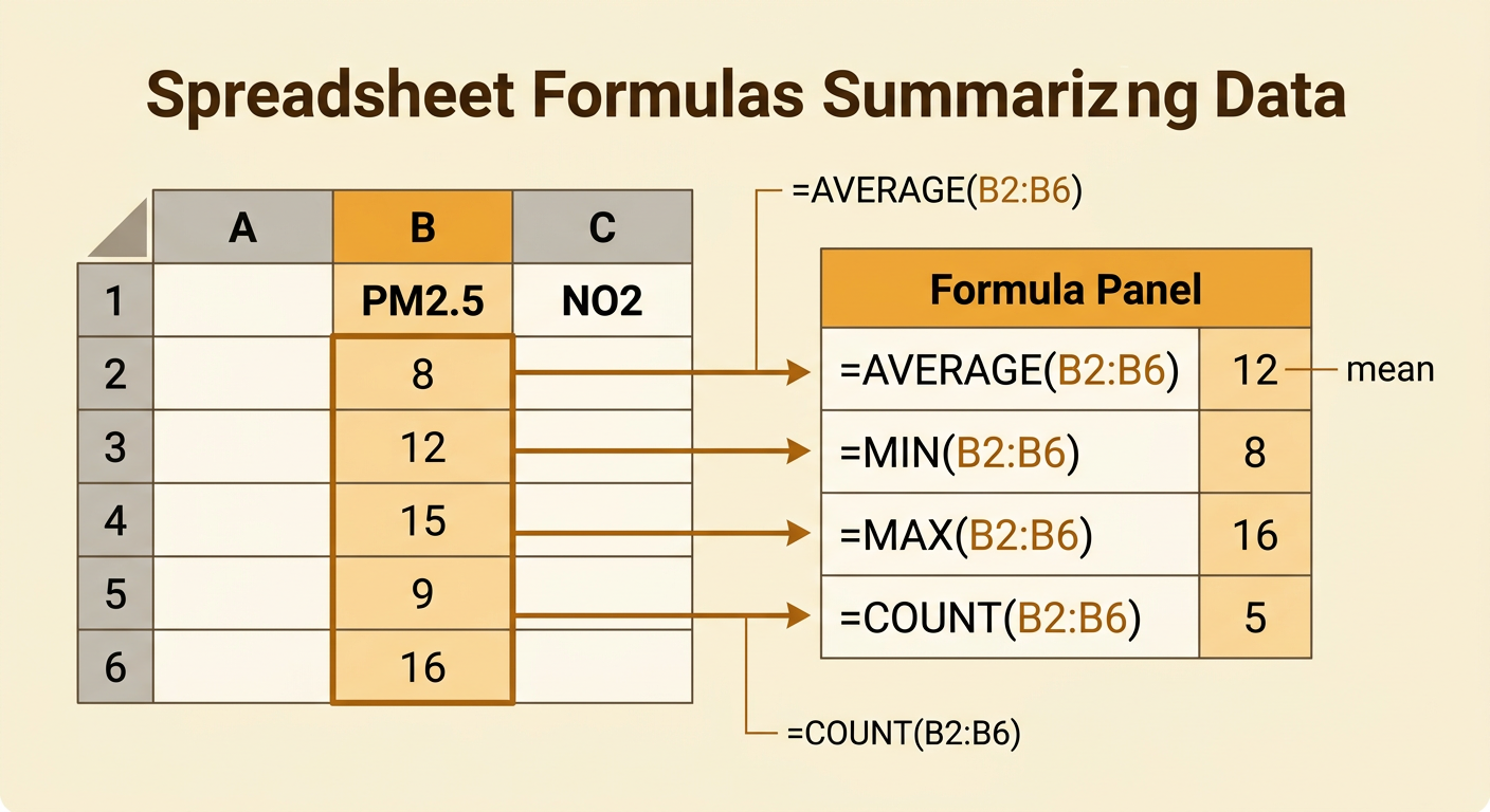
Spreadsheet formulas summarize a large dataset without calculating every value by hand. If cleaned PM2.5 measurements are in cells B2 through B6, enter =AVERAGE(B2:B6) to find the mean, =MIN(B2:B6) for the lowest value, and =MAX(B2:B6) for the highest value. Suppose the five measurements are 8, 12, 15, 9, and 16 micrograms per cubic meter. The mean is 12, the minimum is 8, and the maximum is 16. Use =COUNT(B2:B6) to confirm that five numeric values were included. Calculate the same statistics for nitrogen dioxide in column C. Summary values reveal typical levels and the range of observations, but they do not show how two variables change together. Always include units and check that missing-value codes were removed before using formulas.
Create and Interpret a Scatter Plot
A scatter plot displays paired measurements for two numerical variables. Select the nitrogen dioxide and PM2.5 columns, then insert a scatter plot. Place nitrogen dioxide, measured in parts per billion, on the horizontal x-axis and PM2.5, measured in micrograms per cubic meter, on the vertical y-axis. For example, the paired points (14, 8), (19, 12), (24, 15), (15, 9), and (28, 16) form an upward pattern. This indicates a positive association: hours with higher nitrogen dioxide generally also had higher PM2.5. Look for the direction, strength, clusters, and outliers in the complete plot. An association does not prove that one pollutant causes the other. Traffic, industry, wind, or weather could affect both measurements. An unusual point should be checked against the original data and quality flag rather than automatically deleted.

Recommend a Monitoring Method
Use the evidence to recommend a monitoring method that is reliable, repeatable, and useful for reducing human impacts. One method is to place a calibrated air-quality sensor near a busy road and another at a lower-traffic comparison site. Record PM2.5 and nitrogen dioxide every hour, use the same units and time settings, and compare the sensors regularly with an approved reference monitor. Collect weather and traffic information because wind, rain, and vehicle volume can help explain changing pollution levels. For example, if repeated scatter plots show that both pollutants rise during weekday rush hour, the community could test anti-idling rules, cleaner buses, or adjusted traffic flow. Continue monitoring before and after the action to evaluate whether pollution decreases. Report missing data and sensor limitations, and use verified agency data to check results. This plan connects measurement evidence to a practical way of minimizing pollution exposure.
