
Analyzing Data with Spreadsheet Formulas and Charts
Students use spreadsheet formulas to calculate summary values and create a scatter plot that reveals patterns in a two-variable data set.

Illustrations are auto-generated and may be placeholders. They can be refreshed to match the narration.
Explore Rows, Columns, and Cell References
A spreadsheet is a grid used to store and analyze information. Columns are identified by letters, and rows are identified by numbers. Each cell has a reference formed by its column letter and row number. For example, B3 identifies the cell where column B and row 3 meet. A group of cells is called a range. The reference B2:B7 means every cell from B2 through B7. Cell references let formulas use values stored elsewhere in the spreadsheet. If cell B2 contains 58, the formula =B2+5 returns 63. When the value in B2 changes, the formula result updates automatically. Selecting cells carefully is important because a formula using the wrong reference can produce an incorrect result.

Enter and Organize a Data Set
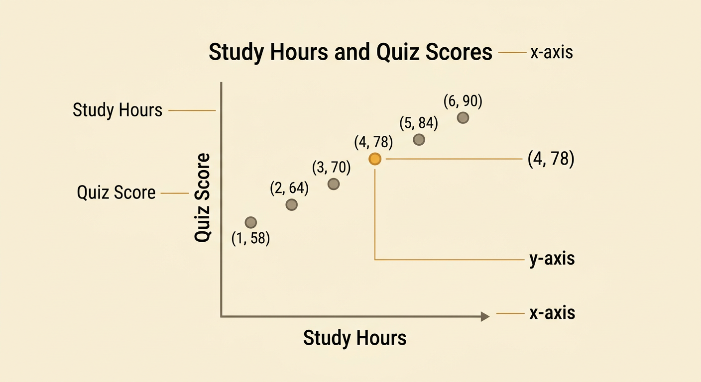
Organize data so that each row represents one observation and each column represents one variable. Suppose six students report how many hours they studied and their quiz scores. Enter the headings Study Hours in A1 and Quiz Score in B1. In rows 2 through 7, enter the pairs (1, 58), (2, 64), (3, 70), (4, 78), (5, 84), and (6, 90). Keep each student’s two values in the same row so the relationship between the variables is preserved. Use numbers rather than text such as “six hours,” because spreadsheet formulas and charts require numerical values. Clear headings, consistent units, and one observation per row make the data easier to check, calculate, and graph.

Calculate Values with Formulas
A formula begins with an equals sign and calculates a result from selected cells. For the quiz scores in B2:B7, enter =AVERAGE(B2:B7) in an empty cell. The result is 74, the mean quiz score. Enter =MIN(B2:B7) to find the lowest score, 58, and =MAX(B2:B7) to find the highest score, 90. To calculate the range, enter =MAX(B2:B7)-MIN(B2:B7), which returns 32. You can also calculate the mean study time with =AVERAGE(A2:A7), which returns 3.5 hours. These summary values describe the data set, but they do not show how the two variables vary together. A scatter plot is needed to examine that relationship. Always check that each formula includes the intended cells and does not include a heading.

Create and Label a Scatter Plot
A scatter plot displays paired quantitative values as points. Select cells A1:B7, then insert a scatter chart with markers only. Place Study Hours on the horizontal x-axis because it is the explanatory variable. Place Quiz Score on the vertical y-axis because it is the response variable being compared with study time. Give the graph a clear title, such as Study Hours and Quiz Scores, and label both axes with units. The point (4, 78) represents a student who studied 4 hours and scored 78. Do not use a line chart, because connecting the points could incorrectly suggest that the students form a sequence. Adjust the axis scales so all six points are visible and the spacing accurately represents numerical differences.
Interpret Patterns and Relationships
Interpret a scatter plot by examining direction, form, strength, and unusual points. In the study data, the points rise from left to right, showing a positive association: students who studied more hours generally earned higher quiz scores. The points also lie close to an imaginary straight line, so the relationship appears strong and approximately linear. There are no obvious outliers far from the overall pattern. This pattern supports a descriptive statement about the observed data, but it does not prove that studying alone caused the higher scores. Other factors, such as prior knowledge or sleep, may also affect performance. A useful conclusion is: “In this group, greater study time was associated with higher quiz scores.” Avoid claiming that every additional study hour guarantees a specific score increase.