Auditing Web Accessibility with Semantic HTML
Students evaluate and revise a webpage’s structure, labels, and keyboard navigation to improve access for users of assistive technologies.
Illustrations are auto-generated and may be placeholders. They can be refreshed to match the narration.
Why Web Accessibility Matters
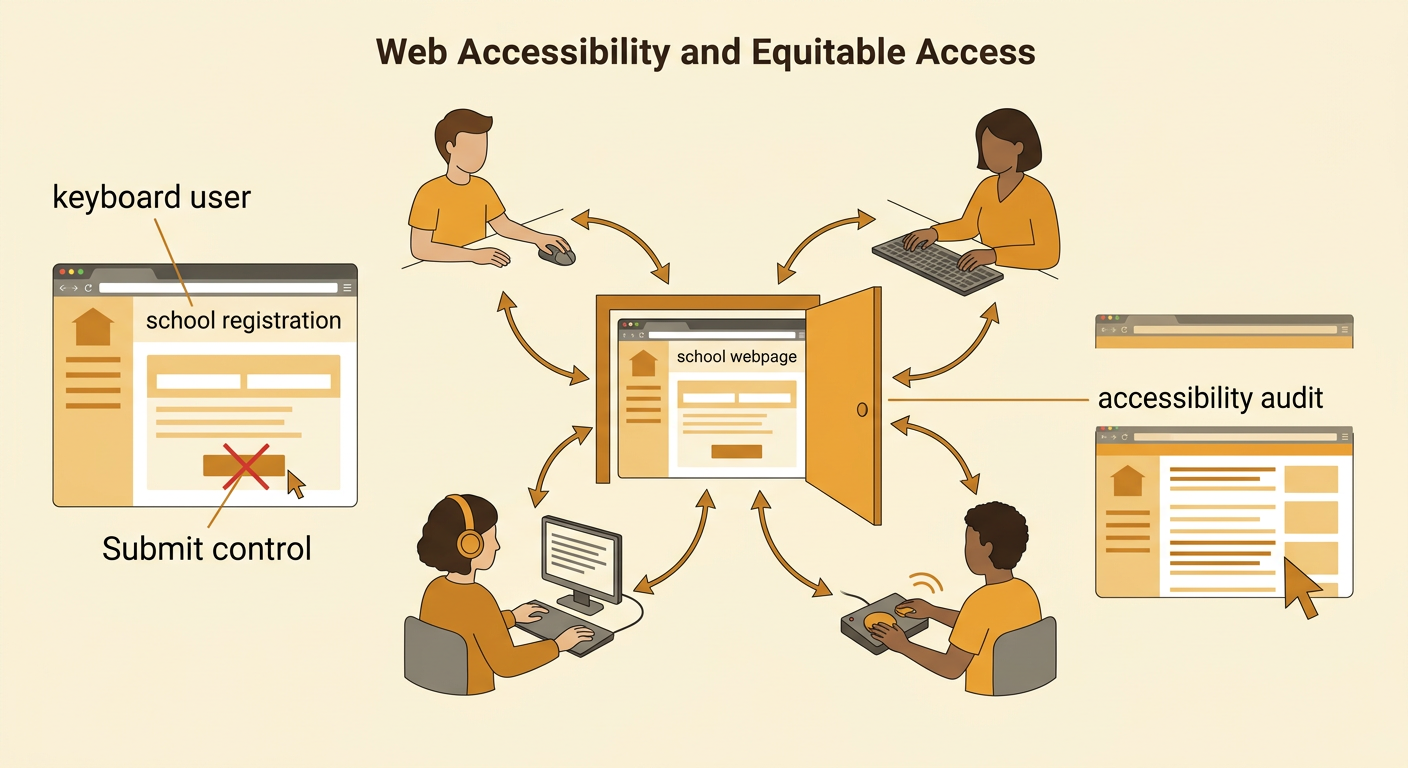
Web accessibility means designing digital content so people with different abilities can perceive, understand, navigate, and use it. A student who is blind may use a screen reader, while a student with limited hand movement may use only a keyboard or switch device. Accessibility also helps people with temporary injuries, slow connections, or changing needs. In the United States, laws such as the Americans with Disabilities Act and Section 508 can apply to digital services in particular settings, although legal requirements vary by organization. Consider a school registration page whose Submit control works only with a mouse. A keyboard user may be unable to enroll, turning a coding decision into an issue of equitable access. An accessibility audit identifies barriers and prioritizes revisions based on impact, feasibility, standards, and user needs.
Semantic HTML and Page Structure
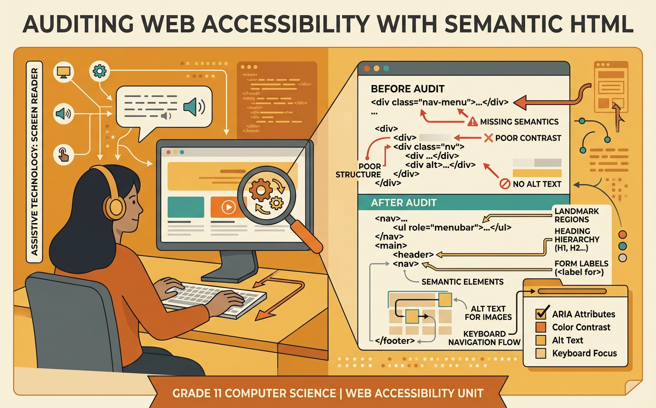
Semantic HTML uses elements that describe the purpose of content, not merely its appearance. Elements such as header, nav, main, article, section, and footer create recognizable page regions. Heading elements from h1 through h6 organize ideas into a meaningful hierarchy. Assistive technologies can use these regions and headings as navigation shortcuts, and developers gain clearer, more maintainable code. For example, a page title styled as large text inside a div may look like a heading but provide no heading information to a screen reader. Replacing it with an h1 communicates its role. A page should usually have one clear primary heading, followed by h2 headings for major topics and h3 headings for their subsections. Choose heading levels by structure rather than font size, and use CSS to control appearance.

Labels, Alternative Text, and Focus Order
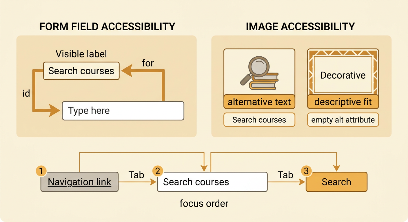
Accessible controls need names that explain their purpose. Connect a visible label to a form input with matching for and id values so selecting the label also activates the field. Placeholder text is not a reliable replacement because it disappears during typing and may be difficult to perceive. Images that communicate information need concise alternative text describing their meaning in context. Decorative images should usually have an empty alt attribute so screen readers can skip them. For example, a search field labeled Search courses is clearer than an unlabeled field with the placeholder Type here. Interactive elements must also follow a logical focus order. In most cases, this means arranging the HTML source in the same sequence users see on the page and avoiding positive tabindex values. A user pressing Tab should encounter navigation, form fields, and buttons in a predictable order.
Keyboard-Only Accessibility Test
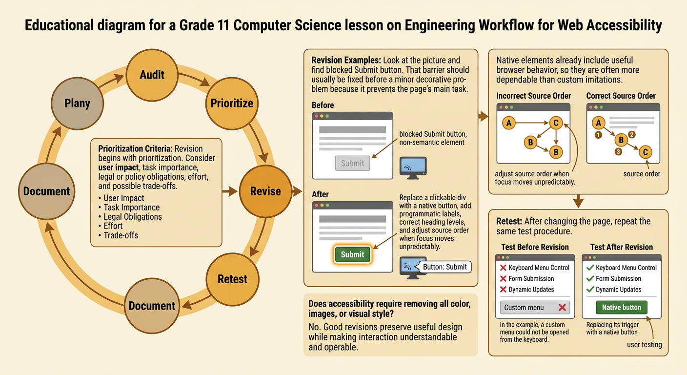
A keyboard-only test checks whether a person can complete every important task without a mouse. Begin at the browser address bar, then press Tab to move forward and Shift plus Tab to move backward. Use Enter to activate links and buttons, Space to operate buttons or checkboxes, and arrow keys when a standard widget supports them. At every step, verify that the focused element has a clearly visible focus indicator and that the sequence matches the page’s meaning. Open menus, complete forms, dismiss dialogs, and watch for keyboard traps that prevent movement away from a component. For example, test a course signup form by tabbing to each field, selecting a session, submitting the form, and reaching any error message. Record the control, keystroke, expected result, actual result, and severity of each barrier so the procedure can be repeated.

Revise and Retest the Page
After testing, revise the page by prioritizing barriers according to user impact, task importance, legal or policy obligations, effort, and possible trade-offs. A blocked Submit button deserves attention before a minor decorative issue because it prevents completion of the page’s main task. Replace clickable div elements with native button elements, add programmatic labels, correct heading levels, and adjust source order when focus moves unpredictably. Preserve useful visual design rather than assuming accessibility requires a plain page. Then repeat the same test procedure and compare results. For example, if a custom menu could not be opened by keyboard, changing its trigger to a button and implementing appropriate keyboard behavior may solve the problem. Retest opening, navigating, and closing the menu with a keyboard and a screen reader. Document what improved, what remains unresolved, and whether the revision introduced new barriers. User testing can uncover problems automated tools miss.