
Building an Interactive Public-Data Visualization
Students transform a public dataset into an interactive visualization, select accurate visual encodings, and evaluate whether the result supports an evidence-based claim.
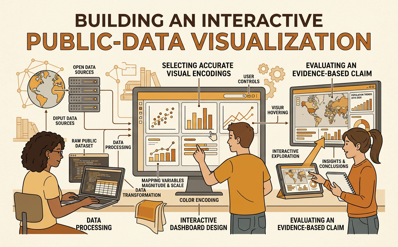
Illustrations are auto-generated and may be placeholders. They can be refreshed to match the narration.
Inspect the Public Dataset
Begin by identifying who published the dataset, why it was collected, and when it was updated. Read the metadata before analyzing the rows. Metadata explains column meanings, units, collection methods, and limitations. For example, suppose you download Environmental Protection Agency air-quality records containing date, monitoring station, daily PM2.5 concentration, and county. Confirm that PM2.5 is measured in micrograms per cubic meter and determine whether values are daily averages. Inspect several rows, list each variable’s data type, and note missing or unusual entries. Ask whether the dataset covers the locations and time period needed for your question. If you want to compare air quality across counties in 2023, records from only one station or one month cannot adequately support the comparison.
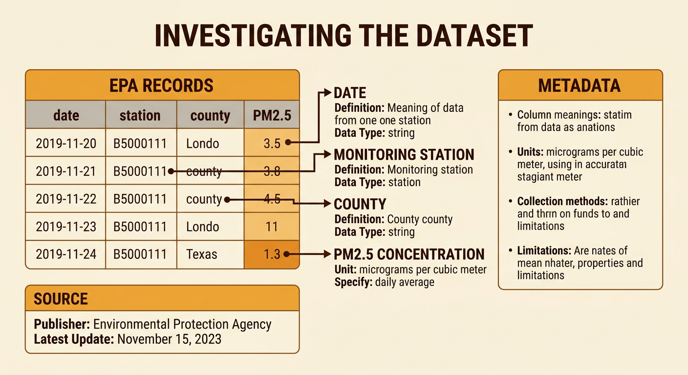
Clean and Structure the Data
Cleaning makes records consistent without hiding problems. Keep an unchanged copy of the original file, then document every transformation. Convert dates to one standard format, store numerical measurements as numbers, standardize county names, and remove exact duplicate records. Do not replace a missing PM2.5 measurement with zero because zero is a real measurement. Instead, mark it as missing and decide whether to exclude or explain it. For example, “Jefferson,” “Jefferson County,” and “JEFFERSON” may need one shared label. Structure the cleaned data so that each row represents one station on one date and each column represents one variable. Check ranges and investigate impossible values, such as a negative concentration. Finally, compare row counts and summary statistics before and after cleaning to ensure that valid observations were not accidentally lost.
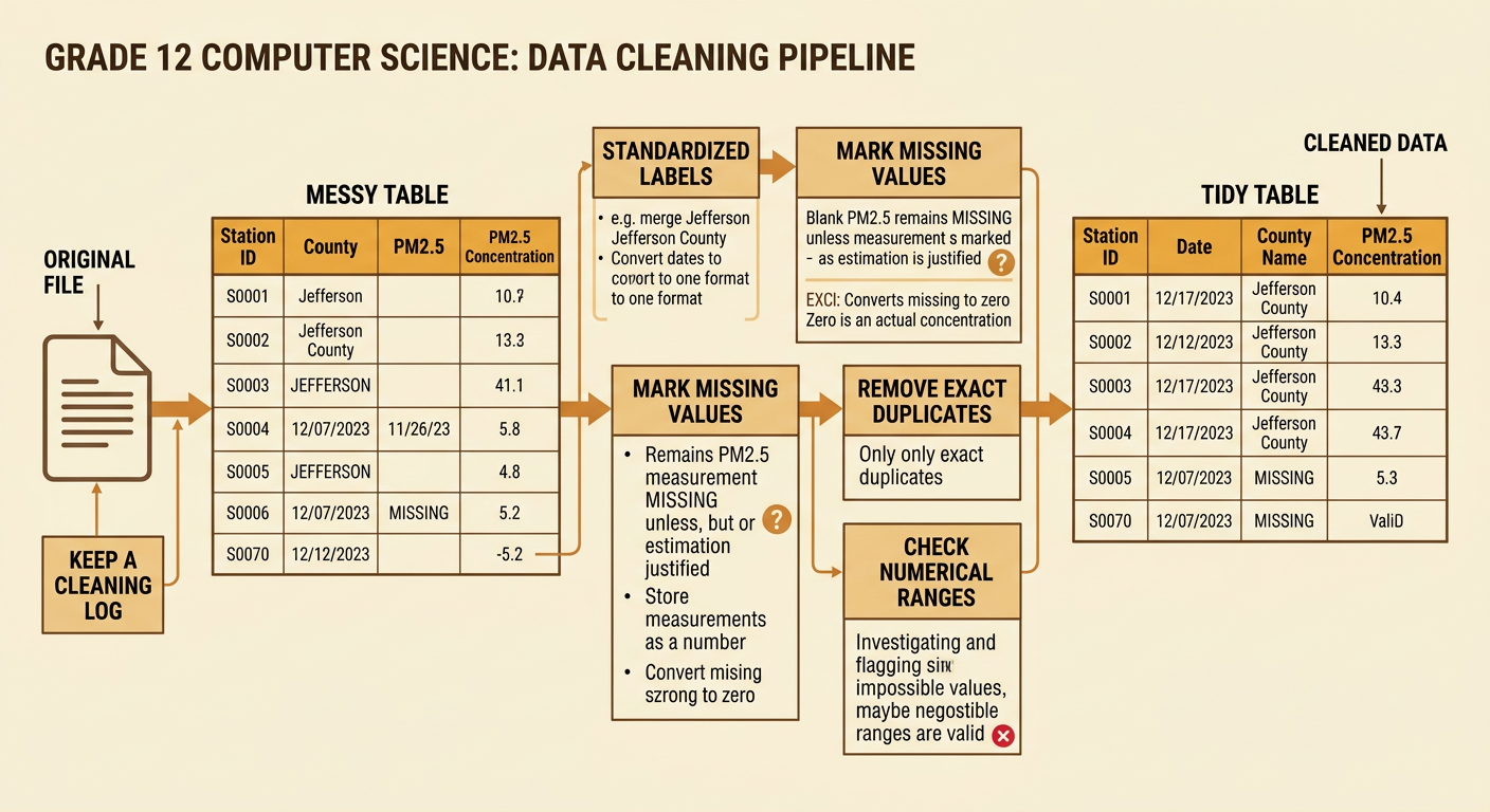
Choose Visual Encodings
Match each variable to a visual feature that represents it accurately. Position along a common scale is effective for quantitative comparisons, while color can distinguish categories such as counties. For example, use a scatterplot to place daily temperature on the horizontal axis and PM2.5 concentration on the vertical axis. Each point represents one station-day, and color identifies the county. A trend line may help describe the direction and strength of the relationship, but it does not prove that temperature causes pollution. Use clear units, readable labels, and consistent scales. Begin numerical axes at appropriate values and avoid three-dimensional effects that distort comparisons. If the question concerns change over time instead, use a line chart with date on the horizontal axis. The chosen encoding should directly support the intended comparison and make uncertainty or gaps visible.
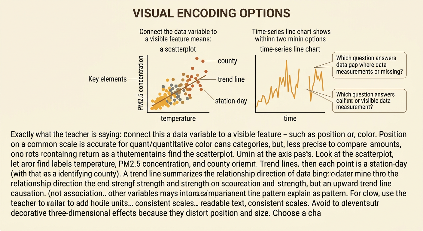
Code Interactive Filters
Interactive filters let users examine subsets without changing the underlying data. Decompose the feature into manageable parts: create interface controls, read the selected values, filter the records, redraw the chart, and update the labels. For example, provide a county menu, a date-range slider, and a station checkbox list. When a user selects Jefferson County and June through August, an event listener should retain only matching rows and recalculate the displayed point count and trend line. Keep axis scales fixed when users need fair comparisons across filters, or clearly announce when scales change. Include an “All counties” option and a reset control. Test empty results, missing values, and rapid changes. Accessible controls need keyboard operation, visible focus, descriptive labels, and information that is not communicated by color alone.

Validate the Claim and Design
Evaluate both the evidence and the visualization before publishing a claim. Suppose the filtered scatterplot suggests, “Higher summer temperatures are associated with higher daily PM2.5 levels in Jefferson County.” Calculate or display an appropriate trend summary, inspect outliers, and test whether the pattern remains when dates, stations, or counties change. Compare the pollution records with Environmental Protection Agency documentation and temperature records from a second public source, such as the National Oceanic and Atmospheric Administration. Investigate inconsistent dates, station locations, units, or missing periods rather than ignoring them. Revise the claim if the evidence is weak; association does not establish causation. Ask classmates to complete a task using the visualization and explain what they conclude. Their errors may reveal confusing legends, filters, or scales. Publish the source, cleaning decisions, limitations, and a claim that matches the displayed evidence.
