
Choosing and Interpreting Graphs for Scientific Data
Students compare bar graphs, line graphs, and scatter plots, then select and interpret the graph type that best represents categorical data, change over time, or relationships between variables.

Illustrations are auto-generated and may be placeholders. They can be refreshed to match the narration.
Why Scientists Use Graphs
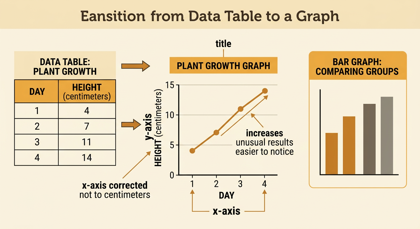
Scientists use graphs to turn numerical data into a visual form that makes patterns easier to notice. A data table gives exact values, while a graph can quickly reveal increases, decreases, differences, clusters, or unusual results. Every graph should have a clear title, labeled axes, appropriate units, and an accurate scale. The meaning of each point or bar must be explained in the context of the investigation. For example, a student measures a bean plant every three days. The table shows heights of 4, 7, 11, and 14 centimeters. When these values are graphed, the upward pattern is immediately visible. The graph does not replace the data table; it presents the same evidence in a way that helps scientists interpret results, communicate findings, and support explanations.
Bar Graphs for Comparing Categories
A bar graph is useful when data are divided into categories. The category names appear on one axis, and a numerical measurement appears on the other. Each rectangular bar has the same width, and spaces separate the bars because the categories are distinct rather than continuous. Bar height represents the value for that category. In an insect survey, students might count 24 insects in a meadow, 15 in a forest, and 9 near a pond edge. A bar graph makes it easy to see that the meadow had the greatest count and the pond edge had the smallest. The vertical scale should begin at zero so differences are not exaggerated. Bar graphs can compare counts, averages, or percentages, but the graph title and axis label must clearly identify what was measured.

Line Graphs for Change Over Time
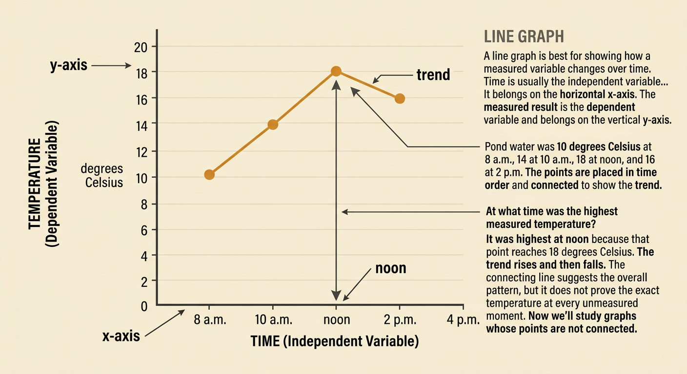
A line graph is best for showing how a measured variable changes over time. Time is usually the independent variable and belongs on the horizontal x-axis. The measured result, or dependent variable, belongs on the vertical y-axis. Data points are plotted in chronological order and connected to show the overall pattern between observations. Suppose students record pond water temperature at 8 a.m., 10 a.m., noon, and 2 p.m. The temperatures are 10, 14, 18, and 16 degrees Celsius. The graph rises until noon and then falls, showing that the highest measured temperature occurred at noon. Connecting points helps show the trend, but it does not prove the exact temperature at every unmeasured moment. Equal time intervals and a consistent temperature scale make the graph accurate and readable.
Scatter Plots for Relationships
A scatter plot shows whether two numerical variables may be related. Each point represents one paired observation, with one value located on the x-axis and the other on the y-axis. The points are not connected in order. Instead, scientists look for an overall direction, clusters, or outliers. Imagine measuring tree canopy cover and soil moisture at several locations. If sites with greater canopy cover generally have greater soil moisture, the points form an upward pattern called a positive association. A downward pattern is a negative association, while widely scattered points may show little or no association. One point might mean that a site with 60 percent canopy cover had 28 percent soil moisture. An association provides evidence of a relationship, but it does not by itself prove that one variable causes the other.

Choosing Appropriate Variables and Scales
Before making a graph, identify the variables and decide which graph type fits the question. Use a bar graph for categories, a line graph for change over time, and a scatter plot for a possible relationship between two numerical variables. Place the independent variable, which is changed or selected, on the x-axis. Place the dependent variable, which is measured in response, on the y-axis. For a fertilizer investigation, students might use 0, 2, 4, and 6 grams of fertilizer and measure plant heights of 8, 11, 15, and 16 centimeters after four weeks. Fertilizer amount belongs on the x-axis, and plant height belongs on the y-axis. Choose evenly spaced intervals that include all values. Scales should not skip values or use uneven spacing, because distorted scales can create a misleading impression.
Interpreting Patterns and Supporting Claims
Interpreting a graph means describing what the data show and using specific evidence to support a claim. First read the title, axes, units, and scale. Then identify the overall pattern and any points that do not fit it. Finally, explain what the pattern means in the investigation's context. Suppose a scatter plot compares dissolved oxygen with the number of mayfly nymphs collected from streams. The points rise from about 3 nymphs at 4 milligrams per liter of oxygen to about 12 nymphs at 9 milligrams per liter. A supported claim is that streams with higher dissolved oxygen tended to have more mayfly nymphs. The plotted values are evidence for that claim. However, sound reasoning should state that the graph shows an association, not proof that oxygen alone caused the difference. Other stream conditions may also affect mayflies.