
Choosing the Right Graph for Scientific Data
Students compare bar graphs, line graphs, scatter plots, and histograms and select the graph type that best displays categories, changes, relationships, or distributions in scientific data.
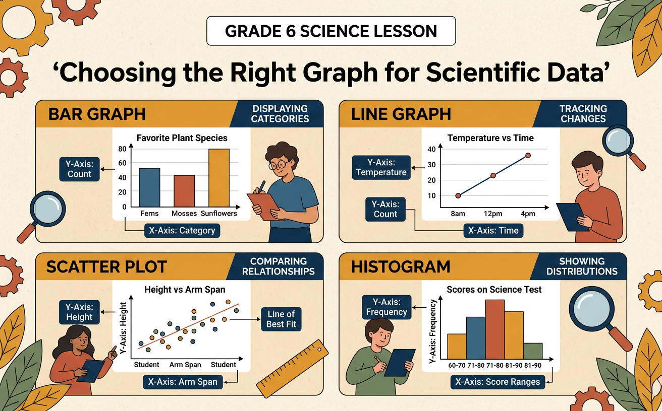
Illustrations are auto-generated and may be placeholders. They can be refreshed to match the narration.
Why Scientists Use Graphs
Scientists collect data by observing and measuring the natural world. A table preserves exact values, but a graph can make patterns easier to notice. Before creating a graph, scientists ask what kind of data they have and what question they want to answer. Suppose students record the number of insects found in grass, soil, and leaf litter. A graph can quickly show which habitat contains the most insects. If students instead measure a plant every week, they need a graph that shows change over time. Every useful graph should have a clear title, labeled axes, appropriate units, and an accurate scale. Scientists study the pattern shown and use specific data as evidence for a claim. They also check the original measurements because a graph does not explain why a pattern occurred.

Bar Graphs for Comparing Categories
Use a bar graph when the data belong to separate categories. The categories are listed on one axis, and the numerical values are shown on the other. The bars have equal widths and spaces between them because each bar represents a distinct group. For example, an ecologist counts 18 pill bugs under logs, 11 under rocks, and 6 in open soil. A bar graph makes it easy to compare these three habitat categories. The bar for logs is tallest, providing evidence that the most pill bugs were found there during the survey. The graph does not prove that logs caused the larger count; other conditions may have affected the result. A bar graph can display counts, averages, or other numerical summaries, but the axis label must name the measurement and its unit.
Line Graphs for Change Over Time
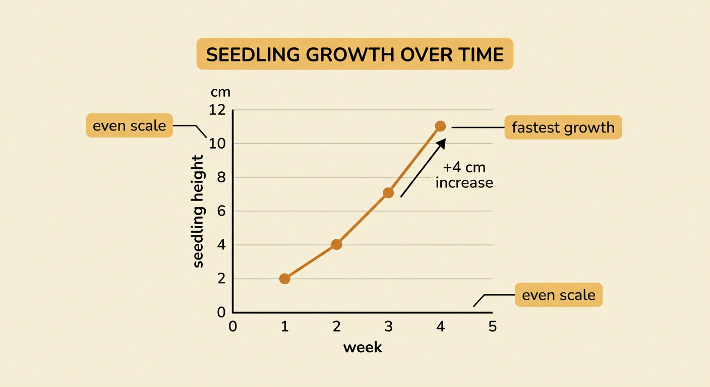
Use a line graph when measurements are taken in order, especially across time. Time usually appears on the horizontal axis, while the measured variable appears on the vertical axis. Data points are connected to emphasize how the value changes from one measurement to the next. Imagine that a seedling is 2 centimeters tall in week 1, 4 centimeters in week 2, 7 centimeters in week 3, and 11 centimeters in week 4. The rising line shows that the seedling grew throughout the study, and the steepest segment shows when growth was fastest. The points should be placed according to an even numerical scale. Connecting points is appropriate because the observations follow a time sequence, but scientists should not claim to know unmeasured values with certainty. A line graph can reveal increases, decreases, cycles, and periods of little change.
Scatter Plots for Relationships
Use a scatter plot to investigate the relationship between two numerical variables measured for the same cases. Each point represents one case and is located using an x-value and a y-value. For example, students measure sunlight hours and plant height for 12 plants. If points generally rise from left to right, greater sunlight is associated with taller plants. This is a positive relationship. A trend line can summarize the overall pattern, but it does not need to pass through every point. Points far from the pattern are called outliers and should be checked rather than automatically removed. A scatter plot can show a positive relationship, a negative relationship, or little apparent relationship. Even a strong relationship does not prove that one variable caused the other. Water, soil nutrients, plant species, and other variables could also affect plant height.
Histograms for Data Distributions
Use a histogram to show the distribution of numerical data. Values are grouped into equal intervals called bins, and each bar shows the frequency, or number of observations, in one interval. Unlike the bars in a bar graph, histogram bars touch because the intervals cover a continuous number scale. Suppose scientists measure the body lengths of 30 minnows. They group the lengths into 2-centimeter bins: 4 to less than 6, 6 to less than 8, 8 to less than 10, and so on. The histogram can show the interval containing the most minnows, the overall spread, and whether values cluster in one region. Bin boundaries must not overlap, so every measurement belongs in exactly one bin. Changing the bin width can change how the distribution looks, but it does not change the original data.
Match the Data to the Graph
Choose a graph by matching the graph's purpose to the scientific question. Use a bar graph to compare categories, such as the average number of species in forests, grasslands, and wetlands. Use a line graph to show change over time, such as pond temperature measured each hour. Use a scatter plot to examine a relationship between two numerical variables, such as water temperature and dissolved oxygen measured at several ponds. Use a histogram to show the distribution of one numerical variable, such as the body masses of 50 frogs. After choosing, check that the title, axis labels, units, scale, and plotted values are accurate. Then make a claim that answers the question and cite values or patterns from the graph as evidence. If information from another table, field note, or source supports the same conclusion, include it and explain how the evidence fits together.