Climate Trends, Variability, and Evidence
Students analyze temperature and atmospheric carbon dioxide data to distinguish short-term variability from long-term climate trends and explain the evidence for recent climate change.
Illustrations are auto-generated and may be placeholders. They can be refreshed to match the narration.
Weather Variation vs. Climate Trends
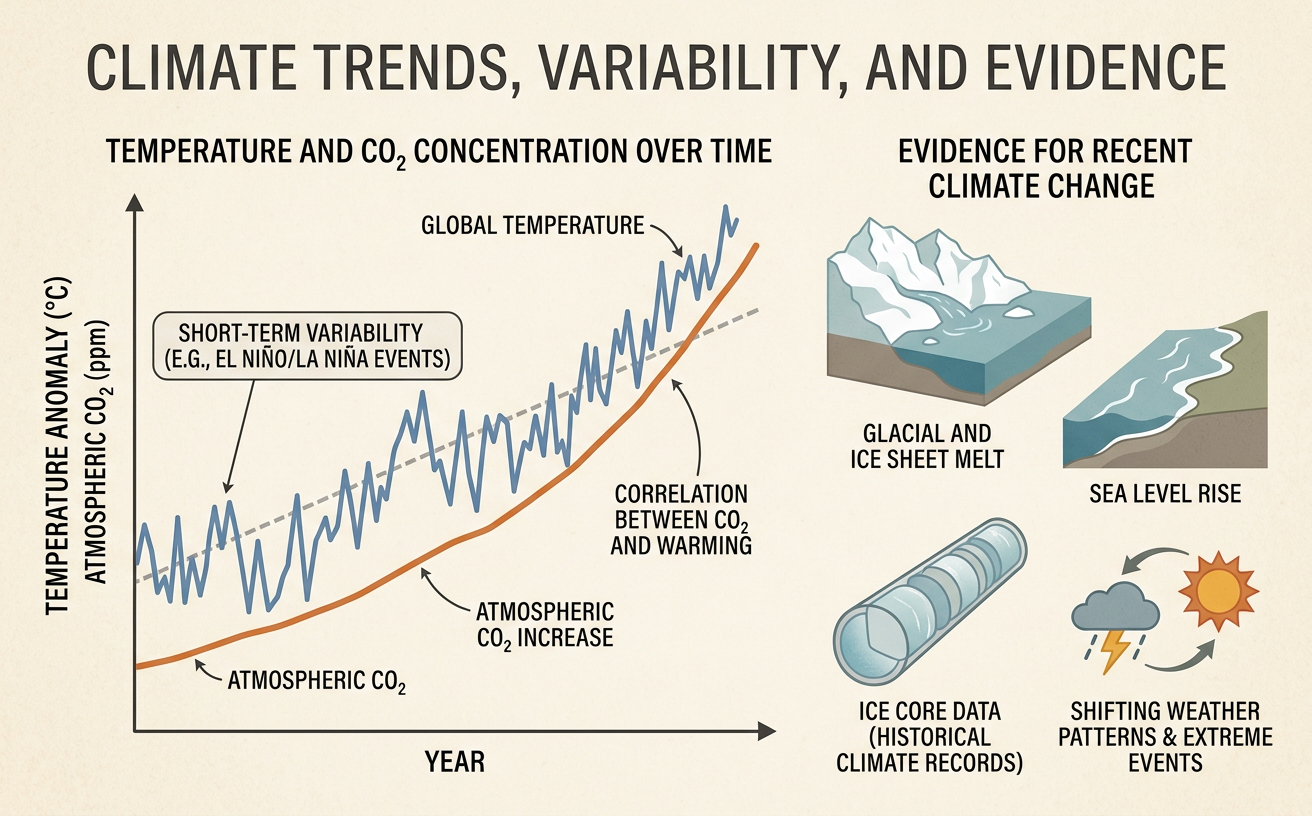
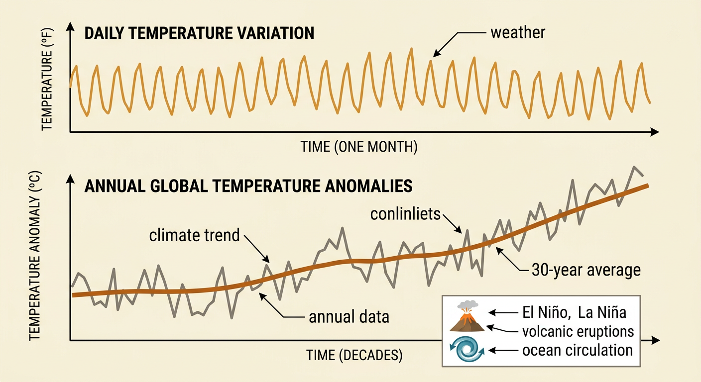
Weather describes atmospheric conditions over hours, days, or weeks, while climate describes patterns measured across several decades or longer. Short-term variability can temporarily push conditions above or below a long-term trend. For example, a city may experience an unusually cold week even while its average winter temperature rises over 30 years. Natural processes such as El Niño, La Niña, volcanic eruptions, and changes in ocean circulation can produce year-to-year temperature variation. To identify a climate trend, scientists use many observations from broad regions and calculate averages over long periods. On a graph, weather or annual climate data may form a jagged line, while a multi-decade average reveals the underlying direction. A single hot year, cold year, storm, or snow event cannot establish or disprove a global climate trend.
Reading Global Temperature Graphs
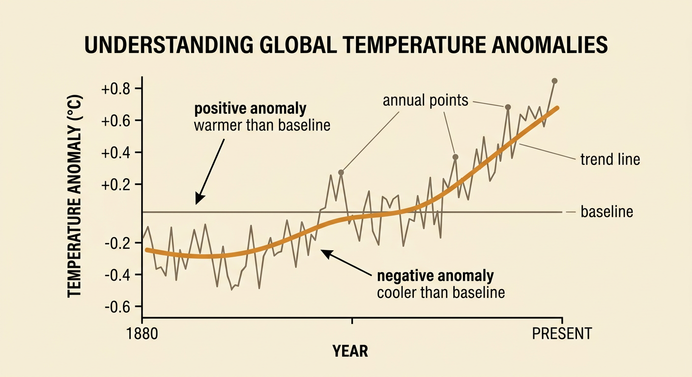
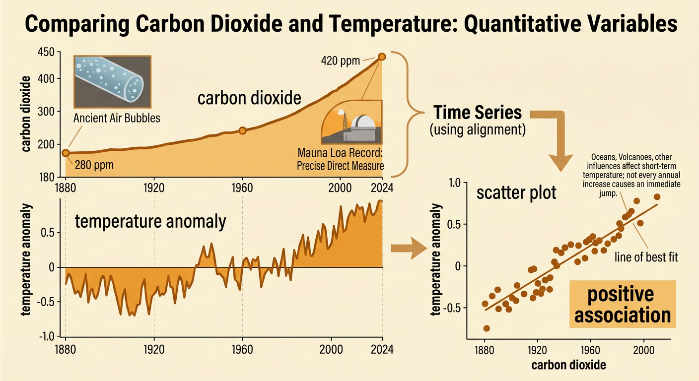
Global temperature graphs often display temperature anomalies rather than absolute temperatures. An anomaly is the difference between an observed temperature and the average for a chosen reference period. If the reference average is 14.0°C and a later annual average is 14.6°C, the anomaly is +0.6°C. Positive anomalies are warmer than the reference average, and negative anomalies are cooler. Read the axes, units, date range, data source, and baseline before interpreting the graph. Annual points show variability, while a trend line or moving average helps reveal sustained change. Different organizations may use different baselines, so their anomaly values can differ even when they show nearly the same trend. Multiple global records based on land stations, ships, buoys, and satellites provide independent evidence that Earth’s average surface temperature has risen, especially since the late twentieth century.
Comparing Carbon Dioxide and Temperature Data
Scientists compare atmospheric carbon dioxide and temperature records to investigate how two quantitative variables are related. Ice cores preserve ancient air bubbles, extending carbon dioxide measurements far into the past, while direct observations such as the Mauna Loa record precisely track recent concentrations. Before large-scale industrialization, atmospheric carbon dioxide was about 280 parts per million; in recent years, it has exceeded 420 parts per million. Over the same broad period, global average temperature has increased, although annual temperatures do not rise by exactly the same amount each year. A time-series comparison shows whether both variables change over time. A scatter plot places carbon dioxide concentration on one axis and temperature anomaly on the other. An upward pattern indicates a positive association. Students should identify the data sources, align dates correctly, and avoid claiming that every short-term temperature change follows carbon dioxide immediately.
Correlation, Causation, and Scientific Mechanisms
Correlation means that two variables change in a related pattern, but correlation alone does not prove that one causes the other. A causal explanation also requires a tested mechanism and evidence that competing explanations do not adequately account for the observations. Carbon dioxide contributes to warming through the greenhouse effect: Earth’s surface emits infrared energy, and carbon dioxide molecules absorb and reemit some of that energy, slowing its escape to space. Laboratory measurements, satellites, surface observations, and atmospheric physics support this mechanism. Climate models provide another test. For example, simulations using only natural influences, such as volcanic eruptions and changes in solar output, do not reproduce the full recent warming trend. Simulations that also include human-produced greenhouse gases more closely match the observed pattern. This agreement does not make models perfect, but it strengthens the causal conclusion when combined with multiple independent lines of evidence.

Forecasting Impacts from Evidence
A scientific forecast extends measured trends using models that represent physical processes and possible future conditions. Climate projections are often presented as ranges because future emissions, natural variability, and some system responses are uncertain. Scientists compare scenarios rather than predicting one exact temperature for one exact year. If greenhouse gas emissions remain high, models generally project faster warming than under a scenario with rapid emissions reductions. Associated impacts can include more frequent extreme heat, changing precipitation patterns, rising sea level, and shifts in ecosystems. These environmental changes can alter land use and trade. For example, repeated coastal flooding may limit housing or farming in low-lying areas, increase demand for protective infrastructure, and disrupt ports that move goods between regions. A strong forecast identifies the observed rate, the scenario used, the projected range, the time period, and the likely impacts without presenting uncertainty as ignorance.

Evidence-Based Exit Explanation
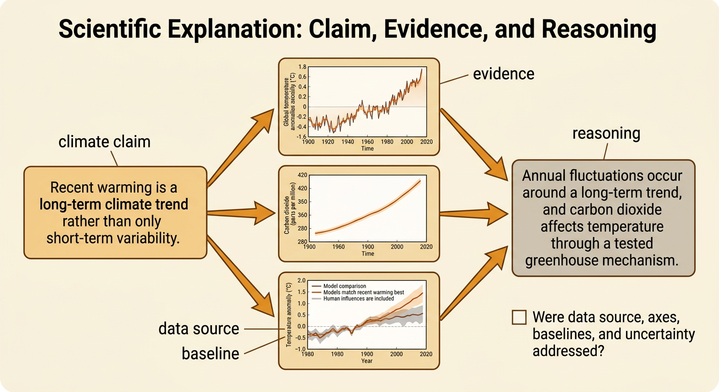
An effective scientific explanation includes a claim, specific evidence, and reasoning that connects the evidence to the claim. A strong claim might state that recent warming is a long-term climate trend rather than only short-term variability. Evidence could include the upward trend in global temperature anomalies, atmospheric carbon dioxide rising from about 280 parts per million before industrialization to more than 420 parts per million in recent years, and models that reproduce recent warming most accurately when human influences are included. The reasoning should explain that annual fluctuations occur around the trend and that carbon dioxide has a well-established greenhouse mechanism. It should also note limits: correlation alone is insufficient, and forecasts are ranges based on stated scenarios. Before submitting an explanation, verify that each number has a source, each graph is interpreted using its axes and baseline, and each conclusion matches the evidence.