Code a Daylight Data Visualizer
Students write a simple program that turns daylight-hour data from different U.S. regions into a bar graph and use the visualization to identify geographic and seasonal patterns.

Illustrations are auto-generated and may be placeholders. They can be refreshed to match the narration.
Explore Daylight Data
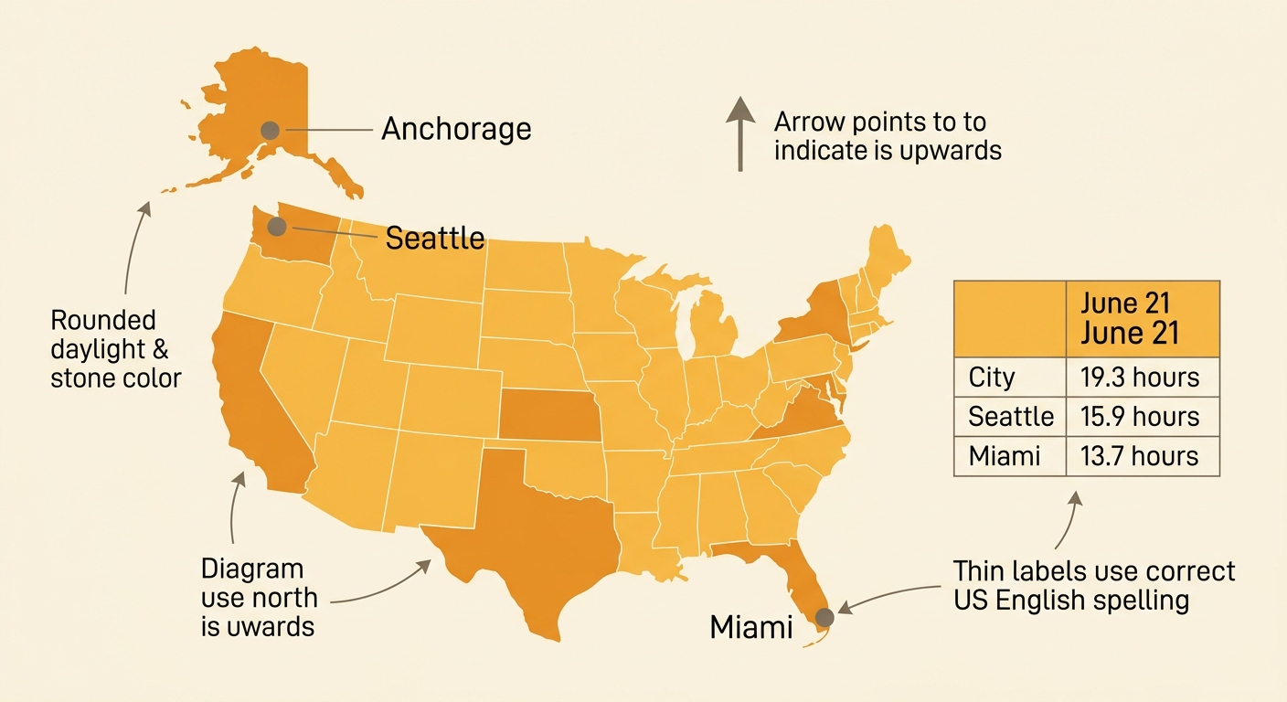
Begin with a digital table of daylight hours and a U.S. map. Daylight means the time between sunrise and sunset. Check the date, location, units, and source before using any value. For example, a rounded sample for June 21 might show about 19.3 hours in Anchorage, Alaska; 15.9 hours in Seattle, Washington; and 13.7 hours in Miami, Florida. Locate each city on the map. Anchorage is farthest north, while Miami is farthest south. On this summer date, the northern location has more daylight. Compare the map and data table instead of relying on only one source. Keep every measurement in decimal hours so the program can compare the values correctly. Remember that 13.5 hours means 13 hours and 30 minutes, not 13 hours and 50 minutes.
Plan the Graphing Algorithm
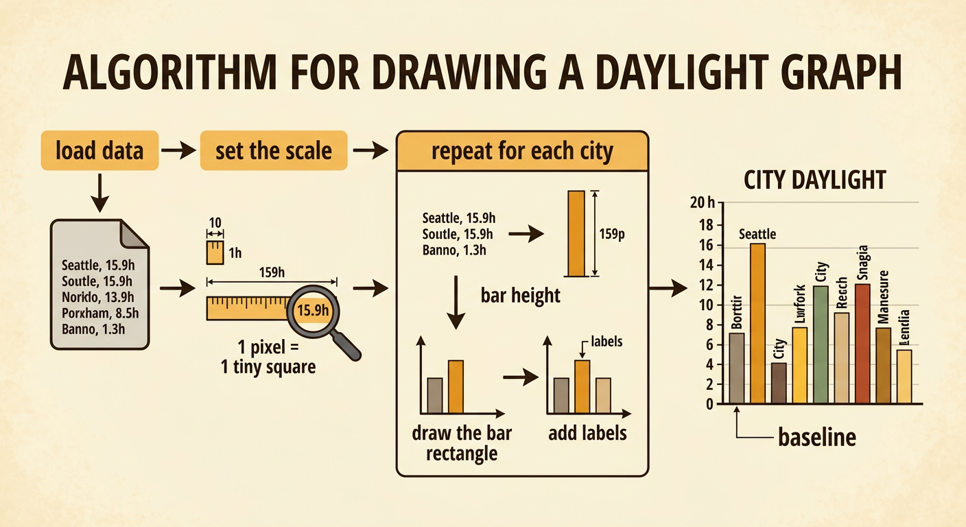
An algorithm is an ordered set of steps for solving a problem. Plan the visualizer before writing code. First, store each city name with its daylight value. Next, choose a scale that changes hours into pixels. If one daylight hour equals 10 pixels, Seattle’s 15.9 hours becomes a 159-pixel bar. Then repeat the same drawing steps for every city: find the bar’s horizontal position, calculate its height, draw the rectangle, and add labels. Use one baseline so all bars start at the same level. Include a title and a vertical axis from 0 to 20 hours. The algorithm can be summarized as: load data, set the scale, repeat for each city, calculate bar height, draw the bar, and label it. A repeated process makes the program shorter and keeps every bar consistent.
Code Bars from Data Values
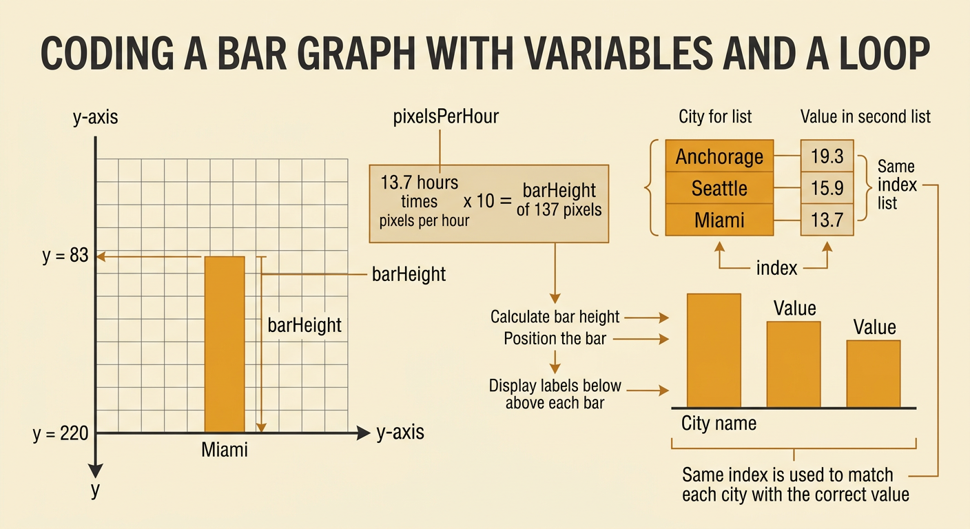
Now translate the plan into code using variables and a loop. Store the names in a list such as Anchorage, Seattle, and Miami, and store the matching values 19.3, 15.9, and 13.7 in the same order. Set pixelsPerHour to 10. During each loop, calculate barHeight as hours times pixelsPerHour. If the graph’s baseline is at y = 220, calculate the top of a bar as 220 minus barHeight because many drawing screens measure downward from the top. For Miami, barHeight is 137 pixels, so the bar begins at y = 83 and ends at the baseline. Move the next bar to the right by adding a fixed spacing amount. Finally, display the city name below the bar and its daylight value above it. Matching names and values by index prevents incorrect labels.
Run and Debug the Visualizer
Run the program and compare its output with the original data table. Debugging means finding and fixing problems in code. Check one bar at a time. With a scale of 10 pixels per hour, Anchorage should be 193 pixels tall, Seattle should be 159 pixels tall, and Miami should be 137 pixels tall. If every bar is only about 19 pixels tall, the scale may be missing. If bars grow downward below the baseline, the program may be using the baseline as the top coordinate. Also check that city names match the correct data values and that bars do not overlap. Use a simple test value, such as 10 hours, which should create a 100-pixel bar. Change only one part of the code at a time, run it again, and record whether the change solved the problem.

Compare Regional Patterns
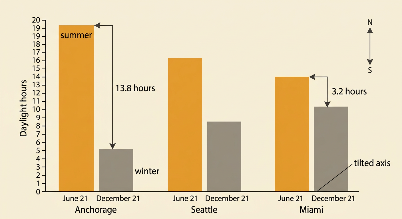
Use the finished graph to identify geographic and seasonal patterns. Compare the June 21 bars with rounded December 21 values: Anchorage about 5.5 hours, Seattle about 8.5 hours, and Miami about 10.5 hours. Anchorage changes by about 13.8 hours between the two dates, while Miami changes by about 3.2 hours. The graph reveals that locations farther north generally have longer summer days and shorter winter days than locations farther south. This pattern is related to Earth’s tilted axis and its orbit around the Sun. Do not conclude that northern cities always have more daylight; the result depends on the season. Use the map to explain where each city is located and use the graph to support your claim with evidence. For example, Anchorage’s bars show both the longest sampled summer day and the shortest sampled winter day.