Comparing Data Distributions Using Center and Spread
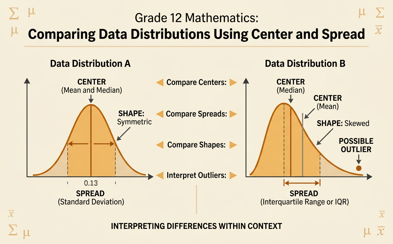
Students compare two quantitative data distributions by interpreting differences in center, variability, shape, and possible outliers within context.
Illustrations are auto-generated and may be placeholders. They can be refreshed to match the narration.
Reviewing Measures of Center and Spread
Measures of center describe a typical value, while measures of spread describe how much the values vary. The mean is the sum divided by the number of observations, and the median is the middle value in order. Common measures of spread include range, interquartile range, and standard deviation. Compare Data Set A: 68, 72, 74, 76, 80, with Data Set B: 60, 70, 74, 78, 88. Both sets have a mean and median of 74, so their centers are identical. However, Set A has a range of 12 and an interquartile range of 8, while Set B has a range of 28 and an interquartile range of 18. Therefore, Set B is much more variable. Reporting both center and spread gives a more complete comparison than reporting either measure alone.

Examining Distribution Shape
The shape of a distribution affects which statistics best summarize it. A symmetric distribution has similar patterns on both sides of its center. A skewed distribution has a longer tail on one side. A distribution may also have clusters, gaps, or possible outliers. Consider the values 60, 70, 75, 80, 85, 90, and 100. They are symmetric around 80, so the mean and median are both 80. Now consider incomes of 35, 38, 40, 42, 45, 48, and 120 thousand dollars. The value 120 creates a long right tail. The median is 42 thousand dollars, but the mean is about 52.6 thousand dollars. Because the unusually high income pulls the mean upward, the median better represents a typical income. Always examine shape before choosing summary statistics.

Selecting Appropriate Statistics
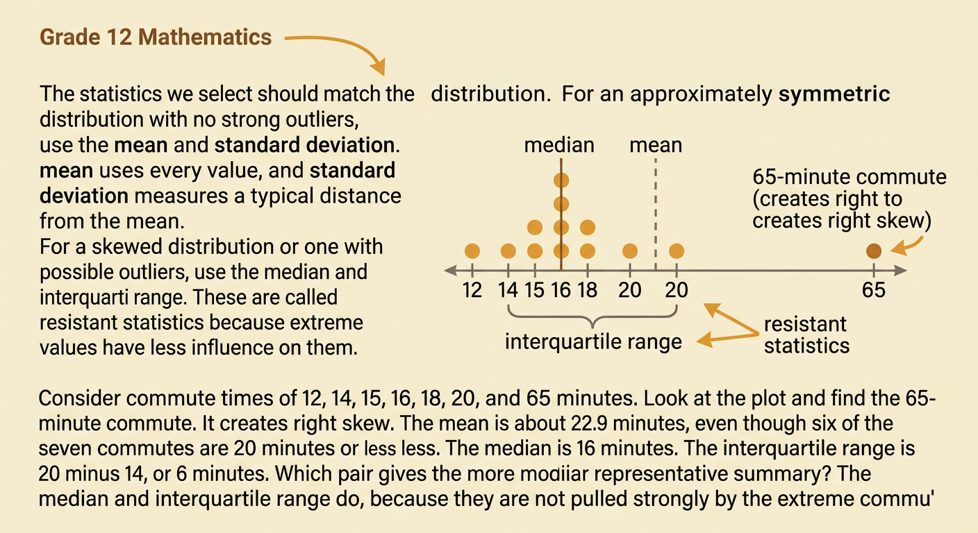
Use the mean and standard deviation when a distribution is approximately symmetric and has no strong outliers. The mean uses every value, and standard deviation measures typical distance from the mean. Use the median and interquartile range when a distribution is skewed or contains possible outliers. These resistant statistics are less affected by extreme values. For example, suppose commute times are 12, 14, 15, 16, 18, 20, and 65 minutes. The 65-minute commute creates right skew. The mean is about 22.9 minutes, which is higher than most observations. The median is 16 minutes, and the interquartile range is 20 minus 14, or 6 minutes. In this case, the median and interquartile range give a more representative summary. The selected statistics should match the distribution’s shape rather than being chosen automatically.
Comparing Data Sets
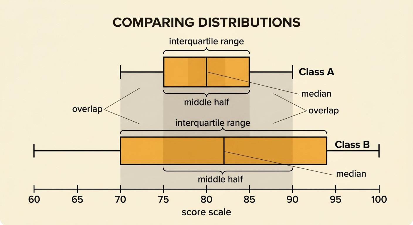
To compare data sets, describe differences in center, spread, shape, and unusual features using the same appropriate statistics. Suppose Class A scores are 70, 74, 76, 78, 80, 82, 84, 86, and 90. Its median is 80, and its interquartile range is 10. Class B scores are 60, 68, 72, 78, 82, 88, 92, 96, and 100. Its median is 82, and its interquartile range is 24. Class B has a slightly higher typical score, but its scores are much less consistent. Class A’s middle half lies from 75 to 85, while Class B’s middle half lies from 70 to 94. The overlapping distributions show that not every Class B student scored above every Class A student. A useful comparison states both the size and direction of differences without making claims unsupported by the data.
Interpreting Differences in Context
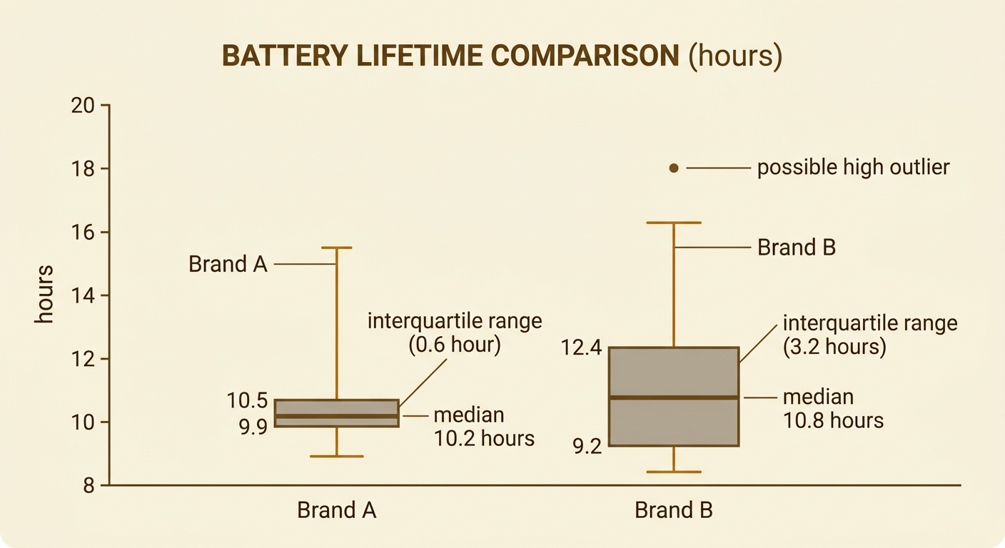
Statistical differences should be explained using the meaning and units of the data. Suppose Brand A battery lifetimes are 9.6, 9.9, 10.0, 10.2, 10.3, 10.5, and 10.8 hours. Brand B lifetimes are 8.8, 9.2, 9.6, 10.8, 12.0, 12.4, and 18.0 hours. Brand A has a median of 10.2 hours and an interquartile range of 0.6 hour. Brand B has a median of 10.8 hours and an interquartile range of 3.2 hours, with 18.0 hours identified as a possible high outlier by the 1.5-interquartile-range rule. In context, Brand B typically lasts about 0.6 hour longer, but its performance is less predictable. Brand A may be preferable when consistency matters. Statistics describe the observed samples, so conclusions about all batteries require representative sampling and an appropriate study design.