
Designing an Accessible App Interface
Students design, test, and improve a simple app interface so that users with different needs can navigate it easily.

Illustrations are auto-generated and may be placeholders. They can be refreshed to match the narration.
What Makes an Interface Accessible?
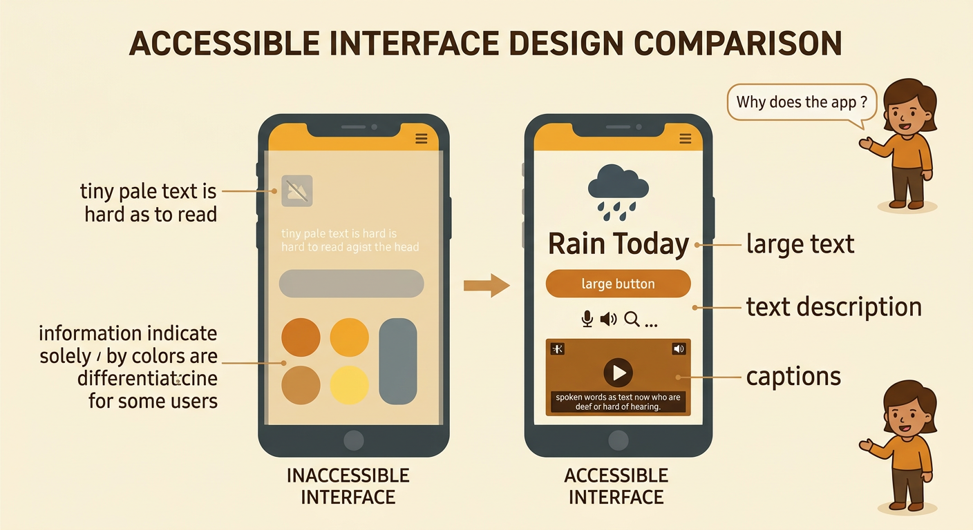
An accessible interface lets people with different abilities and needs use an app successfully. Text should be large enough to read, and it should stand out clearly from the background. Buttons need simple names, recognizable symbols, and enough space for users to tap them accurately. Important information should not depend only on color because some users cannot easily distinguish certain colors. Images should have text descriptions that screen readers can read aloud. Videos should include captions for users who are deaf or hard of hearing. For example, an accessible weather app might show a blue rain symbol, the words “Rain Today,” and a spoken description. Providing information in several forms helps more people understand it and participate equally.
Identify User Needs
Before designing an app, learn who may use it and what they need. Users can have differences in vision, hearing, movement, reading ability, language experience, attention, or access to technology. Ask respectful questions instead of making assumptions. You might use a short survey, interview classmates, or observe volunteers completing a task. Protect people’s privacy and invite everyone to share ideas fairly. Suppose your class is creating an app for reporting problems in a community park. One user may need spoken directions, another may need buttons that work without precise tapping, and another may need plain language. Turn these needs into design criteria, such as “Every button has a text label” or “A report can be submitted using only a keyboard.” Also record constraints, including time, screen size, and available tools.

Sketch the App Screen
A screen sketch, or wireframe, shows where interface elements will go before anyone builds the app. Begin with the screen’s main purpose and place the most important action where it is easy to find. Use a clear title, short instructions, familiar icons with text labels, and buttons with enough space around them. Keep the order predictable from top to bottom so a keyboard user or screen reader can move through it logically. For example, a park reporting screen could include the title “Report a Park Problem,” a problem-type menu, a description box, an optional photo button, and a large “Submit Report” button. Add notes that explain color contrast, image descriptions, or spoken feedback. Compare multiple sketches against the user needs, criteria, and constraints before choosing one to test.

Test Navigation and Readability
Testing reveals whether an interface works for real users rather than only for its designer. Give each tester the same task, such as “Report a broken swing and submit the report.” Do not explain where to click; observe the path the tester chooses. Record whether the task is completed, how long it takes, where errors occur, and what the tester says. Check readability by examining text size, spacing, plain language, and contrast between text and background. Test navigation with touch, a keyboard, and a screen reader when those tools are available. For example, if three testers overlook a pale “Next” button, the contrast or placement may be weak. Use a consistent scoring chart to compare competing designs fairly, such as task success, number of errors, readability rating, and compliance with each design criterion.

Use Feedback to Revise
Revision means using evidence to improve a design, not simply changing what one person dislikes. Sort feedback into patterns, then connect each pattern to a criterion or user need. Give priority to barriers that prevent people from completing the task. For example, if several testers cannot find the submit button, move it to a predictable location, increase its contrast, and label it clearly. If one requested change conflicts with another need, compare possible solutions and explain the trade-off. A larger button may improve tapping but leave less room for instructions, so the team might shorten the instructions without removing important meaning. Retest the revised screen using the same task and measures. When presenting the final design, include before-and-after visuals, test data, and user feedback to clarify why the changes support equal participation in the school or community.
