
Designing an Accessible User Interface
Students evaluate a simple digital interface against accessibility criteria and propose evidence-based design improvements for users with varied needs.
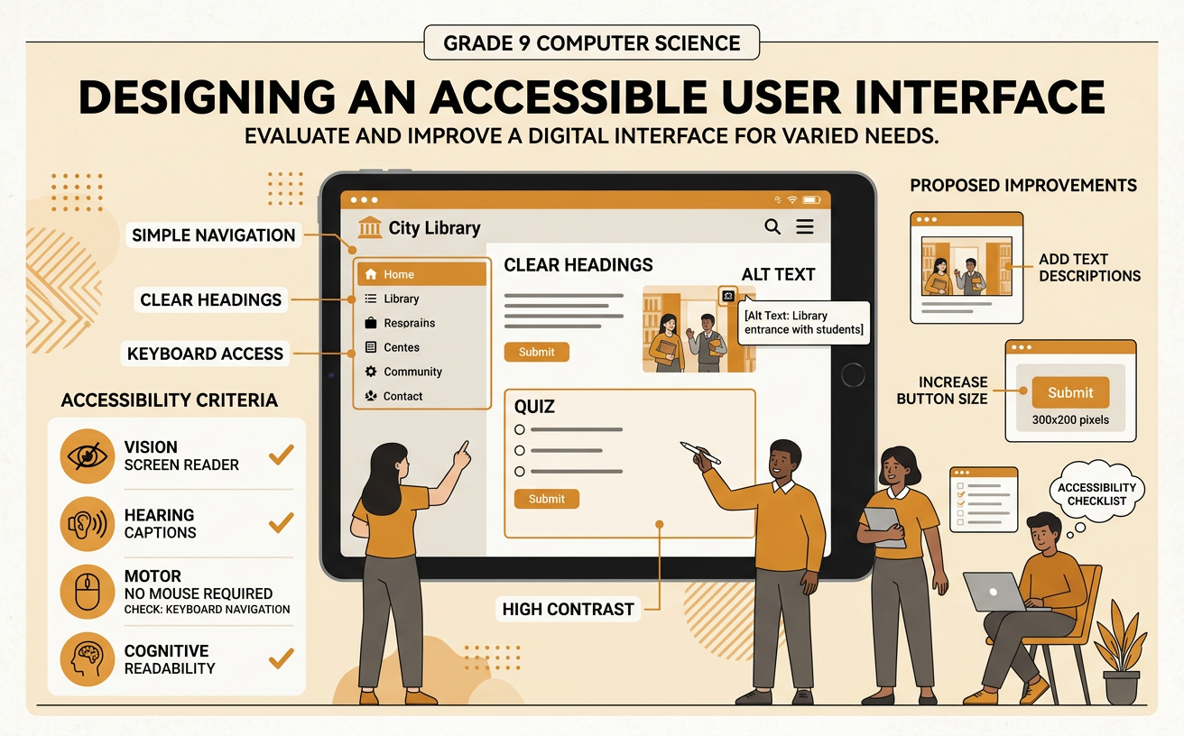
Illustrations are auto-generated and may be placeholders. They can be refreshed to match the narration.
Accessibility and Inclusive Design
Accessibility means designing technology so people with disabilities can perceive, understand, navigate, and use it. Inclusive design considers a wide range of users from the beginning rather than adding fixes later. People may have visual, hearing, mobility, speech, or cognitive disabilities, and needs can also change because of injury, aging, noise, glare, or a slow internet connection. For example, captions help a student who is deaf, but they also help anyone watching a school video in a noisy cafeteria. Laws and public policies may require schools and government services to provide equitable digital access. These requirements affect communities by helping more people participate in education, employment, and civic life. An accessible interface gives users multiple ways to receive information and complete important tasks without unnecessary barriers.
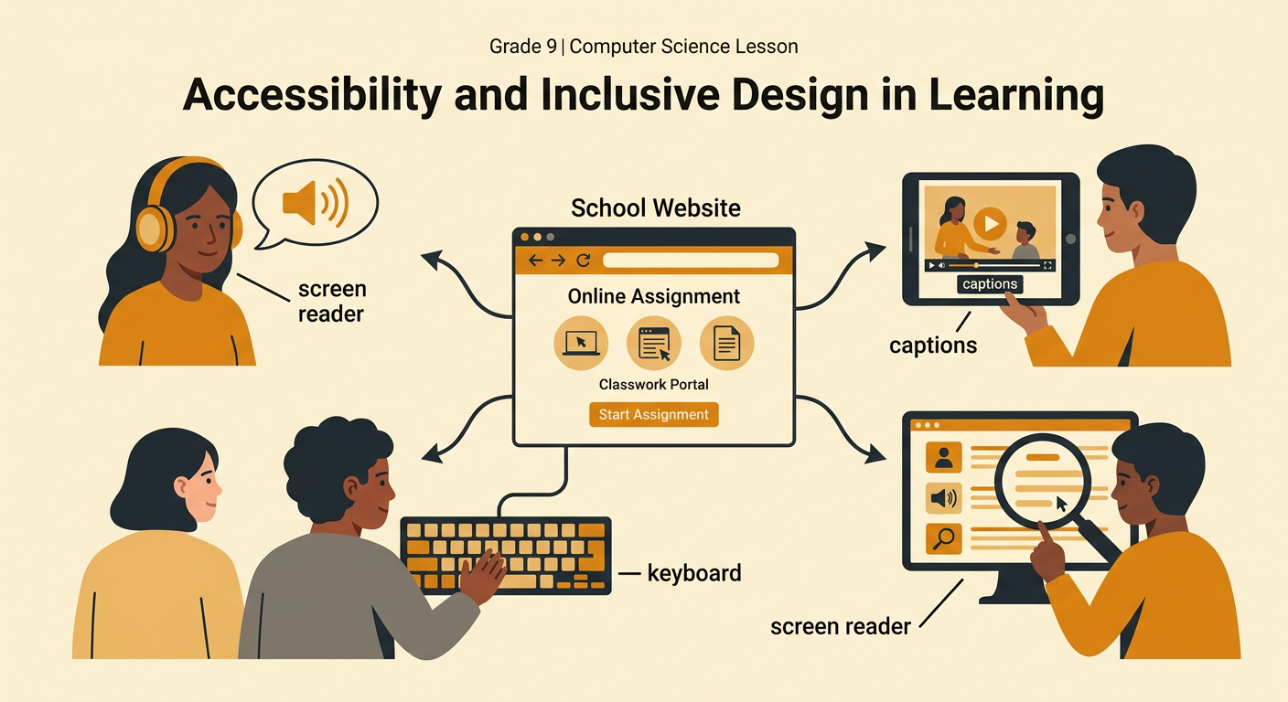
Identifying User Barriers
A user barrier is a design feature that makes a task difficult or impossible for some people. To identify barriers, follow a consistent procedure: choose a task, describe the user’s needs, attempt each step, record where problems occur, and explain the effect. Consider vision, hearing, motor control, reading, attention, device type, and internet speed. For example, imagine a student submitting an assignment on a form with pale gray text, unlabeled input boxes, and a tiny Submit button. Low contrast may make instructions hard to read. Missing labels may prevent a screen reader from identifying each field. A small button may be difficult for someone with limited hand control to select. Recording the exact step and result produces stronger evidence than simply saying the interface is “hard to use.”

Applying Accessibility Criteria
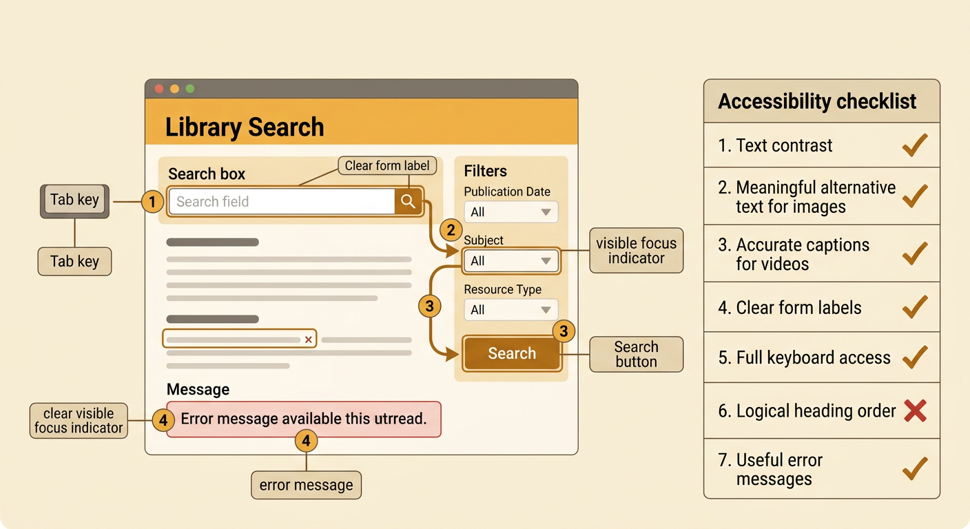
Accessibility criteria turn general goals into features that can be checked. Begin by prioritizing criteria that are necessary for completing the main task. Check whether text has sufficient contrast, images have meaningful alternative text, videos include accurate captions, form controls have clear labels, and every function works with a keyboard. Also check whether headings follow a logical order and error messages explain how to correct a problem. For example, test a library search page without using a mouse. Press the Tab key to move through links, the search box, filters, and the Search button. A visible focus indicator should show the selected control, and the order should match the page’s layout. Record pass-or-fail results and supporting observations. Using the same criteria for every design option makes the evaluation more consistent and evidence based.
Evaluating Design Trade-Offs
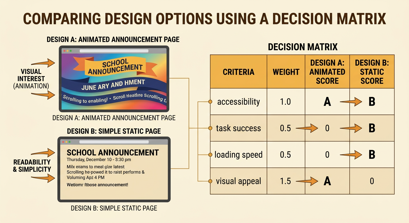
A trade-off occurs when improving one design goal affects another goal, such as cost, speed, appearance, or development time. Teams should compare options using prioritized criteria rather than choosing only the most attractive design. Accessibility requirements that determine whether users can complete the main task should receive high priority. Suppose a school app uses an animated background behind announcements. The animation may create visual interest, but it can reduce readability, distract some users, consume data, and slow older devices. Removing it may make the page less decorative while improving contrast, focus, and performance. A team could compare both versions in a decision matrix using accessibility, task success, loading speed, cost, and visual appeal. The strongest choice is the one best supported by evidence and community needs, not necessarily the option that receives the highest score in every category.
Proposing Interface Improvements
A strong improvement proposal names the barrier, identifies the affected users, recommends a specific change, and supports the change with test evidence. It should also explain how success will be measured. For example, testing may show that keyboard users cannot open a website’s main menu because it responds only to a mouse click. The proposal could recommend using a keyboard-operable menu button with a visible focus indicator and a clear accessible name. The revised menu should open with Enter or Space, close with Escape, and allow users to move through options in a logical order. The team can retest the same task and compare completion rates, errors, and user feedback. Sharing findings with school leaders or a student advisory group is a civic action that can promote equitable access. Effective proposals connect technical details to real effects on people and communities.
