
Detecting Misleading Data Visualizations
Students analyze digital charts and their data sources to identify misleading design choices, evaluate credibility, and redesign a visualization to communicate information accurately.
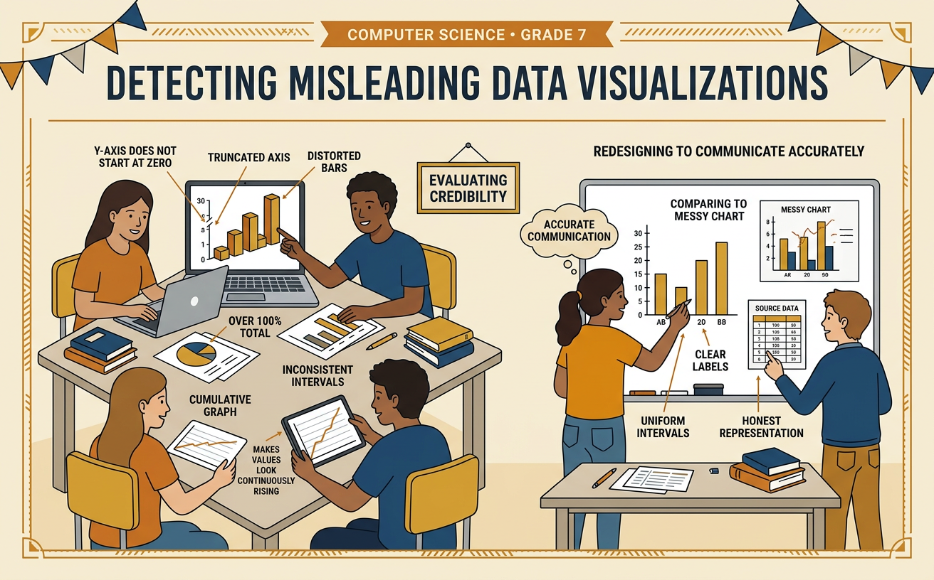
Illustrations are auto-generated and may be placeholders. They can be refreshed to match the narration.
How Computers Represent Data
Computers store data as values organized in structures such as tables. In a table, each row may represent one person or event, while each column represents a variable. Visualization software connects those values to visual features such as position, length, color, or size. For example, a table might show that 12 students chose biking, 18 chose walking, and 30 chose riding in a vehicle as their main way to school. A bar chart can represent each count with a bar of matching length. The computer draws exactly what its instructions specify, even if those instructions create a confusing chart. It does not automatically know whether the title, scale, or comparison is fair. Readers must connect the visual marks to the underlying values and check whether the display represents them accurately.

Inspect the Data Source
Before trusting a chart, inspect where its data came from and why it was collected. Look for the author, date, sample size, selection method, exact question, and connection to the claim. A random sample gives members of a population a fair chance of being selected, so it can support stronger inferences. Suppose a post claims, “Students dislike the new lunch menu,” based on a survey of 20 members of a cooking club. That group may not represent all 800 students. A survey of 120 students randomly selected from every grade would be more useful, although it would still have uncertainty. Also consider the source’s purpose. A food company advertisement may use real numbers but highlight results that help sell its products. A credible judgment explains both the evidence and its limits instead of repeating an unsupported claim.

Spot Misleading Chart Features
A chart can use correct numbers and still create a false impression. Check whether the axes begin at zero, use equal intervals, and display clear units. Also watch for missing categories, cherry-picked dates, oversized pictures, unnecessary three-dimensional effects, and colors that imply meaning without explanation. Imagine that approval increased from 78% to 82%. On a bar chart whose vertical axis runs only from 77% to 83%, the 82% bar may appear several times taller than the 78% bar. The actual change is only 4 percentage points. A zero-based scale shows that the values are fairly close. A shortened axis is not always wrong, especially when small differences matter, but it must be clearly marked and interpreted carefully. Compare the chart’s dramatic appearance with the numerical size of the change before accepting its message.

Compare Visualization Designs
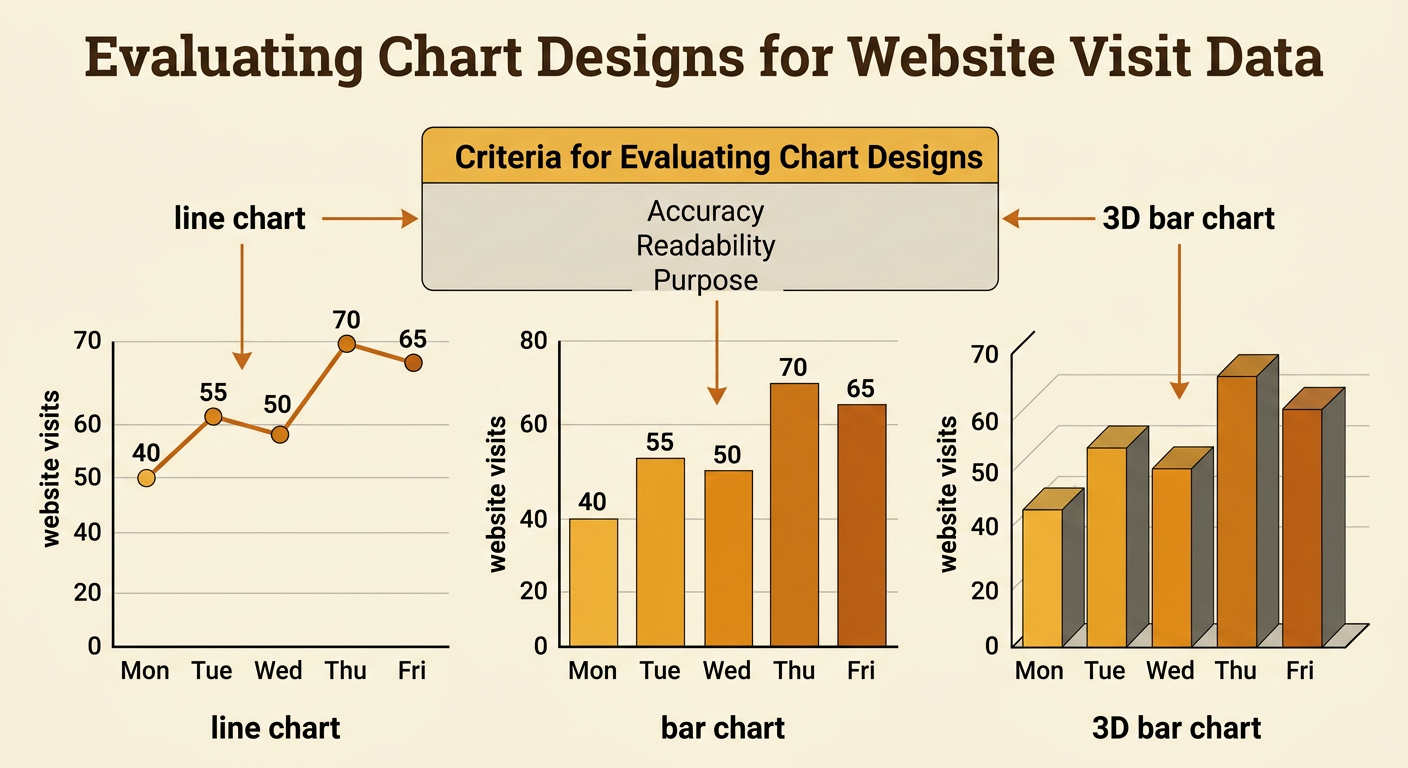
Different designs can represent the same data, but some communicate a particular purpose more accurately. Compare designs using criteria such as accuracy, readability, clear labeling, accessibility, and fit for the question. Suppose a class records website visits for five consecutive days: 40, 55, 50, 70, and 65. A line chart clearly shows how visits changed over time because the connected points emphasize sequence. A bar chart also represents the values accurately and makes individual daily amounts easy to compare. A three-dimensional bar chart adds perspective, which can make equal values appear unequal and may hide parts of bars. Test each design with the same data and ask classmates what conclusion they draw. Their responses are test data. If more readers identify the trend correctly with the line chart, that evidence supports choosing it for a report about change over time.
Redesign and Justify
To redesign a misleading visualization, first preserve the original data and identify the claim the chart should support. Then select a chart type, scale, labels, and colors that match the intended use without exaggeration. For example, suppose a three-dimensional pie chart reports cafeteria ratings of excellent 25%, good 40%, fair 20%, and poor 15%. Perspective may make the front slice look larger than its value. Redesign it as a horizontal bar chart with a zero-based percentage axis, equal bar widths, direct value labels, and one neutral color. Include the survey date, sample size, selection method, and question near the chart. Justify each choice with evidence: bar lengths are easier to compare, the zero baseline preserves proportional differences, and direct labels reduce guessing. Finally, ask several readers to interpret the revision and use their feedback to improve it.
