Graphing Data from a Representative Sample
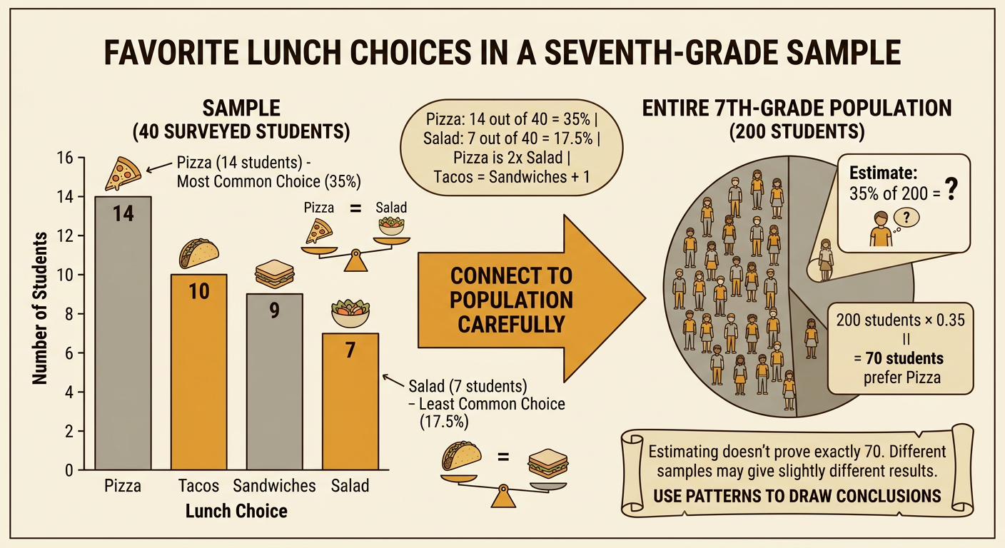
Students organize categorical data from a representative sample and create a labeled bar or circle graph to communicate patterns and support conclusions about a larger population.

Illustrations are auto-generated and may be placeholders. They can be refreshed to match the narration.
Population and Sample
A population is the entire group you want to learn about. A sample is the smaller group from which data are actually collected. Suppose a school has 200 seventh-grade students in four equal-sized homerooms. To study favorite lunch choices, the researcher randomly selects 10 students from each homeroom, creating a sample of 40 students. Selecting students from every homeroom helps the sample represent the whole grade. In contrast, surveying only students who are eating in the cafeteria on pizza day could favor one answer and produce a biased sample. A representative sample reflects important features of the population and gives every type of student a reasonable chance of being included. Conclusions about the population are more trustworthy when the sample is selected fairly and is large enough to show meaningful patterns.

Organize Survey Data
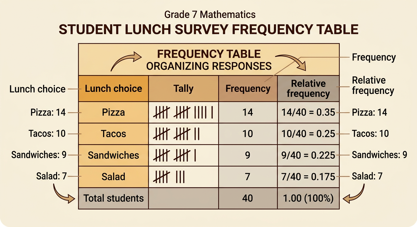
Categorical data place responses into named groups rather than measuring them on a number line. After surveying 40 students about their favorite lunch, record each response with a tally mark. Then count the tallies to find the frequency for each category. In this sample, 14 students chose pizza, 10 chose tacos, 9 chose sandwiches, and 7 chose salad. Check that the frequencies add to the sample size: 14 + 10 + 9 + 7 = 40. You can also calculate relative frequencies by dividing each frequency by 40. Pizza represents 35%, tacos 25%, sandwiches 22.5%, and salad 17.5% of the sample. A clear frequency table makes mistakes easier to notice and provides the values needed to create an accurate graph.
Choose an Appropriate Graph
Choose a graph based on the comparison you want readers to make. A bar graph is useful for comparing the frequencies of separate categories. Its equal-width bars are separated by spaces because lunch choices are categories, not connected numerical intervals. A circle graph is useful for showing how each category forms part of the whole sample. For the lunch survey, both graphs are appropriate because each student selected exactly one choice. A bar graph makes it especially easy to compare sandwiches with tacos, whose frequencies differ by only one student. A circle graph makes it easy to see that pizza accounts for 35% of the sample. Do not use a line graph because the categories do not represent change over time or another continuous numerical sequence.

Set the Scale and Labels
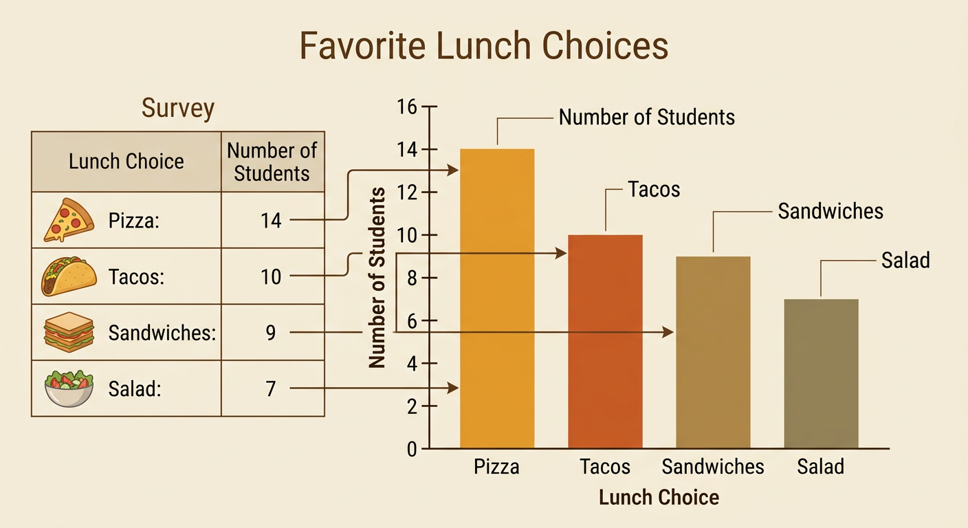
Before drawing a bar graph, plan a scale that includes every frequency and uses equal intervals. The largest lunch frequency is 14, so a vertical scale from 0 to 16 in intervals of 2 works well. The horizontal axis should be labeled “Lunch Choice,” and the vertical axis should be labeled “Number of Students.” Write the category names below the horizontal axis and give the graph a specific title, such as “Favorite Lunch Choices in a Sample of 40 Students.” Begin the numerical scale at 0 so the bar lengths are not visually misleading. Keep every interval the same physical size. If you create a circle graph instead, label each sector with its category and percentage; circle graphs do not use axes or a numerical scale.

Create the Data Graph
Use the organized frequency table to draw one bar for each lunch category. All bars should have the same width, and equal spaces should separate them. Starting at 0, draw the pizza bar to 14, the tacos bar to 10, the sandwiches bar to 9, and the salad bar to 7. Use the vertical scale rather than estimating the heights by eye. Writing each frequency above its bar allows readers to check values quickly. Review the completed graph by matching every bar to the table and checking the title, axis labels, category labels, and scale. Decorative colors may help distinguish categories, but they should not change the apparent width or height of any bar. Accuracy matters because readers will use the graph to compare categories and form conclusions.
Interpret the Results
Interpret a graph by describing patterns and connecting them to the population carefully. Pizza is the most common choice in the sample, with 14 of 40 students, or 35%. Salad is the least common choice, with 7 students, or 17.5%. Pizza received twice as many responses as salad, and tacos received one more response than sandwiches. If the sample represents all 200 seventh-grade students, the survey suggests that about 35% of the population may prefer pizza. Multiplying 200 by 0.35 gives an estimate of about 70 students. This is an estimate, not proof that exactly 70 students prefer pizza. Another representative sample could produce slightly different results. The conclusion is valid only to the extent that the 40 surveyed students fairly represent the full seventh-grade population.