Mapping the Digital Divide with Code
Students use a short data set and a visualization program to map broadband access, identify geographic patterns, and evaluate whether the map clearly communicates community needs.

Illustrations are auto-generated and may be placeholders. They can be refreshed to match the narration.
Define the Mapping Goal
Before writing code, define what the map should help people understand. The goal is to show where households have less broadband access and where community support may be most needed. Useful criteria include accurate county locations, readable colors, a clear legend, and data values that can be compared. Constraints may include a small data set, limited class time, missing neighborhood-level information, and colors that must remain understandable for people with color-vision differences. For example, students might set this goal: “Create a county map that allows a community planner to identify areas where fewer than 65% of households have broadband.” This goal focuses the design on people as well as technology. It also provides a test: if a viewer cannot quickly identify those counties, the map needs improvement.

Inspect the Broadband Data
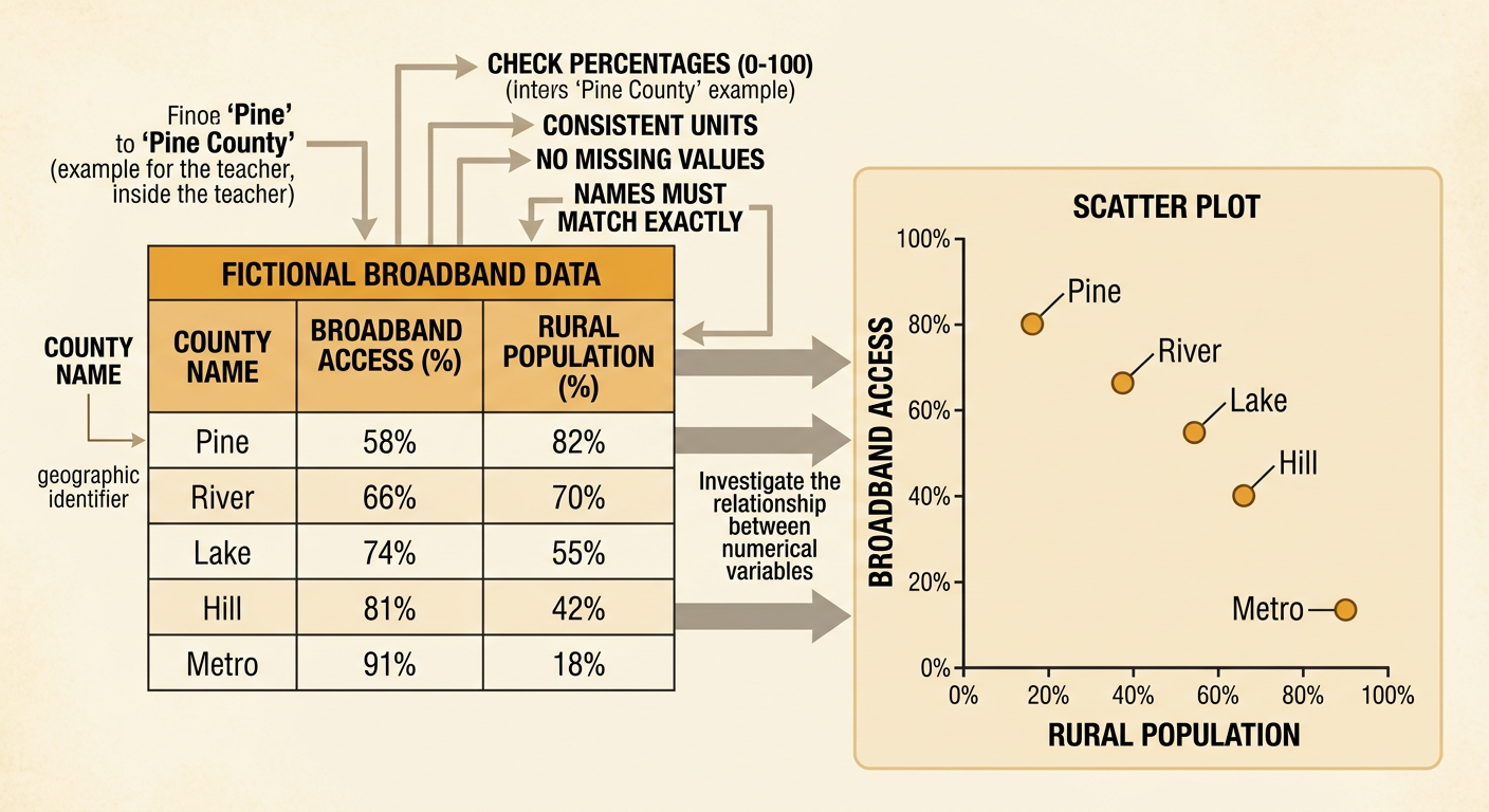
Examine the data before mapping it. In a fictional five-county data set, Pine County has 58% broadband access and an 82% rural population; River has 66% access and 70% rural; Lake has 74% access and 55% rural; Hill has 81% access and 42% rural; and Metro has 91% access and 18% rural. These two numerical variables can be displayed in a scatter plot to investigate their association. County name is the geographic identifier that connects each row to a map shape. Check that percentages are between 0 and 100, county names match the map file, units are consistent, and no values are missing. For example, “Pine” in the table will not automatically match “Pine County” in the map file unless the program corrects the names.
Code Colors and Data Ranges
A choropleth map assigns a color to each area according to a numerical value. Choose ranges that support the mapping goal and cover every possible value without overlap. One accessible scheme uses orange for 0% through 64% broadband access, gold for 65% through 79%, and blue for 80% through 100%. Missing data should appear gray rather than being treated as zero. In code, the program can test each value in order: if access is less than 65, use orange; otherwise, if it is less than 80, use gold; otherwise, use blue. Pine County would be orange, River and Lake would be gold, and Hill and Metro would be blue. A visible legend must use exactly the same boundaries and colors as the code so viewers do not misread the map.

Generate the Digital Map
To generate the map, the program loads a geographic file containing county boundaries and a data file containing broadband values. Each county needs a shared identifier, such as a county name or code. The program joins the two files, loops through the county shapes, selects a color from the access value, and draws each polygon. It then adds a title, legend, source, date, and north arrow. For example, when the loop reaches Pine County, it finds the value 58, selects orange, and fills Pine County’s boundary. If a county shape has no matching data row, the program should color it gray and report the mismatch. Interactive tools can also display a tooltip containing the county name, access percentage, rural percentage, and number of households when a viewer points to an area.

Interpret Geographic Patterns
Read the map by looking for clusters, contrasts, and possible relationships between variables. Suppose Pine is in the north, River is in the west, Lake is central, Hill is east, and Metro is south. The map would show lower access in the north and west and higher access in the east and south. The scatter plot adds another pattern: counties with larger rural percentages generally have lower broadband access. Pine has 82% rural population and 58% access, while Metro has 18% rural population and 91% access. This suggests a negative association between the two variables in this small data set. However, association does not prove that rural location causes low access. Terrain, income, provider costs, infrastructure, and local policies could also matter. Because only five counties are included, the pattern should be treated as evidence for further investigation, not a final conclusion.

Evaluate Clarity and Limitations
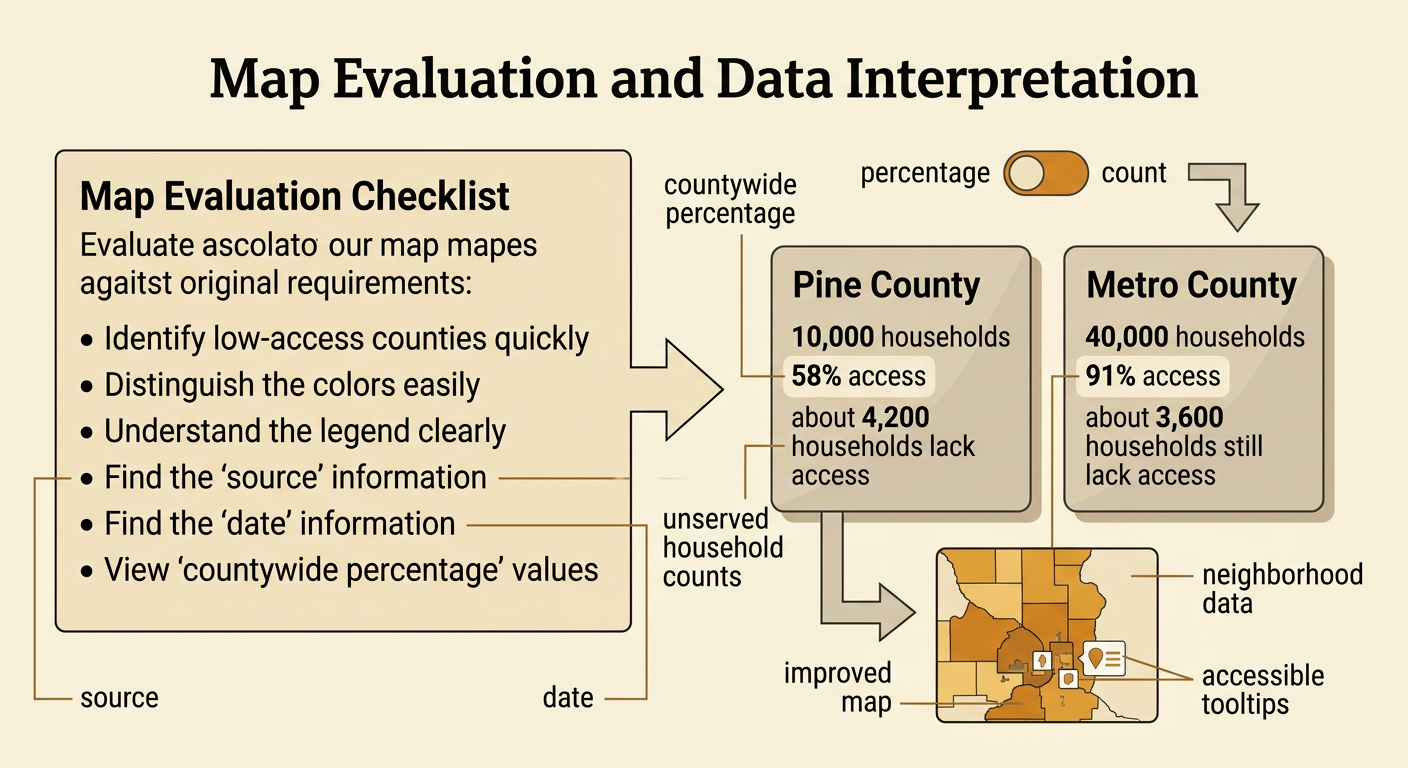
Evaluate the finished map against the original criteria and constraints. Ask whether viewers can identify low-access counties quickly, distinguish every color, understand the legend, and find the data source and date. Also examine what the map leaves out. A countywide percentage hides differences among neighborhoods, and large counties appear visually important even when they contain fewer people. Counts can tell a different story from percentages. For example, if Pine has 10,000 households, its 58% access rate means about 4,200 households lack access. Metro’s 40,000 households and 91% access rate still leave about 3,600 households without access. An improved map could offer a second view showing unserved household counts, add neighborhood data, and include accessible tooltips or patterns. The map communicates evidence, but it should not label communities as deficient or imply that one solution will meet every community’s needs.