
Modeling Disease Spread with a Computer Simulation
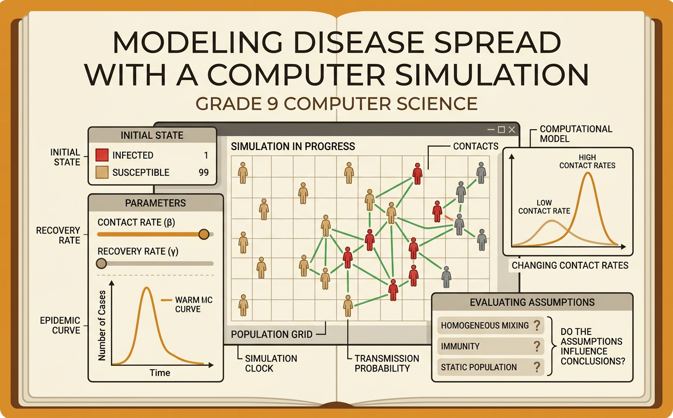
Students use a simple computational simulation to explore how changing contact rates affects disease spread and evaluate how model assumptions influence conclusions.
Illustrations are auto-generated and may be placeholders. They can be refreshed to match the narration.
Identify the Simulation Variables
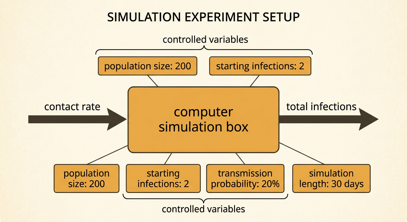
A simulation uses variables to represent parts of a real system. In this disease-spread model, contact rate is the independent variable because students deliberately change it. Contact rate means the average number of close interactions each person has during one simulated day. The dependent variable is the total number of people infected because it may change in response to contact rate. Controlled variables should remain constant, including population size, starting infections, transmission probability, and number of simulated days. For example, students might model 200 people for 30 days, begin with 2 infected people, and use a 20 percent transmission probability. They could compare contact rates of 2, 4, 6, and 8 contacts per person per day while keeping every other setting unchanged.
Define Rules and Assumptions
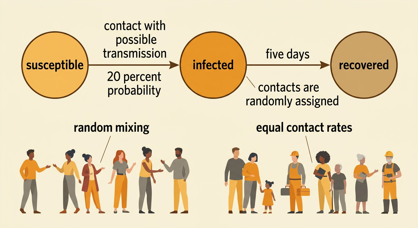
Simulation rules tell the computer what happens at each step. One simple model classifies every simulated person as susceptible, infected, or recovered. During each simulated day, people are assigned contacts. If an infected person meets a susceptible person, the susceptible person has a fixed chance of becoming infected. An infected person might recover after five days and then be protected from reinfection. For example, if the transmission probability is 20 percent, a contact does not guarantee infection; the computer uses a random process to determine the outcome. The model also makes assumptions, such as equal contact rates and random mixing across the population. These assumptions simplify reality. Students should record them because conclusions apply to the modeled population, not automatically to every real community.
Run Multiple Trials
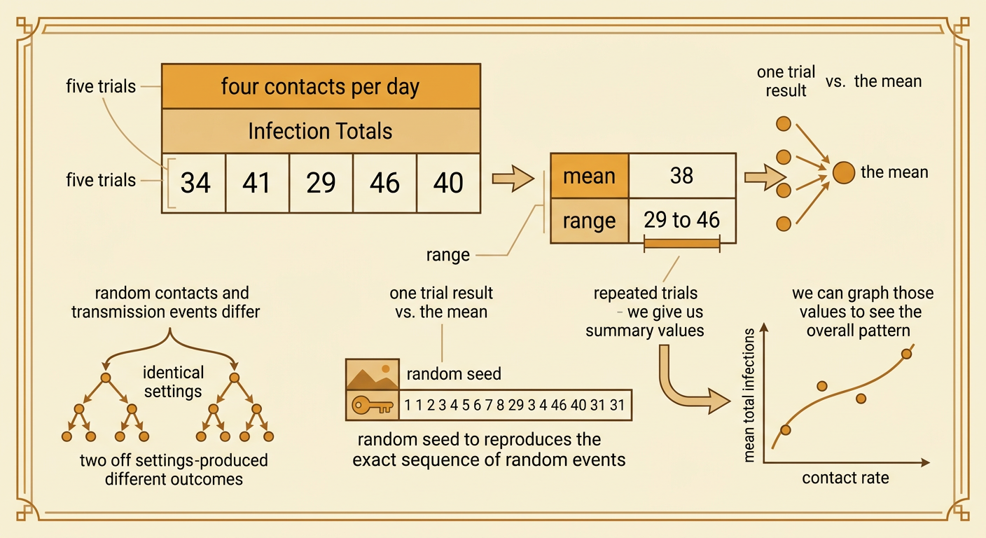
Disease simulations include randomness, so identical settings can produce different results. One infected person may happen to contact many susceptible people in one trial but very few in another. Therefore, students should run multiple trials for every contact rate. For example, five trials at four contacts per day might produce 34, 41, 29, 46, and 40 total infections. The mean is 38 infections, but the range from 29 to 46 shows variation. Students should repeat the same procedure for each tested contact rate and change only that rate. Using at least five trials makes the comparison more reliable than using a single run. If the program records a random seed, students can save it to reproduce a trial and check their work.
Graph Contact Rate and Infections
A graph can show how two quantitative variables are related. Place contact rate on the horizontal axis and the mean total infections on the vertical axis. Plot one point for each tested contact rate. For example, simulation averages might be 18 infections at 2 contacts per day, 39 at 4 contacts, 68 at 6 contacts, and 85 at 8 contacts. These points show a positive association: higher contact rates are connected with more infections in this model. The pattern may curve or level off because the population is limited and fewer susceptible people remain over time. Students can draw a trend line or curve, but they should not claim that every increase in contact rate produces an identical increase in infections. They should describe both the direction and shape of the relationship.

Evaluate the Model's Limitations
A model is useful only when its limitations are understood. Real communities do not mix randomly, and people differ in age, health, occupation, household size, and daily behavior. Transmission probability also changes with distance, ventilation, immunity, and protective actions. A model that gives everyone four random contacts per day cannot represent these differences accurately. For example, students may revise the model so that half of all contacts occur within fixed household groups. The revised model might produce fewer infections than the random-mixing model because transmission can repeatedly reach the same people. Comparing versions helps students evaluate whether a conclusion depends on an assumption. The model can support a claim that contact patterns influence spread, but it cannot precisely predict infections in a particular city without suitable data and validation.

Connect Results to Public Policy
Public policies can influence contact patterns, so simulation results can help people examine possible outcomes. A policy that limits crowd size, changes school schedules, or supports remote work may reduce close contacts and therefore lower infections in the model. However, policies can also have unintended consequences. For example, alternating school attendance days might reduce student contacts, but it could create child-care difficulties, limit access to school meals, or affect learning. Students should compare benefits, costs, fairness, and impacts on different groups. They should also identify evidence the simple simulation does not include, such as local health data or economic effects. A responsible recommendation might state that reducing crowded contacts is supported by the model, while the exact policy should be evaluated with additional evidence and revised if harms outweigh benefits.
