Modeling Population Carrying Capacity
Students analyze population and resource data to explain how limiting factors affect carrying capacity and consider how communities can respond to resource pressures.

Illustrations are auto-generated and may be placeholders. They can be refreshed to match the narration.
Carrying Capacity and Limiting Factors
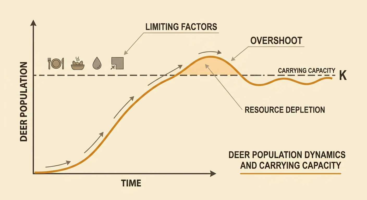
Carrying capacity is the largest population an ecosystem can support over time with its available resources and environmental conditions. It is not a fixed number because food, water, shelter, space, disease, predation, and climate can change. These limiting factors slow population growth as population density increases. For example, a deer population may grow quickly when plants are abundant. As more deer compete for the same vegetation, some animals receive less food, birth rates may fall, and death rates may rise. The population may then level off or fluctuate around the carrying capacity. A population can briefly exceed carrying capacity, a condition called overshoot, but resource depletion may cause a later decline. A mathematical model represents these relationships, but scientists must compare the model with observations because real ecosystems include many interacting factors.
Reading Population and Resource Graphs
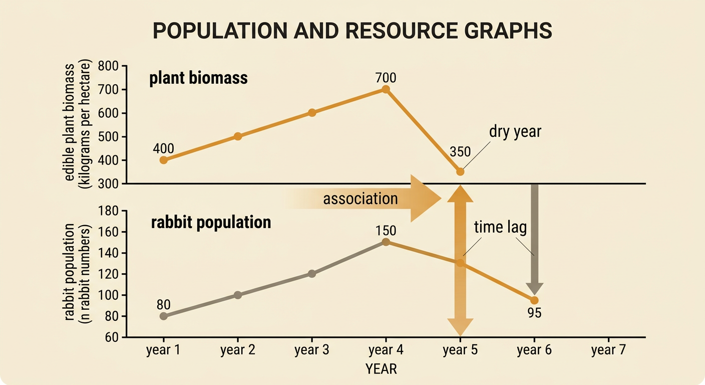
To read population and resource graphs, first identify each axis, variable, unit, and time interval. Then compare changes that occur during the same periods. Imagine two aligned graphs showing rabbits and edible plant biomass in a grassland. From year 1 to year 4, plant biomass rises from 400 to 700 kilograms per hectare, while the rabbit population rises from 80 to 150. A dry year then reduces plant biomass to 350 kilograms per hectare. The rabbit population does not decline immediately, but it falls to 95 the following year. This time lag suggests that reduced food affected survival or reproduction after the drought began. The graphs show an association, not proof that food was the only cause. Disease, predators, or migration could also affect the rabbits, so scientists examine additional evidence before making a causal claim.
Identifying Patterns and Relationships
Scientists use tables, scatterplots, and trend lines to identify relationships between quantitative variables. Each point on a scatterplot represents one paired observation. For example, researchers might plot annual rainfall on the horizontal axis and the number of breeding frog pairs on the vertical axis. If years with more rainfall generally have more breeding pairs, the points show a positive association. A line of best fit summarizes the overall pattern, while points far from that line are outliers that may require investigation. The strength of the relationship depends on how closely the points cluster around the trend. Scientists should also consider whether the pattern is linear, curved, or absent. A positive association does not prove that rainfall alone causes population growth; pond duration, temperature, disease, and habitat quality may also influence frog reproduction and carrying capacity.

Explaining Changes in Carrying Capacity
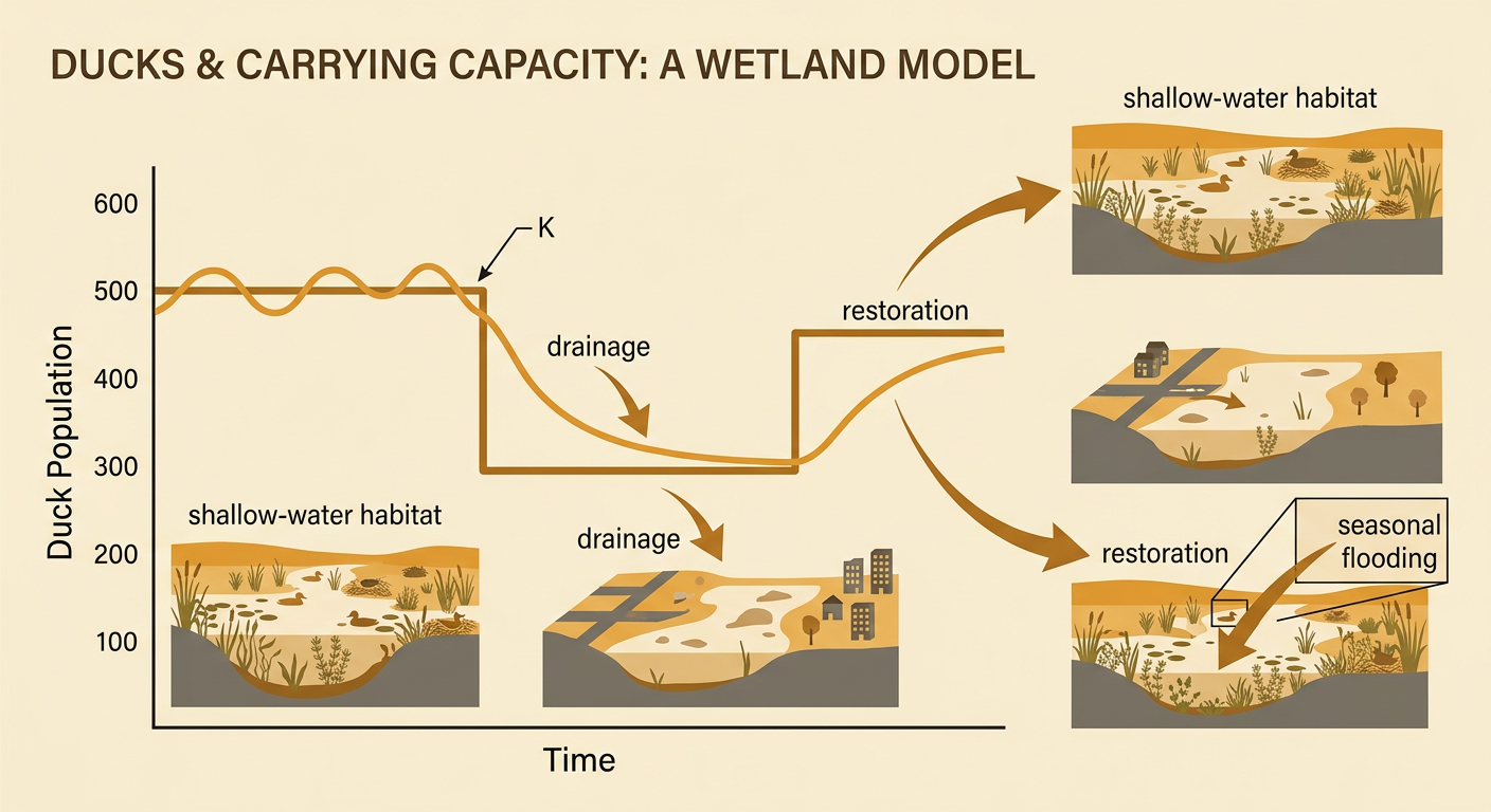
Carrying capacity changes when the amount or quality of a limiting resource changes. A long drought may lower carrying capacity by reducing water and plant growth, while habitat restoration may raise it by increasing food, shelter, or breeding sites. Suppose a wetland normally supports about 500 ducks. Drainage for development reduces shallow-water habitat, and the population declines toward a new carrying capacity of about 300. Years later, restoration reconnects the wetland to seasonal flooding, increasing aquatic plants and nesting cover. The carrying capacity may rise to about 450 ducks. To explain these changes, connect the environmental cause to a resource, then connect that resource to survival or reproduction. In a model, carrying capacity can be represented by K. Changing K over time produces different predicted population curves, which can be tested against field data.
Connecting Resource Decisions to Ecosystems
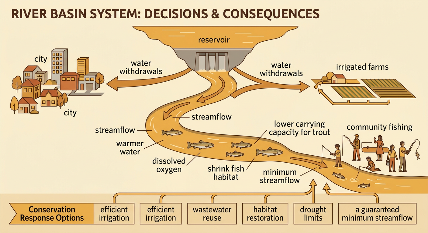
Political and economic decisions determine who uses resources, where development occurs, and which ecosystems receive protection. Consider a river basin where a city council approves additional water withdrawals for homes and irrigated farms. The decision may support housing, jobs, and food production, but lower streamflow can warm the water, reduce dissolved oxygen, and shrink fish habitat. These changes may lower the river’s carrying capacity for trout and affect communities that depend on fishing, recreation, or cultural practices. Possible responses include water-use limits during drought, efficient irrigation, wastewater reuse, habitat restoration, and guaranteed minimum streamflows. Evaluating a response requires comparing ecological data with economic costs and community needs. Students should ask who benefits, who bears the costs, how the decision changes the place, and whether the plan protects resources over time.