Organize and Compare Data in a Picture Graph
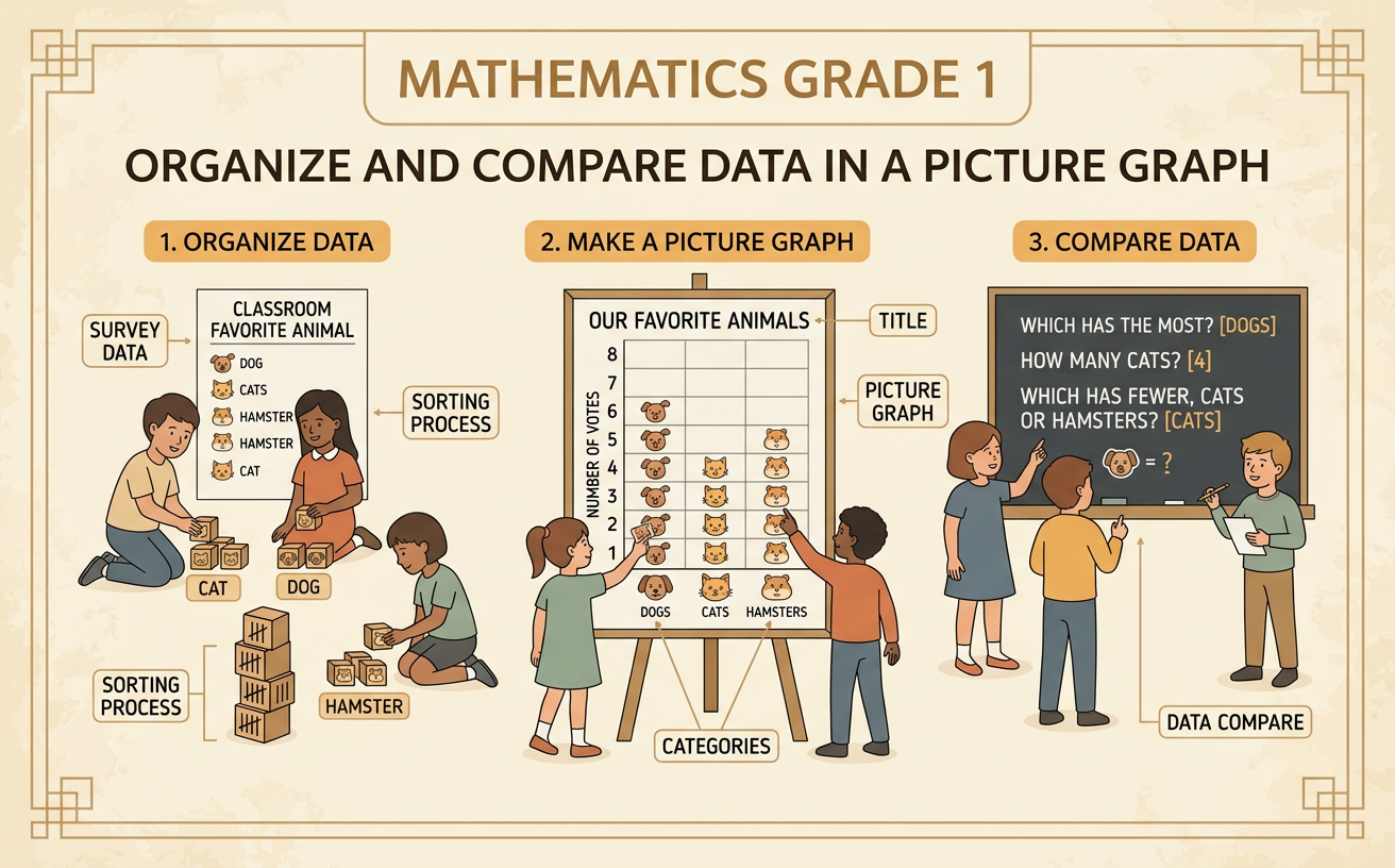
Students sort classroom data into categories, create a picture graph, and answer questions about how many are in each category.
Illustrations are auto-generated and may be placeholders. They can be refreshed to match the narration.
Collect Class Data
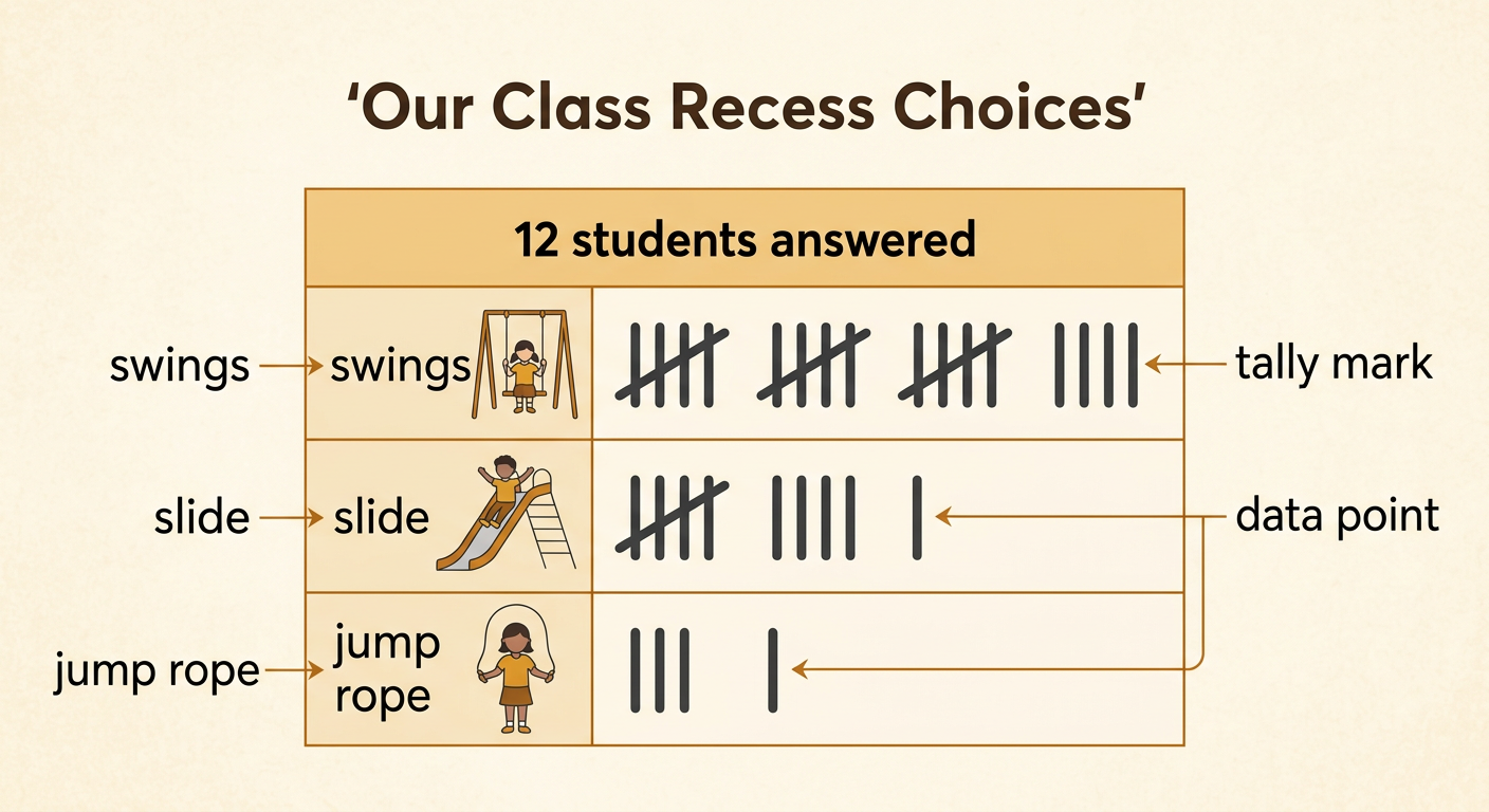
Data are pieces of information that we collect. Begin with one clear class question: “Which recess activity is your favorite?” Give three choices: swings, slide, or jump rope. Each student chooses only one activity. As students answer, record one tally mark beside each choice. Suppose 12 students answer. Six choose swings, four choose the slide, and two choose jump rope. Each answer is one data point, so there are 12 data points altogether. Check that every student answered once. Collecting answers carefully helps the class make an accurate graph. If an answer is skipped or counted twice, the graph will not show the class choices correctly.
Sort into Categories
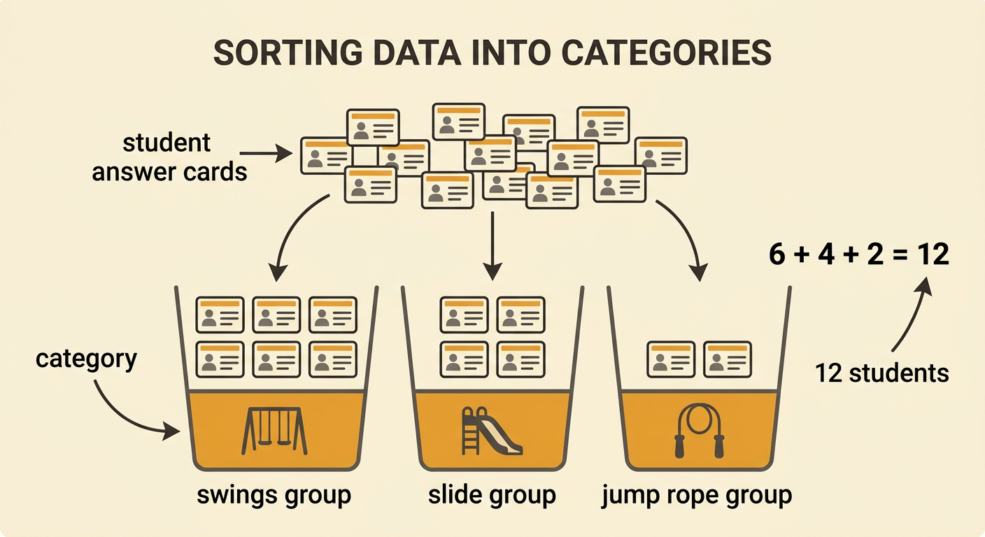
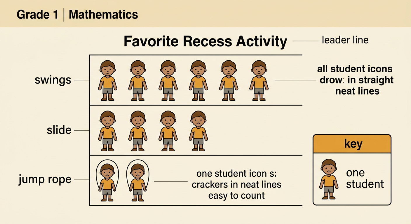
A category is a group of data points that belong together. Sort each student’s answer into one of the three activity categories. Place every “swings” answer in the swings group, every “slide” answer in the slide group, and every “jump rope” answer in the jump rope group. Do not place one answer in two groups. After sorting, count the answers in each group. The swings category has 6 answers, the slide category has 4 answers, and the jump rope category has 2 answers. Check the sort by adding the groups: 6 plus 4 plus 2 equals 12. This matches the 12 students who answered, so every data point has been sorted.
Build a Picture Graph
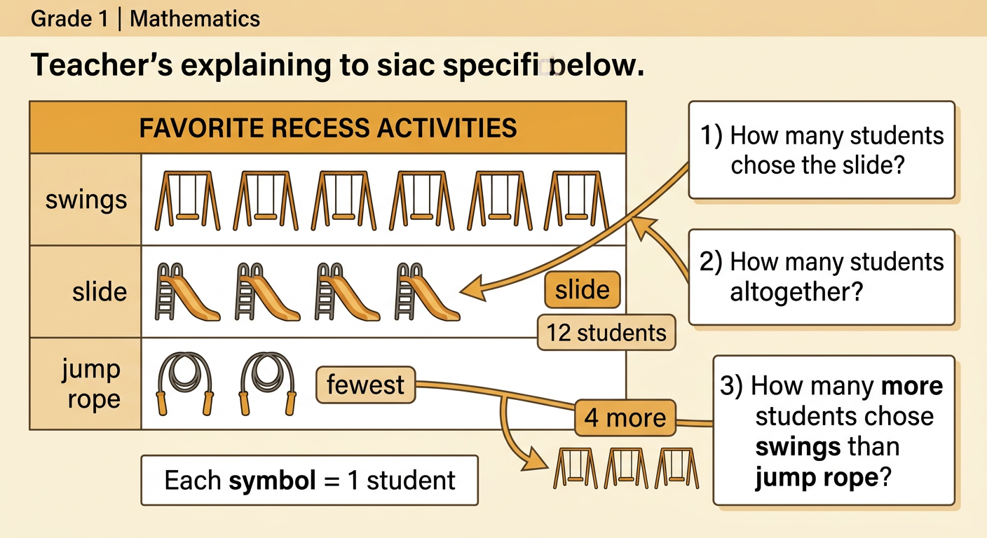
A picture graph uses pictures to show data. Give the graph a title, list the three categories, and include a key. For this graph, the key says that one student picture stands for one student. In the swings row, draw 6 student pictures. In the slide row, draw 4 student pictures. In the jump rope row, draw 2 student pictures. Keep the pictures the same size and place them in straight rows so they are easy to count. Always read the key before counting a picture graph. Here, each picture means one student, so the number of pictures in a row is also the number of students in that category.
Count and Compare Categories
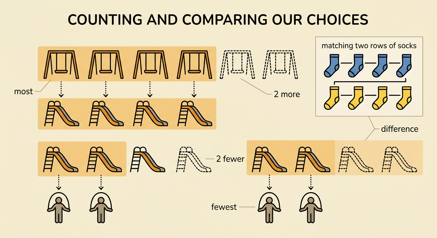
Use the picture graph to count and compare the categories. The swings row has 6 pictures, so 6 students chose swings. The slide row has 4 pictures, and the jump rope row has 2 pictures. Swings has the most students. Jump rope has the fewest students. To find how many more students chose swings than the slide, match the first 4 swings pictures with the 4 slide pictures. There are 2 swings pictures left, so 2 more students chose swings. To compare the slide and jump rope, match their pictures. Two slide pictures are left, so 2 fewer students chose jump rope than the slide. Matching helps us see the difference between categories.
Answer Data Questions
A picture graph can answer questions about each category, the total, and the differences between categories. Ask, “How many students chose the slide?” Count the slide pictures to get 4. Ask, “How many students answered altogether?” Add all three categories: 6 plus 4 plus 2 equals 12. Ask, “How many more students chose swings than jump rope?” Match the pictures or find the difference between 6 and 2. The answer is 4 more students. You can also ask, “Which category has the fewest students?” Jump rope has the fewest, with 2 students. Use the title, category labels, pictures, and key each time. Then answer in a complete sentence and check that your answer fits the graph.