Reading Climate Trends and Forecasting Change
Students interpret atmospheric carbon dioxide and temperature data, calculate rates of change, and use evidence to forecast potential regional climate impacts.

Illustrations are auto-generated and may be placeholders. They can be refreshed to match the narration.
Climate Indicators and Evidence
Climate indicators are measurements that reveal long-term changes in Earth’s climate system. They include atmospheric carbon dioxide concentration, global surface temperature, ocean heat content, sea level, glacier mass, and the timing of seasonal events. Scientists look for trends across decades because a single hot year or large storm does not establish climate change. They also compare independent sources of evidence. For example, instruments at Mauna Loa Observatory have recorded a long-term rise in atmospheric carbon dioxide since 1958. During the same broad period, global temperature records and ocean measurements show increasing heat. Ice cores provide evidence from much earlier periods by preserving samples of ancient air. Agreement among different indicators strengthens a conclusion, although each measurement has uncertainty. Climate evidence therefore depends on repeated observations, consistent methods, and patterns found in multiple datasets.

Reading CO2 and Temperature Graphs
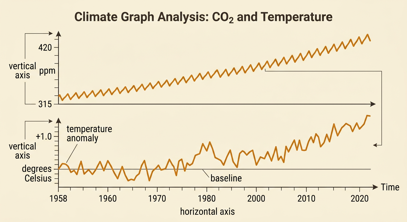
To read a climate graph, first identify the variables, units, time interval, and scale. Time usually appears on the horizontal axis. Carbon dioxide concentration may appear on the vertical axis in parts per million, or ppm. At Mauna Loa, annual average carbon dioxide increased from about 315 ppm in 1958 to more than 420 ppm in recent years. A temperature graph often shows temperature anomaly rather than actual temperature. An anomaly is the difference from a chosen long-term average, so a value of +1.0 degrees Celsius means one degree above that baseline. Short-term rises and falls do not erase the overall trend. When comparing two graphs, check whether their axes begin at different values or use different intervals. A steep-looking line can be misleading if the vertical scale is compressed.
Calculating Rates of Change
Average rate of change describes how quickly a quantity changes over a given interval. Subtract the starting value from the ending value, then divide by the elapsed time: rate equals change in output divided by change in time. Suppose atmospheric carbon dioxide rises from 315 ppm in 1958 to 420 ppm in 2024. The change is 105 ppm over 66 years, giving an average rate of about 1.6 ppm per year. The units are important because they explain what the rate means. A temperature dataset rising from a +0.4 degrees Celsius anomaly to +1.0 degrees Celsius over 30 years has an average rate of 0.02 degrees Celsius per year. An average does not show every yearly fluctuation, and rates may differ across intervals. Comparing shorter intervals can reveal whether change is speeding up or slowing down.

Making an Evidence-Based Forecast
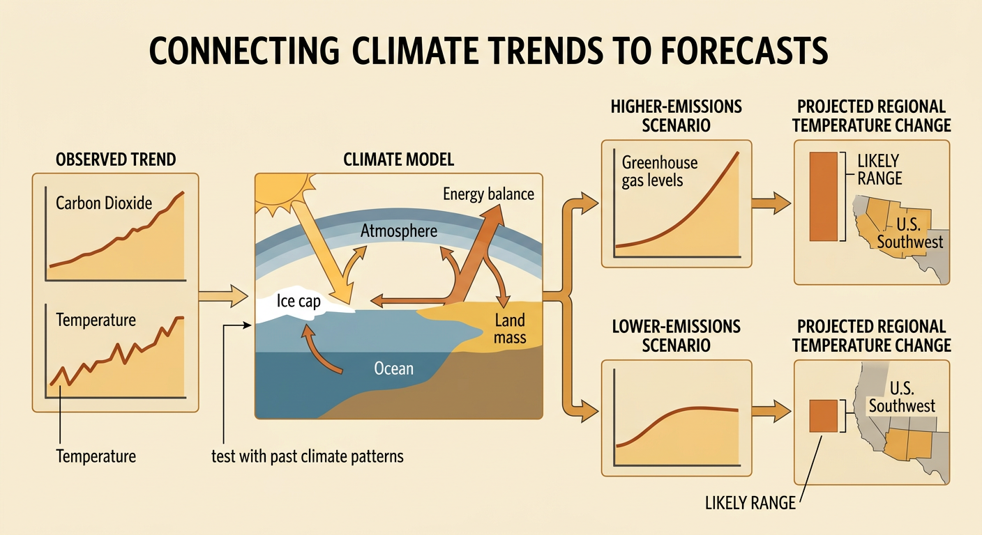
A climate forecast should connect observed trends, scientific mechanisms, and model results. Climate models use mathematical relationships among the atmosphere, oceans, land, ice, and incoming and outgoing energy. Scientists test models by checking whether they can reproduce past climate patterns. They then run different scenarios based on possible future greenhouse gas emissions. For example, if carbon dioxide continues increasing and a model projects more frequent extreme heat in the U.S. Southwest, a reasonable regional forecast is that heat stress and evaporation may increase. The forecast should name the evidence and acknowledge uncertainty. Models cannot predict the exact temperature or rainfall on a particular day decades ahead, but they can estimate ranges and probabilities for long-term conditions. A strong statement uses language such as “likely,” gives a time frame, and avoids claiming more certainty than the data support.
Regional Impacts and Land Use
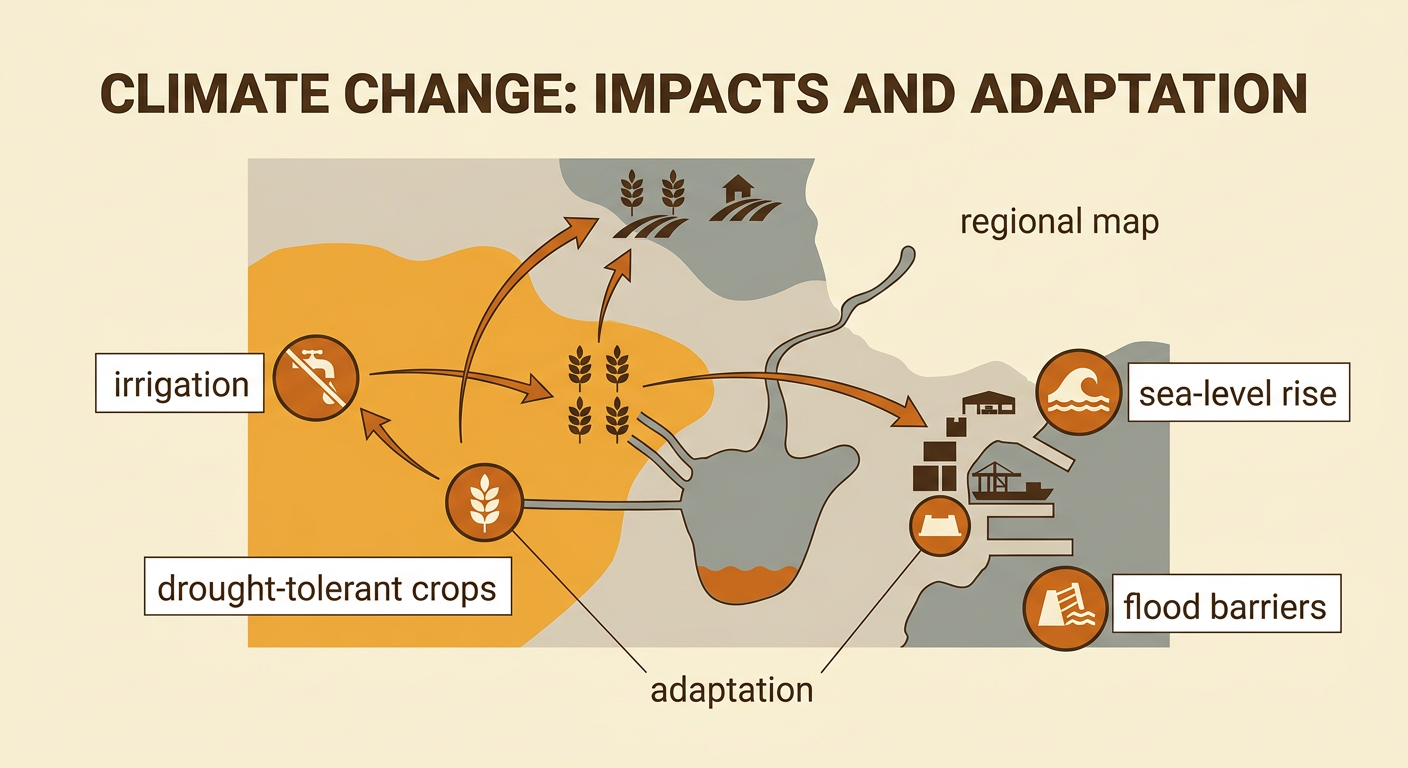
Climate change affects regions differently because each place has distinct landforms, water supplies, ecosystems, industries, and populations. Changes in temperature and precipitation can influence where crops grow, how much irrigation is needed, and which transportation routes remain reliable. For example, hotter and drier conditions in an agricultural region may reduce water available for irrigation. Farmers might shift planting dates, grow more drought-tolerant crops, or move some production to cooler areas. These choices can change land values, employment, food prices, and trade between regions. Coastal sea-level rise may also require ports to elevate equipment or strengthen flood barriers, increasing shipping costs. Evaluating an impact requires considering both environmental evidence and human responses. Adaptation can reduce risk, but it may involve costs or trade-offs, such as using land for water storage instead of housing or farming.