
Reading the Evidence: Climate Change Trends and Impacts
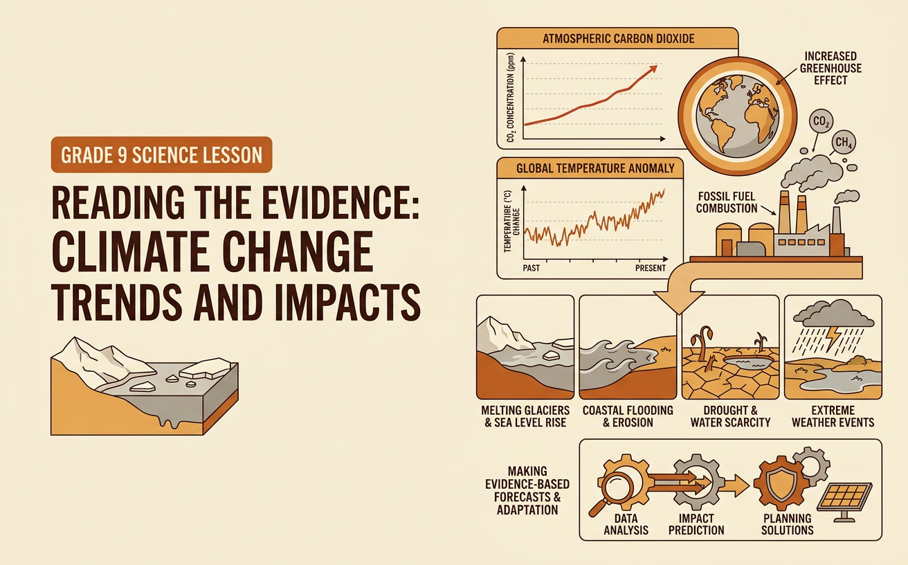
Students analyze temperature and atmospheric carbon dioxide data to identify climate trends, explain relationships between human and Earth systems, and make evidence-based forecasts of potential impacts.
Illustrations are auto-generated and may be placeholders. They can be refreshed to match the narration.
Climate Versus Weather
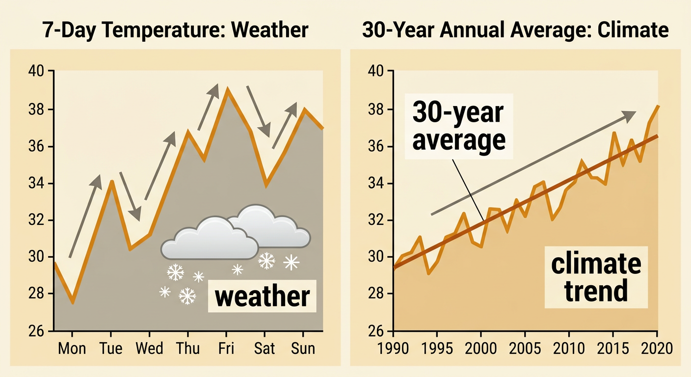
Weather describes atmospheric conditions over a short time and in a specific place, such as today’s temperature, wind, rain, or snow. Climate describes long-term patterns, usually measured over 30 years or more and across a region or the entire planet. A single cold day does not disprove global warming because local weather naturally changes from day to day. Scientists identify climate change by examining many measurements collected over decades. For example, a city might experience a January day that is much colder than average while its average winter temperature over 30 years is rising. The cold day is weather; the long-term rise is a climate trend. Climate evidence becomes more reliable when measurements from many locations, instruments, and time periods show a similar pattern.
Interpreting Temperature and Carbon Dioxide Graphs
To interpret a climate graph, first read the title, axes, units, time span, legend, and data source. A global temperature graph often shows temperature anomaly, which is the difference between an observed temperature and a reference-period average. A positive anomaly means warmer than the reference average, not a temperature above zero. A carbon dioxide graph usually reports atmospheric concentration in parts per million, or ppm. For example, measurements at Mauna Loa show carbon dioxide rising from about 315 ppm in 1958 to more than 420 ppm in recent years. Over a similar broad period, global temperature anomalies also increased, although temperatures varied from year to year. Separate graphs should use clearly labeled scales so that visual stretching does not exaggerate or hide change.

Identifying Trends and Relationships
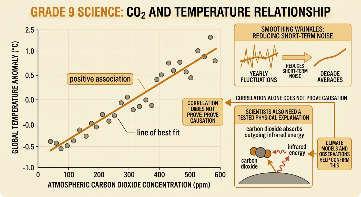
A trend is the overall direction of data over time, even when individual values fluctuate. Scientists can add a line of best fit or calculate averages to make a trend easier to see. They can also create a scatter plot using carbon dioxide concentration as one variable and temperature anomaly as the other. If points generally rise from left to right, the variables have a positive association: higher carbon dioxide values tend to occur with higher temperature anomalies. For example, decade averages can reduce short-term noise and make this relationship clearer than individual yearly values. However, correlation alone does not prove causation. Scientists also use physical evidence showing that carbon dioxide absorbs outgoing infrared energy, along with climate models and other observations, to explain why increasing greenhouse gas concentrations contribute to warming.
Connecting Human Activities to Earth Systems
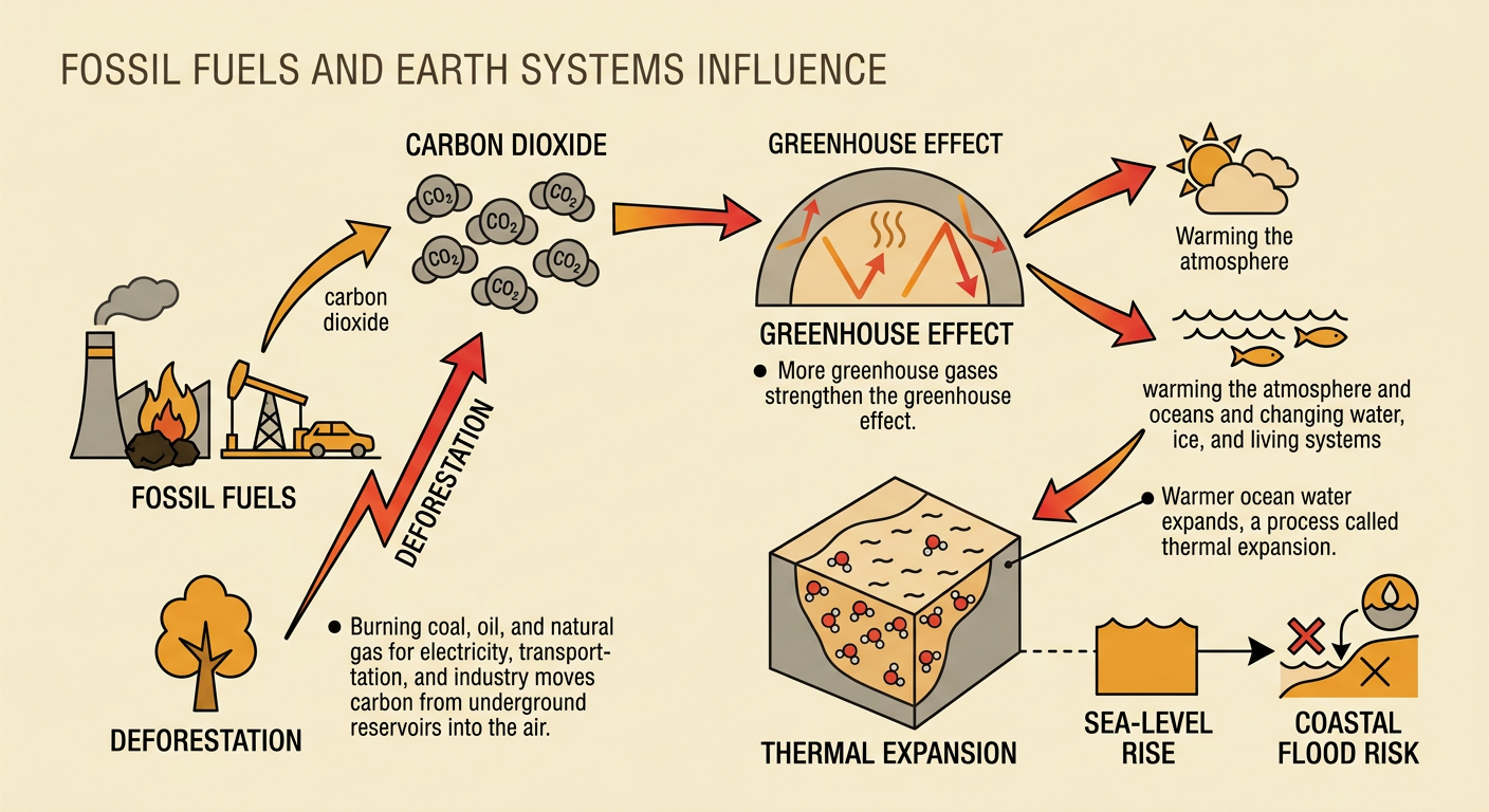
Human and Earth systems influence one another. Burning coal, oil, and natural gas for electricity, transportation, and industry transfers carbon from underground reservoirs into the atmosphere as carbon dioxide. Deforestation can add carbon dioxide and remove trees that would otherwise absorb it. Higher greenhouse gas concentrations strengthen the greenhouse effect, warming the atmosphere and oceans and changing parts of the water, ice, and living systems. These physical changes can then affect people. For example, warmer ocean water can contribute to sea-level rise through thermal expansion, increasing coastal flood risks for communities and infrastructure. Human responses, such as building renewable energy systems, conserving forests, or changing land use, can reduce emissions or improve resilience. This two-way interaction demonstrates reciprocal influence between human decisions and Earth processes.
Forecasting Climate Impacts
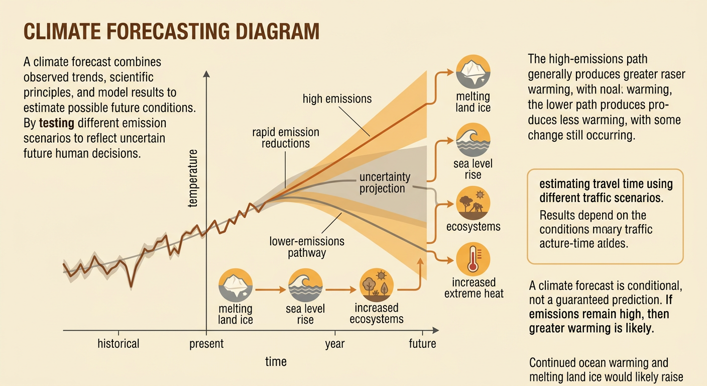
A climate forecast uses observed trends, scientific understanding, and model results to estimate possible future conditions. Climate models represent interactions among the atmosphere, oceans, land, ice, and living things. Scientists run models under different greenhouse gas emission scenarios because future human decisions are uncertain. If emissions remain high, models generally project greater warming than under a scenario with rapid emission reductions. A forecast should therefore be conditional rather than presented as a guaranteed prediction. For example, continued ocean warming and melting land ice would likely raise average sea level, increasing the frequency of coastal flooding in many locations. A graph may show a central projection surrounded by a range of possible outcomes. That range communicates uncertainty, but it does not mean that all outcomes are equally likely or that scientists know nothing.
Writing an Evidence-Based Conclusion
An evidence-based conclusion includes a clear claim, relevant quantitative evidence, and reasoning that connects the evidence to scientific principles. Begin by answering the investigation question. Then cite specific values, time periods, trends, or model results instead of saying only that a graph “goes up.” For example: Atmospheric carbon dioxide and global temperature have increased over recent decades. Carbon dioxide measured at Mauna Loa rose from about 315 ppm in 1958 to more than 420 ppm in recent years, while global temperature records show an overall warming trend. Carbon dioxide absorbs outgoing infrared energy, so its increase strengthens the greenhouse effect. If emissions continue at high levels, model results support a forecast of additional warming and related impacts. A strong conclusion also notes limitations, such as natural variability, measurement uncertainty, and the dependence of future outcomes on human choices.
