Redlining: Housing Segregation, Wealth, and Environmental Inequality
Students analyze historical housing maps and present-day demographic and environmental data to explain how redlining shaped enduring patterns of segregation, wealth inequality, and exposure to urban heat.
Illustrations are auto-generated and may be placeholders. They can be refreshed to match the narration.
Origins of Federal Redlining
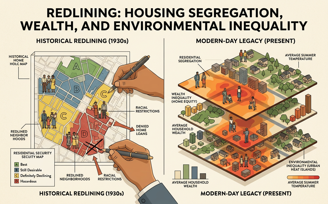
During the Great Depression, the federal government created the Home Owners’ Loan Corporation, or HOLC, to refinance troubled mortgages. Beginning in the 1930s, HOLC surveyors and local real estate professionals produced residential security maps that graded neighborhoods from A, considered the lowest lending risk, to D, considered the highest risk. Race, ethnicity, housing age, and class influenced these judgments. Black neighborhoods were frequently marked D regardless of the condition of individual homes. Discrimination existed before these maps through racial covenants, violence, zoning, and private lending practices. Federal Housing Administration policies also promoted racial separation by favoring new, racially homogeneous suburbs for mortgage insurance. For example, a stable Black neighborhood could receive a D grade while a new white suburb received an A grade, directing credit and investment toward the suburb and away from the city neighborhood.

Reading HOLC Maps and Housing Policies
A HOLC map is a primary source that reveals how officials and real estate professionals evaluated neighborhoods during the 1930s. Areas labeled A were colored green, B areas blue, C areas yellow, and D areas red. Written area descriptions often discussed building conditions, income, occupations, and residents’ race or ethnicity. Students should cite both the map and its accompanying description rather than treating color alone as complete evidence. For example, if a Chicago neighborhood was graded D and its description used racial change as a sign of risk, the wording demonstrates discriminatory assumptions within the rating process. However, a HOLC grade does not prove that every mortgage application there was rejected. To analyze policy effects, compare the map with lending records, FHA underwriting guidance, restrictive covenants, or local planning documents. Multiple sources clarify how ratings related to actual housing decisions.

Segregation and the Racial Wealth Gap
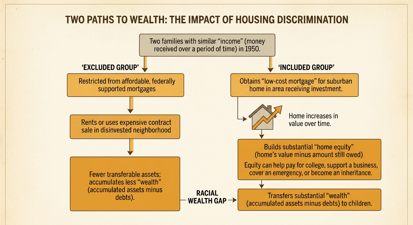
Housing discrimination contributed to segregation by limiting where Black families and other excluded groups could buy homes with affordable, federally supported mortgages. At the same time, many white families gained access to suburban homes whose values increased over decades. Home equity could then help pay for college, support a business, survive an emergency, or provide an inheritance. Wealth differs from income because it includes accumulated assets minus debts. Consider two families with similar incomes in 1950: one obtains a low-cost mortgage in a neighborhood receiving investment, while the other must rent or use a costly contract sale in a disinvested neighborhood. Even if both work and save, rising home values may give the first family substantially more wealth to transfer to children. Redlining was not the only cause of the racial wealth gap, but it reinforced unequal access to a major path for building wealth.
Comparing Historical Maps with Urban Heat Data
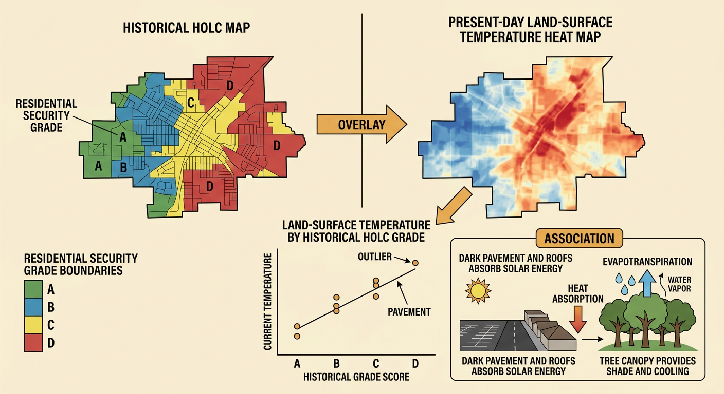
Researchers can overlay historical HOLC boundaries with present-day land-surface temperature, tree canopy, pavement, and demographic data. In many U.S. cities, areas once graded D are now hotter on average than areas graded A. A scatterplot can test this relationship by placing historical grade or a numerical grade score on one axis and current temperature on the other. Students should describe the direction, form, and strength of the pattern and identify unusual cases. For example, a formerly red-graded neighborhood with little tree cover, wide roads, and large paved lots may record higher summer surface temperatures than a nearby formerly green-graded area with mature trees and parks. Dark pavement and roofs absorb solar energy, while trees provide shade and cooling through evapotranspiration. The pattern is evidence of association, but additional sources are needed before claiming that redlining alone caused current heat differences.
Evaluating Causes and Long-Term Effects
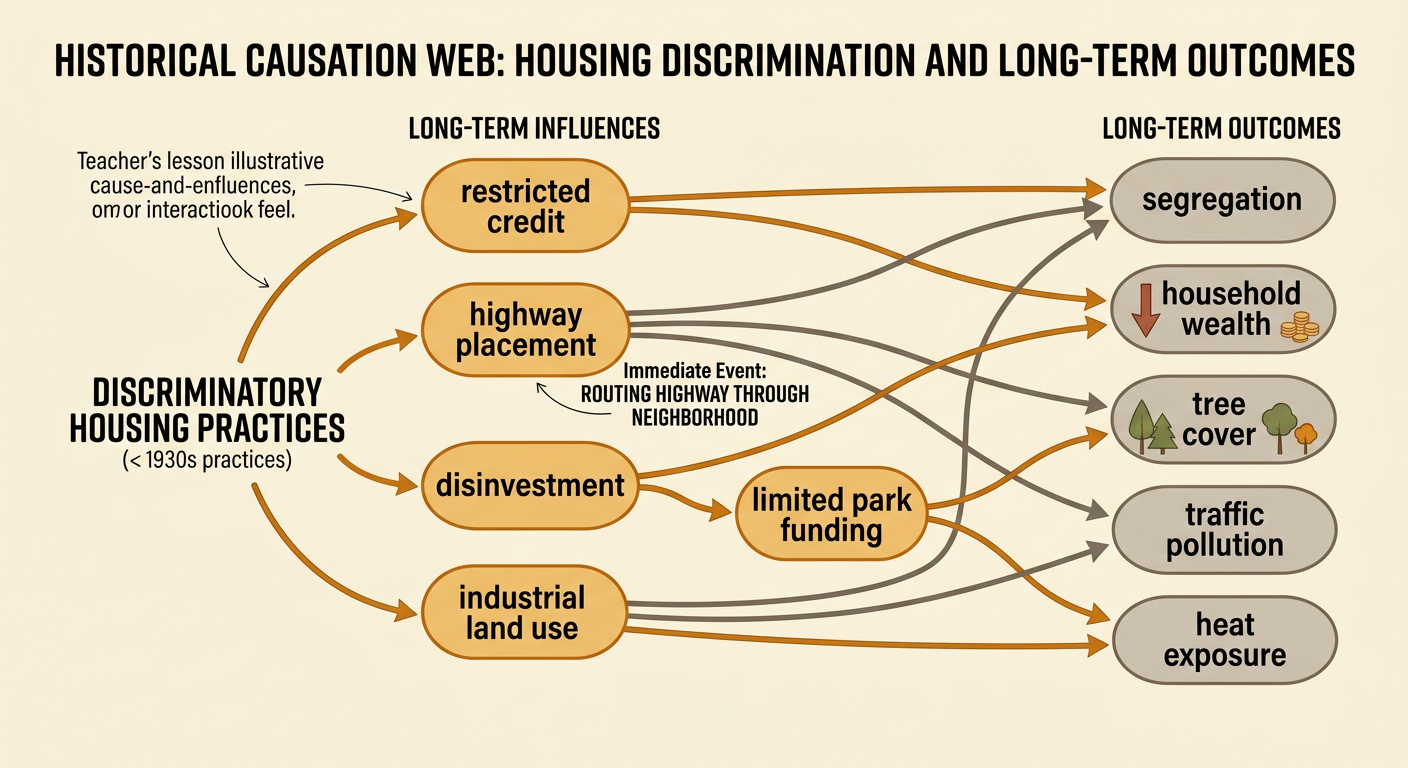
Historical explanation requires separating immediate events from long-term influences and considering multiple causes. An immediate event might be a bank’s denial of a mortgage or a city’s decision to route a highway through a neighborhood. Long-term influences include decades of restricted credit, lower property investment, industrial land use, limited park funding, and unequal political power. These forces interacted rather than operating separately. For example, a neighborhood marked D in the 1930s might later receive fewer conventional loans, lose homes to highway construction, and gain warehouses or large parking areas. Those decisions could reduce household wealth and tree cover while increasing traffic pollution and heat exposure. Researchers should also examine later zoning, suburbanization, deindustrialization, and local activism. This approach avoids claiming that one map directly caused every later outcome while still recognizing how discriminatory institutions shaped the choices and resources available over time.
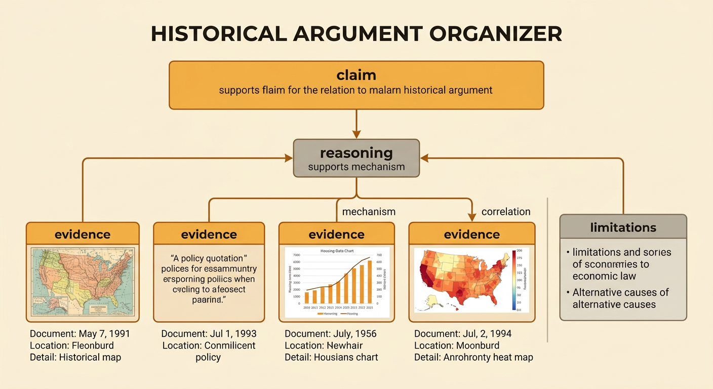
Evidence-Based Claim
A strong historical argument uses a clear claim, specific evidence, and reasoning that explains how the evidence supports the claim. One defensible claim is that discriminatory housing policies helped create enduring patterns of segregation, unequal wealth, and heat exposure, although later decisions also shaped each outcome. Evidence might include a quoted phrase from a HOLC area description, mortgage or homeownership data, a present-day temperature map, and a scatterplot comparing historical grades with heat. Cite each source precisely by naming the document, date, location, and relevant detail. Then explain the mechanism: restricted credit reduced opportunities for ownership and investment, while later infrastructure and land-use choices increased pavement and reduced vegetation. Address limitations by noting that correlation does not establish a single cause and that cities developed differently. A well-supported conclusion distinguishes what the sources directly show from what the combined evidence reasonably suggests.