
Represent Habitat Data with a Picture Graph
Students organize a small set of plant and animal observations into categories, represent the data with digital-style symbols, and use the picture graph to answer questions.
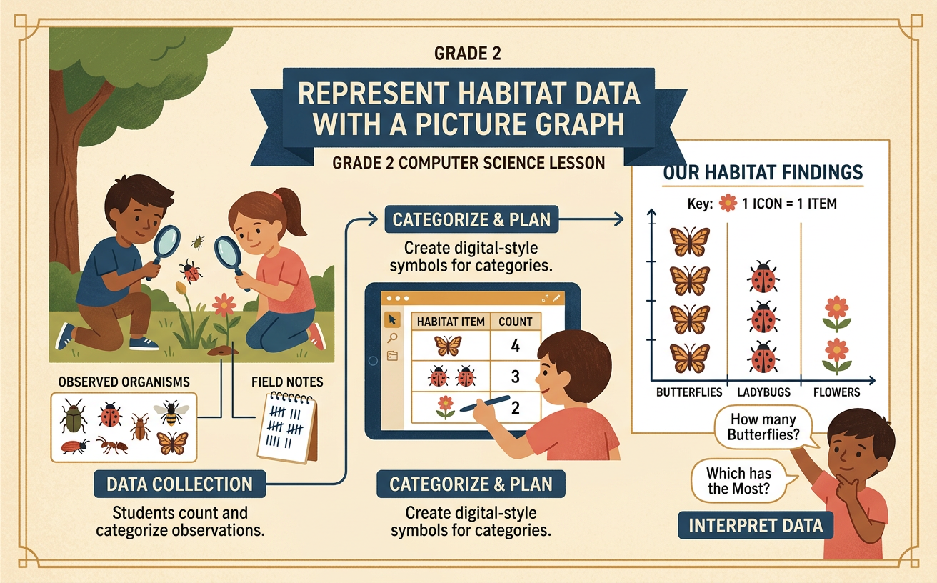
Illustrations are auto-generated and may be placeholders. They can be refreshed to match the narration.
Data Is Information
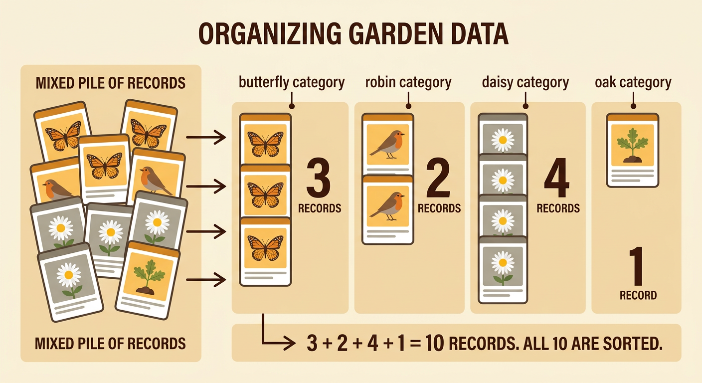
Data is information that we collect to answer questions. When we observe a habitat, we can record the plants and animals we see. Each record is one piece of data. Imagine that a class walks through a school garden. The class records 3 butterfly sightings, 2 robin sightings, 4 daisy plants, and 1 oak seedling. These numbers tell what the students observed in that place and at that time. The records do not include every living thing in the garden, but they give useful information about its life. Students can organize the data to find which kind was observed most, which was observed least, and how many observations were made altogether.

Sort Observations into Categories
A category is a group of things that belong together. Before making a graph, sort the observation records by kind. Place every butterfly record in the butterfly category, every robin record in the robin category, every daisy record in the daisy category, and the oak seedling record in the oak category. The garden data make four categories. Count the records in each group after sorting: butterflies have 3, robins have 2, daisies have 4, and oak seedlings have 1. Check that each record is in exactly one group. Do not leave out a record or count the same record twice. Sorting makes a mixed list easier to understand and prepares the data for a picture graph.
Choose Symbols to Encode Data
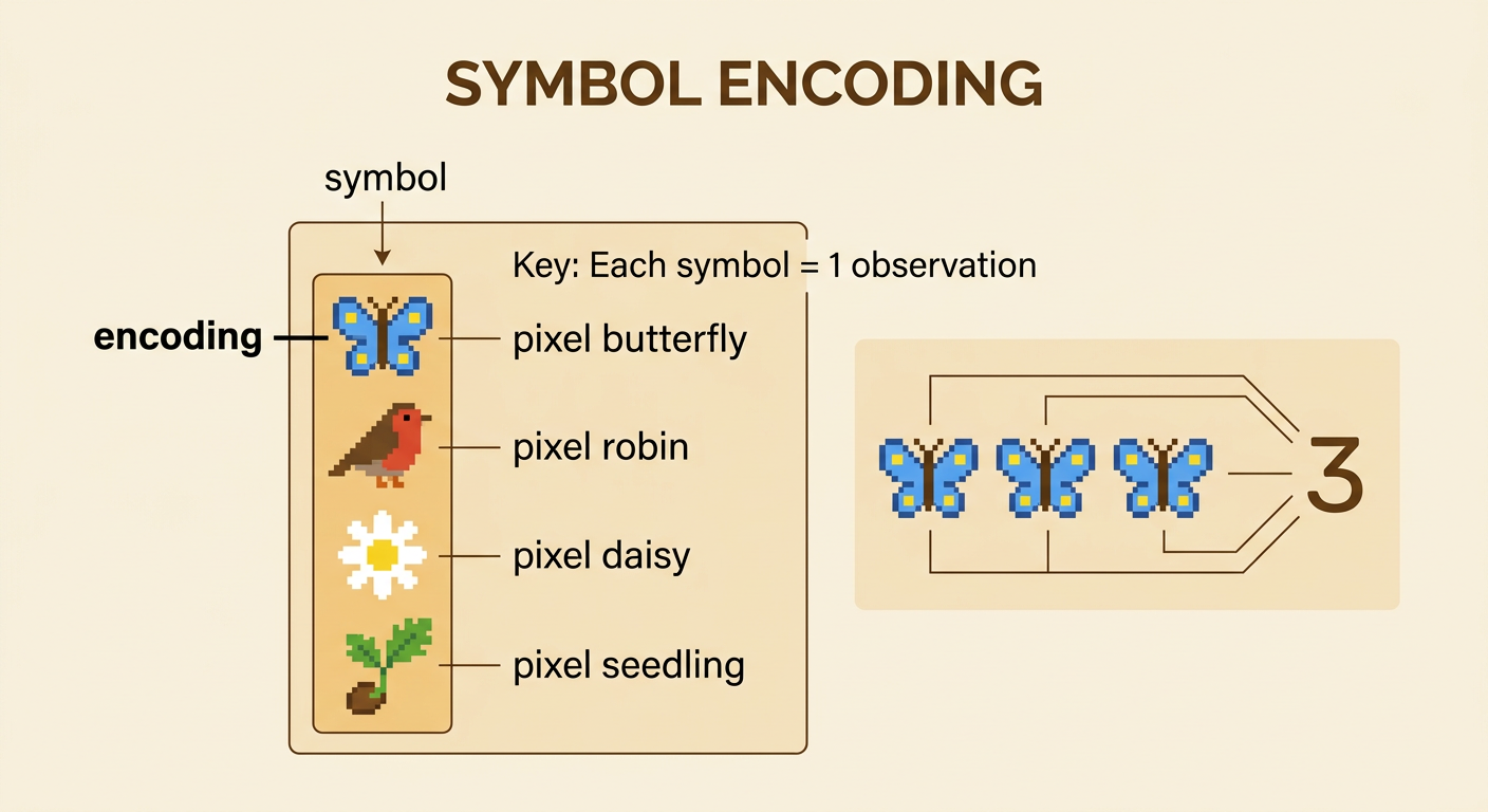
A symbol is a small picture that stands for information. Using symbols to represent data is called encoding. Choose a simple digital-style symbol for each category, such as a pixel butterfly, robin, daisy, or oak seedling. Use symbols that are easy to tell apart. Then choose a key that explains their value. For this small data set, the key can say, “Each symbol = 1 observation.” That means three butterfly symbols encode three butterfly sightings. Four daisy symbols encode four daisy plants. Keep every symbol the same general size so the graph is easy to read. Never add extra symbols just to fill space, because every symbol must match a real observation in the data.
Build the Picture Graph
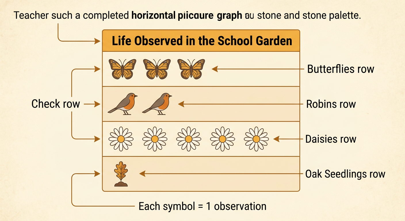
A picture graph uses repeated pictures to show how many items are in each category. Start with a clear title, such as “Life Observed in the School Garden.” Write the four category names in a column. Next to Butterflies, place 3 butterfly symbols. Place 2 robin symbols next to Robins, 4 daisy symbols next to Daisies, and 1 seedling symbol next to Oak Seedlings. Arrange the symbols in straight rows with equal spacing. Add the key, “Each symbol = 1 observation.” If building the graph on a computer or tablet, copy and paste the correct icon into each row. Count each row once more. The number of symbols must equal the number of records in that category.
Compare and Check the Results
Use the finished graph to compare categories and answer questions. First count the symbols in each row. Daisies have 4 symbols, so they were observed most. Oak seedlings have 1 symbol, so they were observed least. To find how many more daisies than oak seedlings were observed, subtract: 4 − 1 = 3. There was one more butterfly sighting than robin sighting because 3 − 2 = 1. Altogether, the graph shows 10 observations. Check this by adding 3 + 2 + 4 + 1. Also compare groups: the plant categories have 5 observations, and the animal categories have 5 observations. The four categories show four kinds of life recorded in this garden. A class could make another graph for a pond and compare the kinds found in the two habitats.
