
Turn Weather Data into a Digital Chart
Students organize weather observations in a digital table, create a bar graph, and use the visualization to identify and explain patterns.

Illustrations are auto-generated and may be placeholders. They can be refreshed to match the narration.
Explore a Weather Data Set
Weather data are facts collected by observing and measuring the atmosphere. A class might record the main weather condition each school day during spring. Imagine that students observed 20 days. They counted 10 sunny days, 6 cloudy days, and 4 rainy days. Before making a chart, check that every observation fits one category and that the totals are correct. In this example, 10 + 6 + 4 = 20 days. Also look for missing or repeated observations. Weather data from one short period describe only that place and time. They do not tell us the weather everywhere. Scientists collect data over many years to describe weather that is typical for a season or region.

Enter Data in a Digital Table
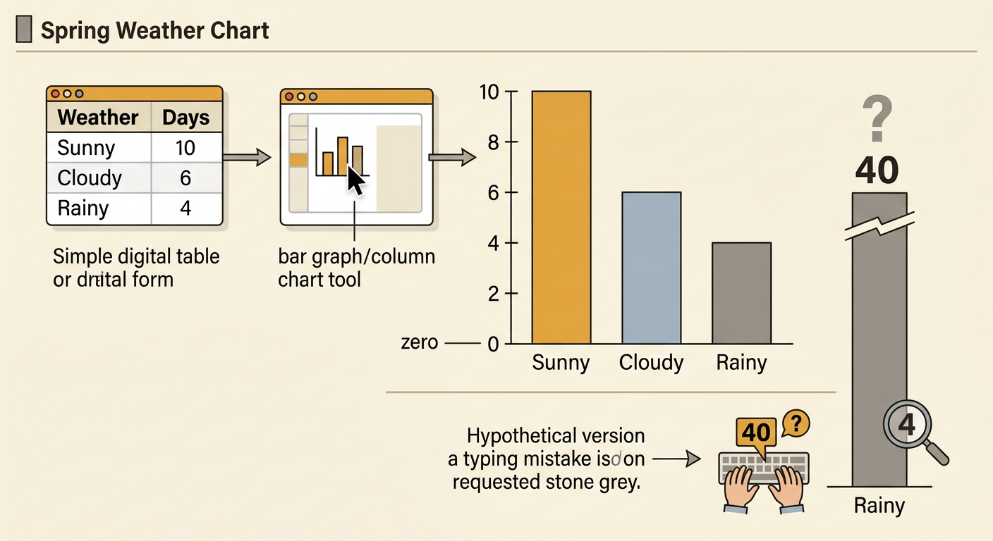
A digital table organizes information into rows and columns. Open a spreadsheet or chart-making program and create two column headings: Weather Condition and Number of Days. In the first column, enter Sunny, Cloudy, and Rainy. In the second column, enter 10, 6, and 4. Put only one piece of information in each cell. Use numbers instead of words such as ten so the program can use the values to build a graph. Check each entry against the original observations. The sunny row should show 10, the cloudy row should show 6, and the rainy row should show 4. Clear headings and accurate entries help both people and computers understand the data.

Choose Labels and a Scale
A graph needs a title, category labels, a number label, and a scale. Use the title Spring Weather Over 20 School Days. Label the horizontal axis Weather Condition because it will show Sunny, Cloudy, and Rainy. Label the vertical axis Number of Days. Since the greatest value is 10, the vertical axis can run from 0 to 10. A scale counting by 2 is a good choice: 0, 2, 4, 6, 8, and 10. Each equal step represents 2 days. The scale must use equal spaces so the bars are not misleading. Check where each value belongs. Four lines up with 4, six lines up with 6, and ten reaches 10.

Create a Bar Graph
Select both columns of the digital table, including the headings, and choose a bar graph or column chart tool. The program should create one bar for each weather condition. Check the graph instead of assuming it is correct. The Sunny bar must reach 10, the Cloudy bar must reach 6, and the Rainy bar must reach 4. The bars should have equal widths and equal spaces between them. They should begin at zero so their heights can be compared fairly. Add the title and axis labels if the program does not add them automatically. You may choose different colors for the bars, but color should not change the values. Save the graph with a clear file name, such as Spring Weather Chart.
Identify and Share Weather Patterns
Use the graph to compare categories and describe patterns with evidence. The Sunny bar is tallest, so sunny weather occurred most often during the 20 observed spring days. There were 4 more sunny days than cloudy days because 10 − 6 = 4. Rainy weather occurred least often, with 4 days. A clear explanation might say, “Sunny weather was the most common condition during this observation period.” Do not claim that every spring day will be sunny. A short data set shows a pattern, not a guarantee. Weather patterns also vary among regions. For example, a coastal region may receive more rainy days than a dry desert region because location, nearby water, landforms, and moving air affect weather. Compare graphs from different places before explaining regional differences.
