Understanding Slope in Proportional Relationships
Students graph proportional relationships, interpret unit rate as slope, and compare relationships represented in different forms.
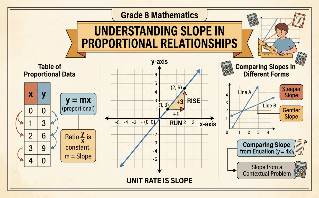
Illustrations are auto-generated and may be placeholders. They can be refreshed to match the narration.
Reviewing Proportional Relationships
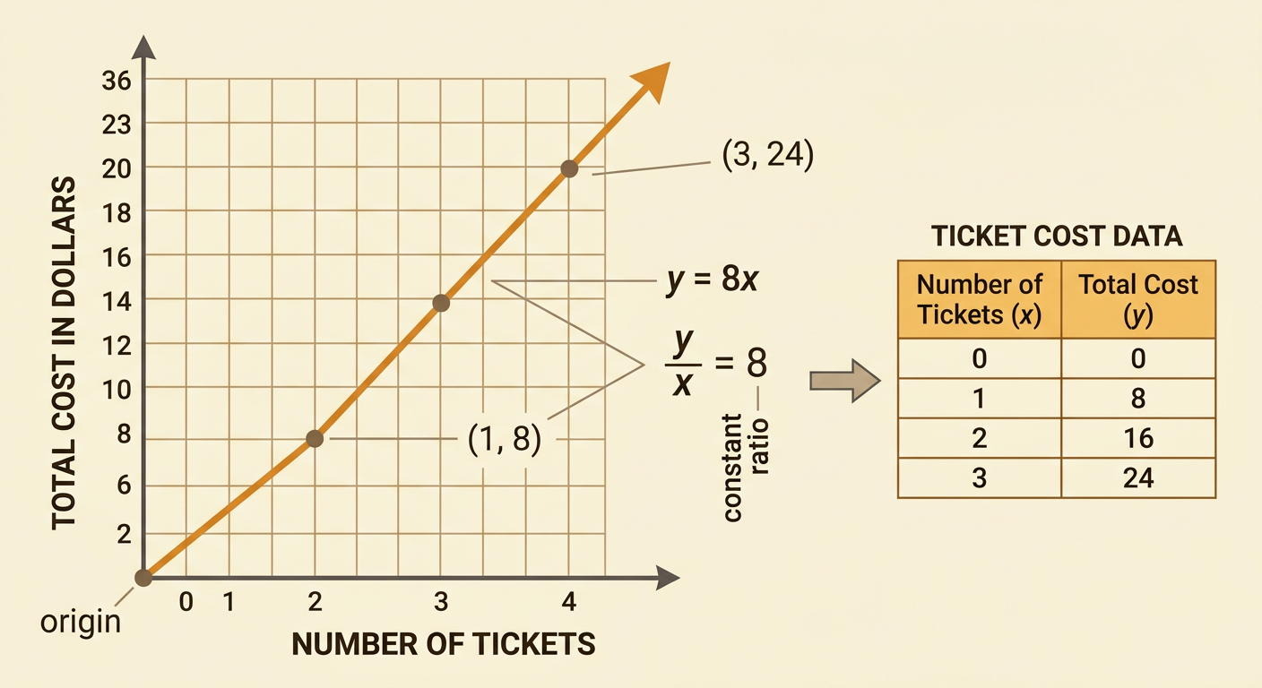
A proportional relationship connects two quantities with a constant ratio. It can be written as y = kx, where k is the constant of proportionality. For example, suppose each movie ticket costs $8. The total cost y for x tickets is y = 8x. The pairs (1, 8), (2, 16), and (3, 24) all have the same ratio, y divided by x, which equals 8. A graph of a proportional relationship is a straight line that passes through the origin, (0, 0). The origin belongs on the graph because buying zero tickets costs $0. If the ratio changes or the graph does not pass through the origin, the relationship is not proportional.
Connecting Unit Rate and Slope
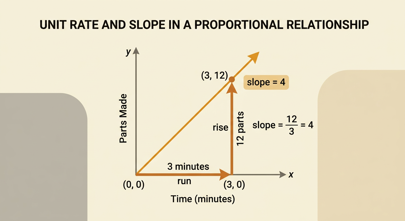
The unit rate in a proportional relationship is also the slope of its graph. Slope measures how much y changes when x increases by one unit. It can be calculated as change in y divided by change in x, often called rise over run. Suppose a machine makes 12 parts in 3 minutes at a constant rate. The unit rate is 12 divided by 3, or 4 parts per minute. On the graph, the line passes through (0, 0) and (3, 12). The rise is 12 parts and the run is 3 minutes, so the slope is 12 divided by 3, or 4. This means that each additional minute corresponds to 4 additional parts.
Graphing from a Table
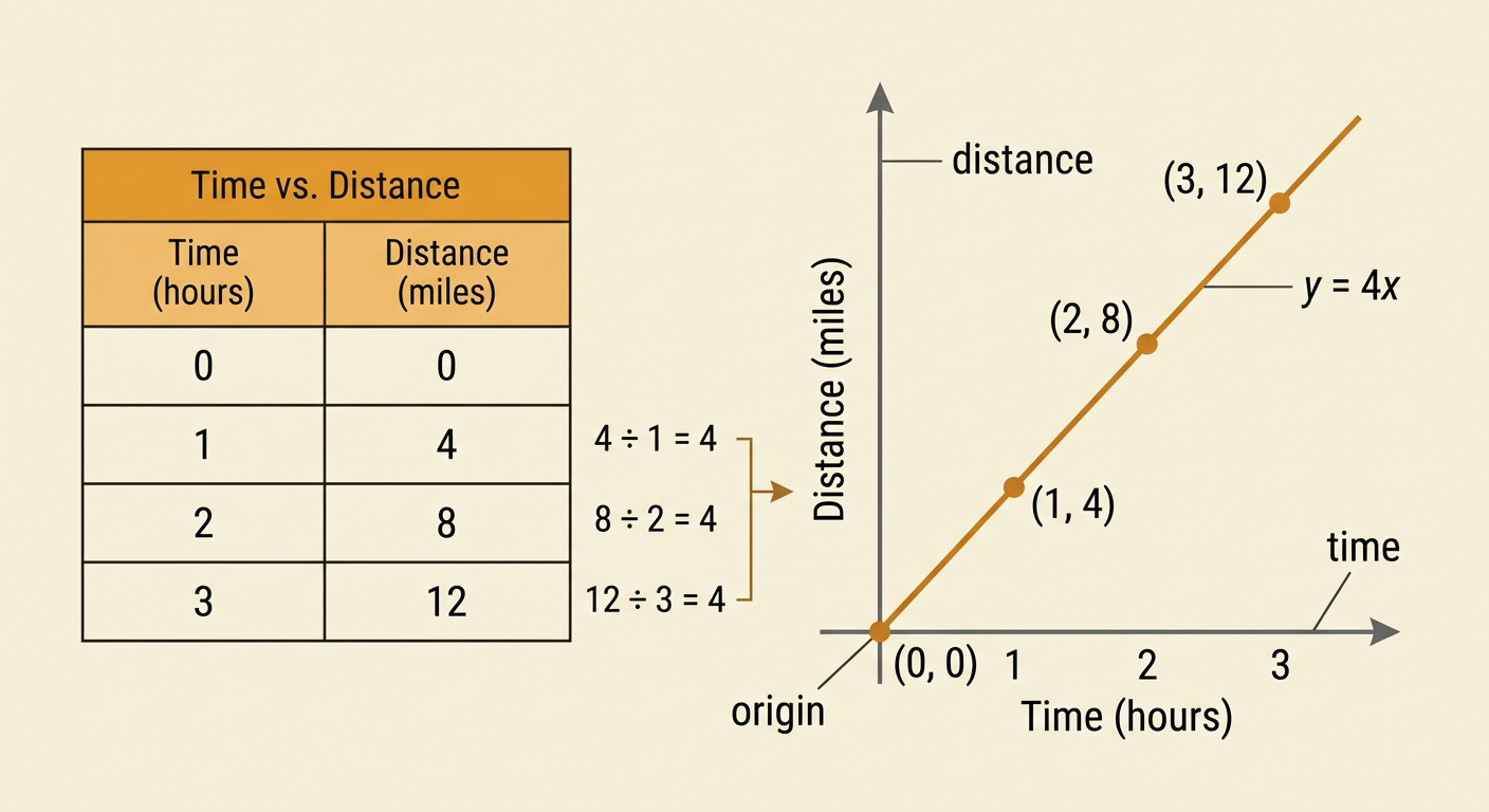
To graph a proportional relationship from a table, first check that each nonzero y-value divided by its x-value gives the same unit rate. Then plot the ordered pairs and include the origin. Suppose a cyclist travels at a constant speed of 4 miles per hour. A table shows 0 hours and 0 miles, 1 hour and 4 miles, 2 hours and 8 miles, and 3 hours and 12 miles. Plot (0, 0), (1, 4), (2, 8), and (3, 12). Draw a straight line through the points because the cyclist’s speed stays constant. The equation is y = 4x, where x is time and y is distance. The line’s slope is 4 miles per hour.
Interpreting Slope in Context
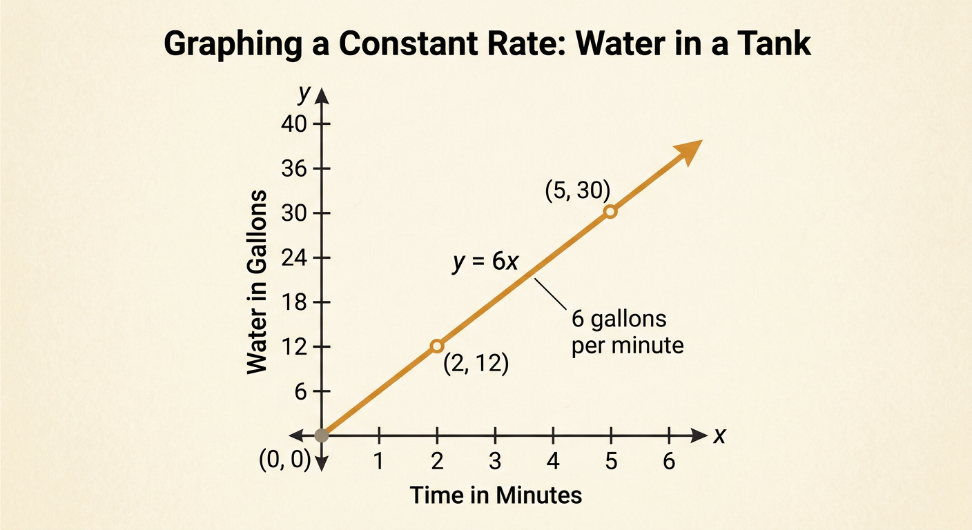
Slope should be described with both a number and meaningful units. Suppose water flows into an empty tank at a constant rate of 6 gallons per minute. If x represents minutes and y represents gallons, the relationship is y = 6x. The slope is 6, but its full meaning is 6 gallons per minute. After 2 minutes, the tank contains 12 gallons, so the point (2, 12) lies on the graph. After 5 minutes, it contains 30 gallons. The graph starts at the origin because the tank contains zero gallons at zero minutes. A steeper line would represent a faster filling rate, while a less steep line would represent a slower rate. Always use the axis labels to determine the slope’s units and meaning.
Comparing Multiple Representations
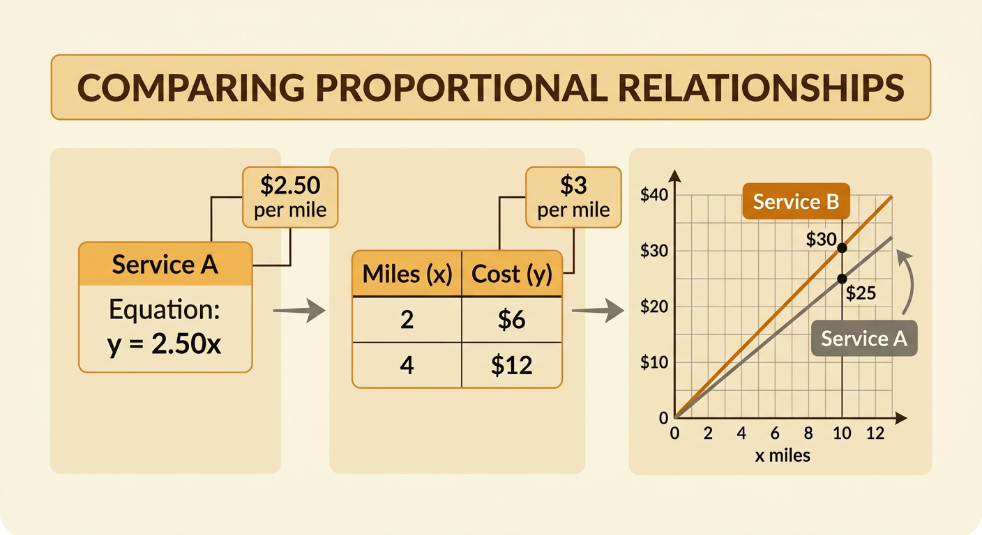
Proportional relationships may be shown with equations, tables, graphs, or verbal descriptions. To compare them, find the unit rate, or slope, in each representation. Delivery Service A charges according to y = 2.50x, so its rate is $2.50 per mile. Service B is shown in a table: 2 miles cost $6 and 4 miles cost $12. Dividing cost by miles gives 6 divided by 2 and 12 divided by 4, so Service B charges $3 per mile. Because 3 is greater than 2.50, Service B has the greater unit rate and would have the steeper graph. For 10 miles, Service A costs $25, while Service B costs $30. Converting every representation to a unit rate makes the comparison direct.