Visualize Classroom Device Use with a Spreadsheet
Students enter device-use measurements into a spreadsheet, create a digital line plot, and discuss how data can inform responsible energy choices.
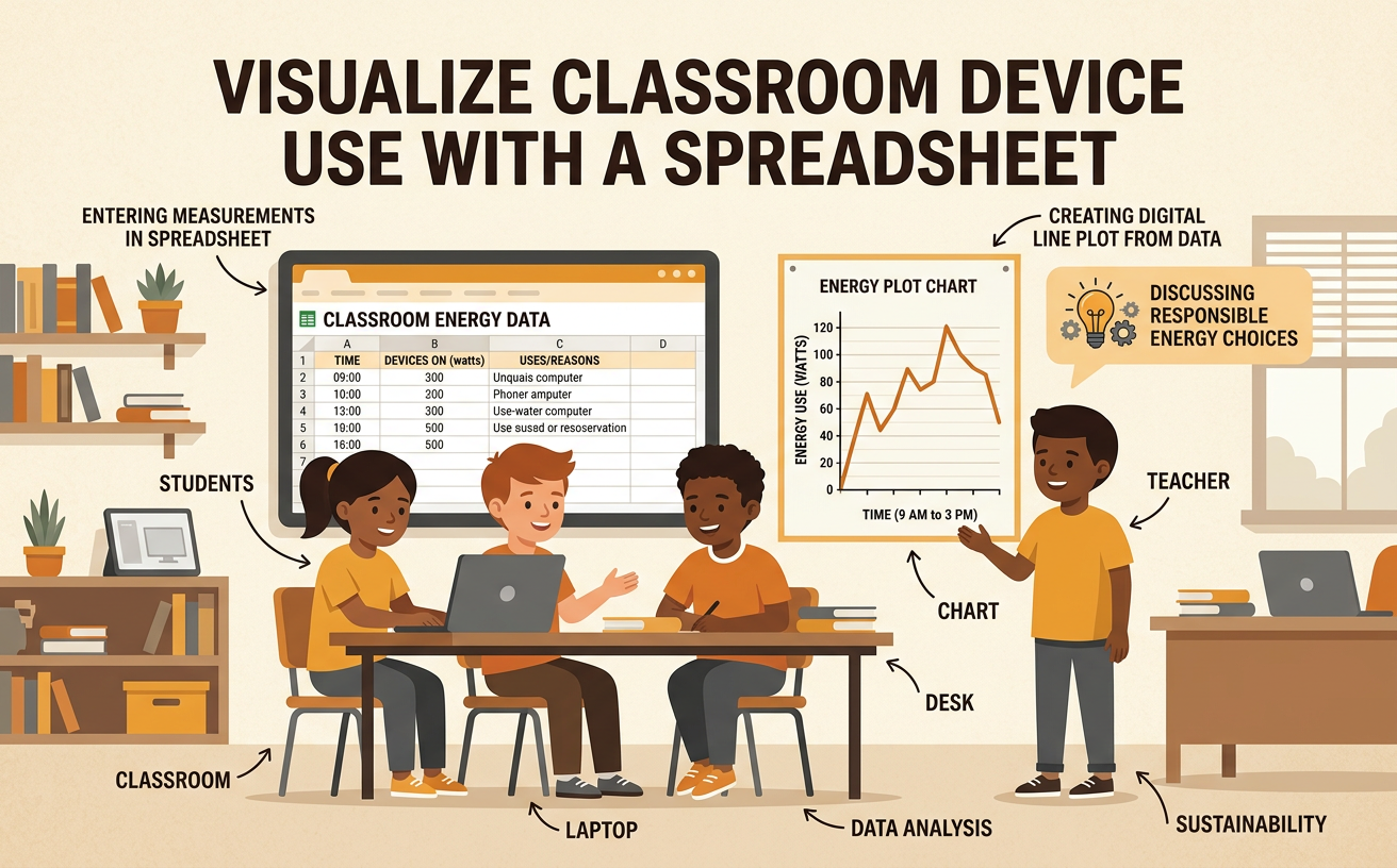
Illustrations are auto-generated and may be placeholders. They can be refreshed to match the narration.
Explore the Device-Use Data
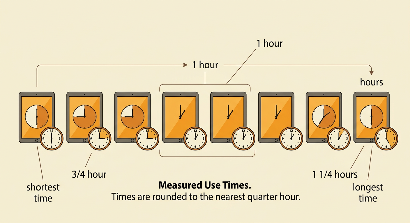
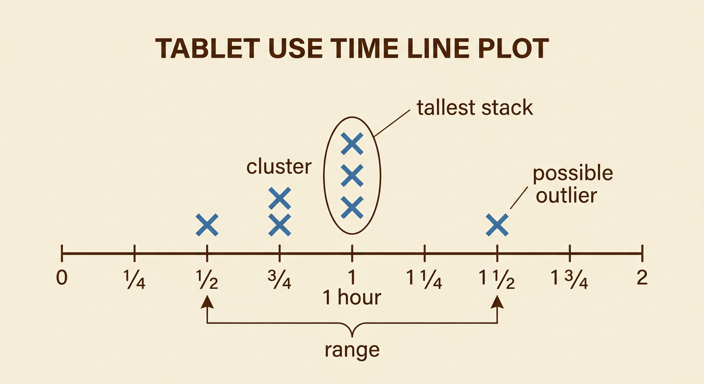
Imagine that eight classroom tablets were used for these amounts of time during one school day: 1/2, 3/4, 3/4, 1, 1, 1, 1 1/4, and 1 1/2 hours. Each measurement is rounded to the nearest quarter hour. Before using a spreadsheet, read the data carefully and identify the unit. The shortest use time is 1/2 hour, and the longest is 1 1/2 hours. Three tablets were used for exactly 1 hour. You can compare values by remembering that 1/2 equals two fourths and 3/4 equals three fourths. Ask your group what the measurements represent and how they were collected. Accurate measurements and clear units help everyone understand the data in the same way.
Enter Data in a Spreadsheet
Open a new spreadsheet and enter a clear heading in the first cell: Tablet Use Time in Hours. Type one measurement in each cell below the heading. For example, enter 1/2 in cell A2, 3/4 in cell A3, and the remaining values in cells A4 through A9. Check that all eight measurements are included. Depending on the spreadsheet, you may need to format the cells as fractions so that 1/2 does not change into a date. Compare the spreadsheet with the original list and correct any typing errors. Then sort the values from least to greatest. Sorting makes repeated measurements easier to see, but it does not change the data. Save the file with a descriptive name, such as Classroom Tablet Use.

Create a Digital Line Plot
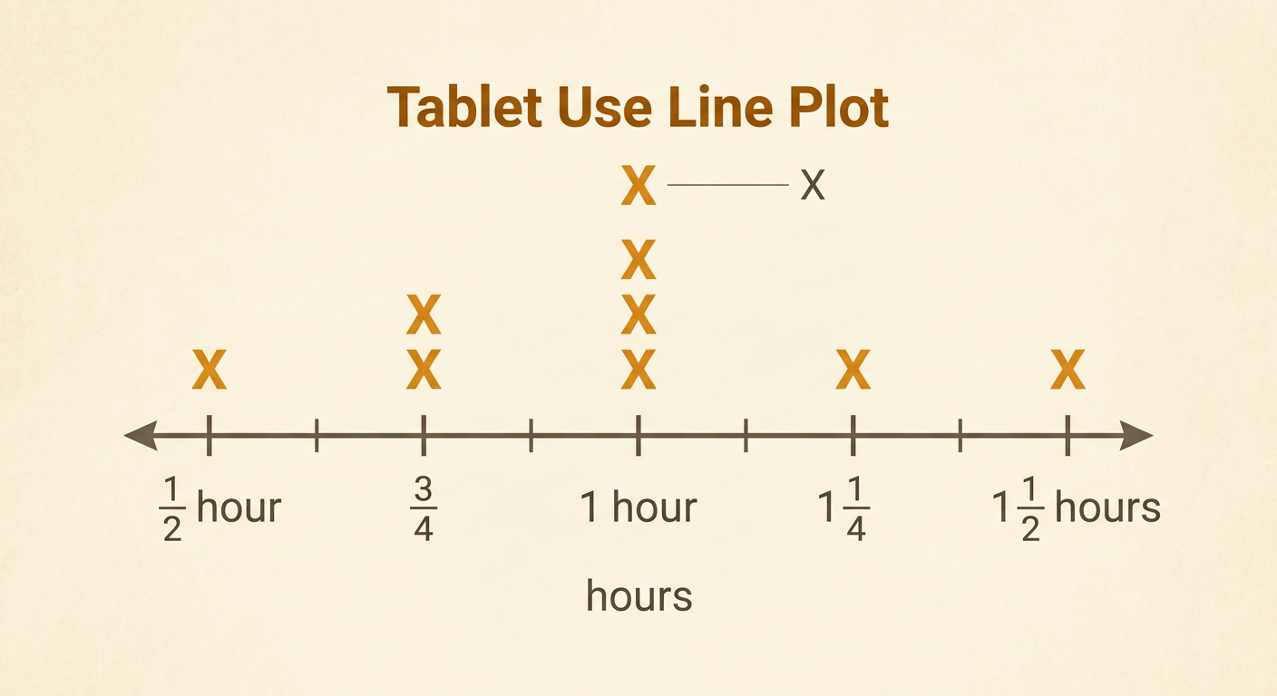
Use the spreadsheet data to create a digital line plot. Make a horizontal number line from 1/2 hour to 1 1/2 hours, marked in equal 1/4-hour intervals. Place one X above the number line for each measurement. The plot should have one X at 1/2, two Xs at 3/4, three Xs at 1, one X at 1 1/4, and one X at 1 1/2. Stack repeated Xs directly above one another. In a spreadsheet, you can build this display with a chart template or by placing X symbols in aligned cells. Add a title and label the time unit. Finally, count the Xs. There should be eight because the original table contains eight measurements. Equal spacing and accurate stacks make the graph easy to read.
Identify Patterns and Outliers
Study the line plot to find patterns. The tallest stack is at 1 hour, so 1 hour is the most common use time. Five of the eight tablets were used for 3/4 hour or 1 hour. The data cluster near 1 hour because most Xs are close to that value. The point at 1 1/2 hours is separated from most of the data and may be considered a possible outlier, but it is still a real measurement unless an error is found. Compare it with the shortest time: 1 1/2 minus 1/2 equals 1 hour, so the range is 1 hour. Ask why one tablet had a longer use time. It might have supported a special project, or the time might need to be checked.
Discuss Responsible Energy Choices
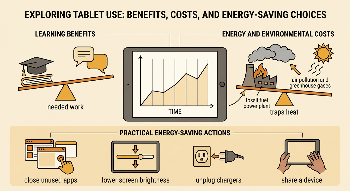
Digital devices need electrical energy for charging and use. Producing electricity can affect the environment, especially when power plants burn fuels that release air pollution and greenhouse gases. The line plot does not show exactly how much electricity each tablet used, but it can help the class ask useful questions. For example, the tablet used for 1 1/2 hours may have supported important learning, yet unnecessary screen time could use extra battery power. In a group discussion, compare benefits and costs before suggesting changes. Students might close unused apps, lower screen brightness when appropriate, unplug chargers after charging, or share a device for a short activity. Listen to each speaker, build on classmates’ ideas, and use evidence from the plot. A responsible choice should save energy without preventing students from completing needed work.