
Visualizing Climate Trends with Python
Students use Python to create and interpret a line graph of climate data, then evaluate how visualization choices affect the evidence communicated.
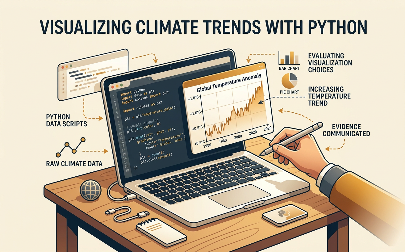
Illustrations are auto-generated and may be placeholders. They can be refreshed to match the narration.
Inspect the Climate Dataset
Begin by examining the dataset before writing code. Identify each column, its unit, geographic scale, time interval, and source. For example, a classroom dataset might contain Year, Global Temperature Anomaly (degrees Celsius), and Southwest Temperature Anomaly (degrees Celsius). A temperature anomaly is the difference between an observed temperature and a stated long-term average, not the actual temperature. A value of 0.82 degrees Celsius means the observed average was 0.82 degrees Celsius above the baseline. Check for missing entries, repeated years, inconsistent units, or unusual values. Also read the metadata to learn whether the values are annual averages and which baseline period was used. Comparing global and regional columns can reveal how climate patterns differ by geographic scale. Reliable conclusions require data from a credible source and enough years to represent climate rather than short-term weather.

Load Data into Python
Use the pandas library to load a comma-separated values file into a DataFrame. A typical sequence is import pandas as pd followed by climate = pd.read_csv("climate_data.csv"). Then use climate.head() to preview the first rows and climate.info() to check column names, data types, and missing values. For example, Year should usually be an integer, while Temperature_Anomaly_C should be numeric. If Python reads a numeric column as text because it contains symbols or spaces, calculations and graphs may fail. You can check missing values with climate.isna().sum() and remove incomplete rows for selected columns with climate.dropna(subset=["Year", "Temperature_Anomaly_C"]). Do not delete values automatically; first determine why they are missing and record any cleaning decision. Finally, sort the records with climate.sort_values("Year") so the line graph follows chronological order.

Create and Label a Line Graph
A line graph is useful when one quantitative variable changes over time. Import Matplotlib with import matplotlib.pyplot as plt. Then create the graph with plt.plot(climate["Year"], climate["Temperature_Anomaly_C"], marker="o"). Add an informative title, label both axes, and include the measurement unit: plt.xlabel("Year") and plt.ylabel("Temperature Anomaly (°C)"). A horizontal reference line at zero, created with plt.axhline(0, color="gray"), distinguishes years above and below the baseline average. Finish with plt.grid(True), plt.tight_layout(), and plt.show(). For example, if the anomaly rises from 0.20 degrees Celsius in 1980 to 0.95 degrees Celsius in 2020, the plotted line communicates an overall increase. Connecting points helps show temporal change, but it does not prove that changes occurred smoothly between annual measurements.

Identify Trends and Anomalies
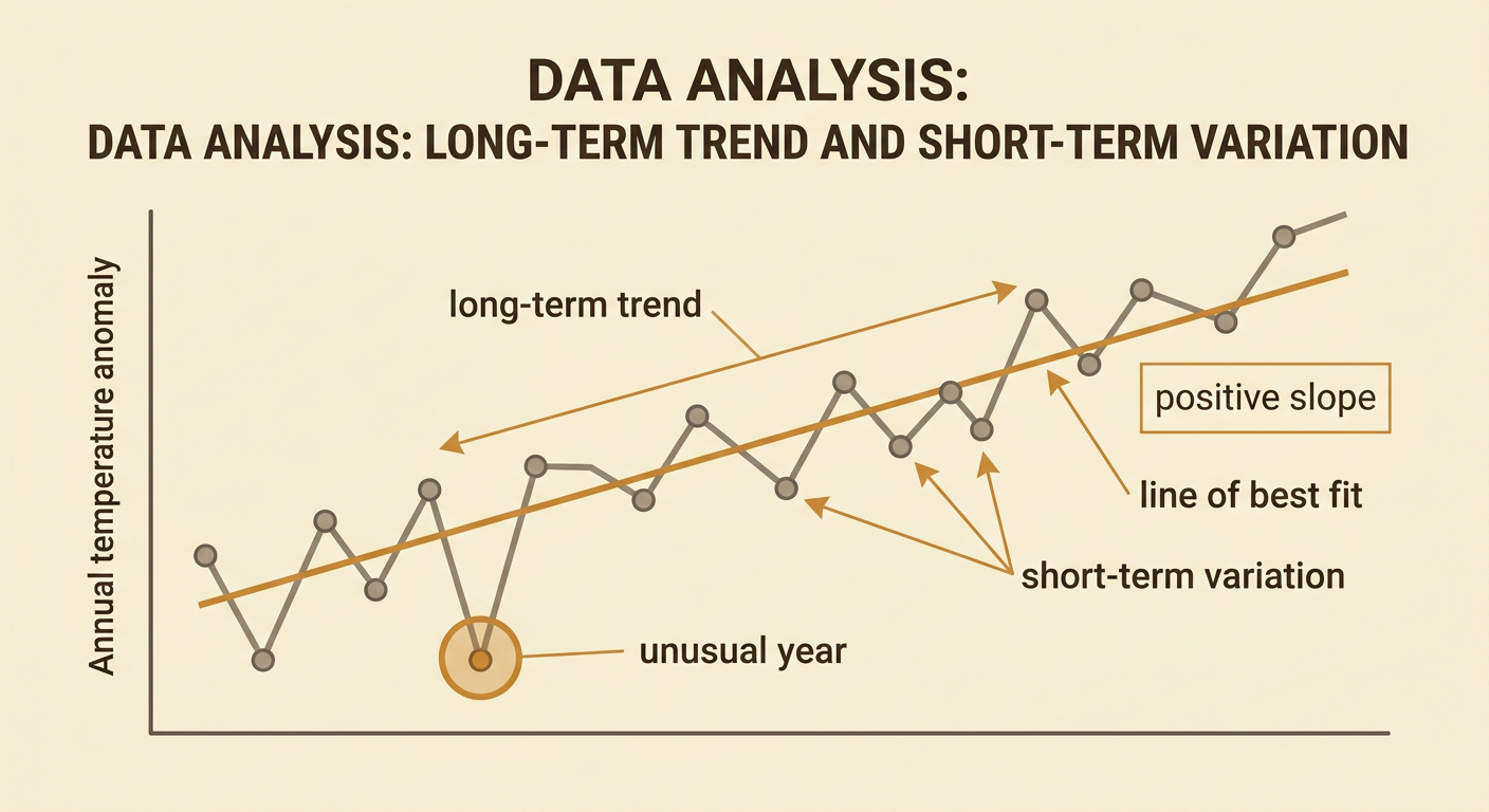
Interpret the graph by separating long-term patterns from short-term variation. A trend is the general direction across many observations, while an anomaly in data analysis is a point that differs noticeably from nearby values or the broader pattern. This use of anomaly is different from the term temperature anomaly, which measures departure from a baseline. Suppose the plotted values generally rise from 1980 through 2020 but drop in 1992. The single decline is an unusual year within an upward long-term trend; it does not erase the trend. Quantify the relationship by calculating a line of best fit or comparing beginning and ending averages. You might report that the fitted line has a positive slope of 0.018 degrees Celsius per year. Investigate unusual points using source notes or other evidence rather than assuming an error or cause. Correlation over time alone does not establish causation.
Evaluate Visualization Choices
Visualization choices can strengthen or distort the evidence communicated. Compare graphs that use the same data but different vertical-axis ranges. A graph ranging from 0.6 to 1.0 degrees Celsius makes a small increase look steep, while a graph ranging from minus 1.0 to 1.5 degrees Celsius makes it appear less dramatic. Neither range is automatically wrong, but the scale must be visible and appropriate to the question. Also evaluate the selected years, geographic scale, colors, line thickness, smoothing, and treatment of missing data. For example, beginning with an unusually cool year may exaggerate later warming. A five-year moving average can clarify the long-term pattern, but it should be labeled and displayed with the annual data so variation is not hidden. Comparing global and Southwest graphs can reveal different patterns, but identical axis scales make that comparison more defensible.

Write an Evidence-Based Conclusion
An evidence-based conclusion should state a claim, cite quantitative evidence, explain the reasoning, and acknowledge limitations. For example: “The dataset indicates a long-term warming trend from 1980 to 2020. The temperature anomaly increased from 0.20 degrees Celsius to 0.95 degrees Celsius, and the line of best fit had a positive slope of 0.018 degrees Celsius per year. Although some individual years were cooler than the preceding year, the multi-decade pattern supports a forecast of continued warming if the observed relationship persists.” Then explain potential impacts supported by other geoscience evidence, such as increased heat risk or changes in snowpack. Identify the dataset’s geographic scale; global results cannot automatically predict every local outcome. Mention uncertainty, data quality, time coverage, and the fact that extrapolation assumes relevant conditions continue. Finally, note how graph choices affected the clarity and fairness of the evidence.
