
Weather Patterns Through the Seasons
Students analyze and graph monthly temperature or precipitation data to identify seasonal weather patterns in their region.

Illustrations are auto-generated and may be placeholders. They can be refreshed to match the narration.
Observe Seasonal Weather
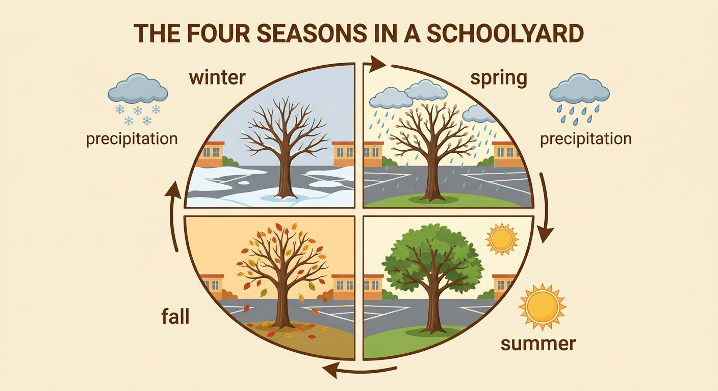
Weather describes conditions outside at a certain time, including temperature, rain, snow, wind, and clouds. A season is a part of the year with a typical pattern of daylight and weather. In many U.S. regions, winter is colder, summer is warmer, and spring and fall are between those extremes. For example, students in Pine City might wear coats during cold January days but shorts during warm July days. One hot winter day does not change the usual winter pattern. Scientists study weather recorded over many days and years to find what is typical. Begin by observing the sky, temperature, and precipitation in your region. Record the date and conditions. Then ask: How do these observations compare with what usually happens during this season?
Read the Weather Data
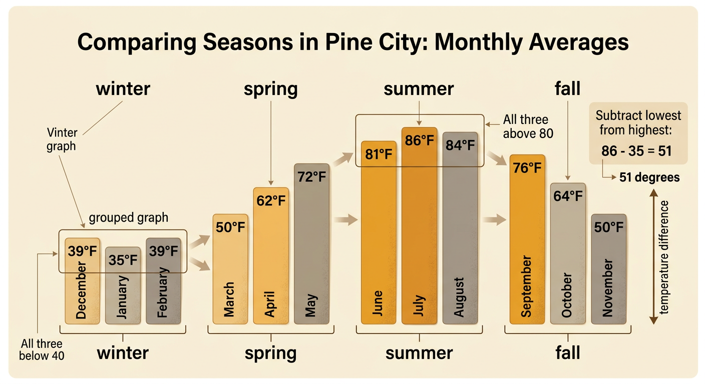
A weather table organizes information so it is easy to read and compare. The sample Pine City table lists the average high temperature for each month: January 35°F, February 39°F, March 50°F, April 62°F, May 72°F, June 81°F, July 86°F, August 84°F, September 76°F, October 64°F, November 50°F, and December 39°F. An average combines temperatures recorded over many years to show what is typical. It does not predict the exact temperature on every day. Read across each row to connect the month with its value and unit. For example, July’s average high is 86°F, while January’s is 35°F. Always check the table title, headings, and units before using the numbers.

Create a Bar Graph
A bar graph turns the table values into bars that make comparisons easier. Write the months from January through December along the horizontal axis. Label the vertical axis Average High Temperature (°F). Use an equal scale, such as 0°F to 90°F in steps of 10°F. Each space must represent the same amount. Draw one bar for every month, making its height match the table value. For example, the January bar reaches halfway between 30°F and 40°F because its value is 35°F. The July bar reaches 86°F, a little above 80°F. Add a title that tells what the graph represents. Check every bar against the table. A correct scale and accurate bar heights help readers understand the data without being misled.

Identify Patterns
A pattern is a change or feature that repeats or follows an understandable order. Look across the graph from January to December. In Pine City, average high temperatures generally rise from 35°F in January to 86°F in July. They then generally fall to 39°F in December. July has the highest bar, and January has the lowest bar. March and November share an average high of 50°F. The graph shows a yearly cycle: cold months, warming months, warm months, and cooling months. Minor differences do not erase the larger pattern. For example, August is 2°F cooler than July, but both months are part of the warm summer period. Describe patterns using evidence from several bars instead of making a statement from only one month.

Compare Seasons
Group the months into seasons to make broader comparisons. For this activity, winter includes December, January, and February; spring includes March, April, and May; summer includes June, July, and August; and fall includes September, October, and November. Pine City’s three summer values are all above 80°F, while its three winter values are all below 40°F. The difference between the highest and lowest monthly averages is 51°F because 86 minus 35 equals 51. This evidence shows that summer is typically much warmer than winter in this region. Other regions can have different patterns. A coastal region may have smaller temperature changes because nearby ocean water warms and cools slowly. A desert region may be very dry, while a mountain region may be colder and snowier because of its elevation.
Make a Weather Claim
A weather claim is a statement that answers a question about typical conditions. Support the claim with evidence from the table or graph, then explain how the evidence supports it. For example, a student might claim, “Summer is typically the warmest season in Pine City.” The evidence is that June, July, and August have average highs of 81°F, 86°F, and 84°F. These are the three highest temperatures in the data set, so they support the claim. Avoid saying that every summer day will be hot because the graph shows averages, not exact daily weather. You can also make a prediction based on the pattern, such as expecting July to be warmer than January. A strong response names the season, gives accurate numbers, and connects those numbers to the claim.
